Dennis Burnett

DB_editorialcommercial_promo_02.jpg

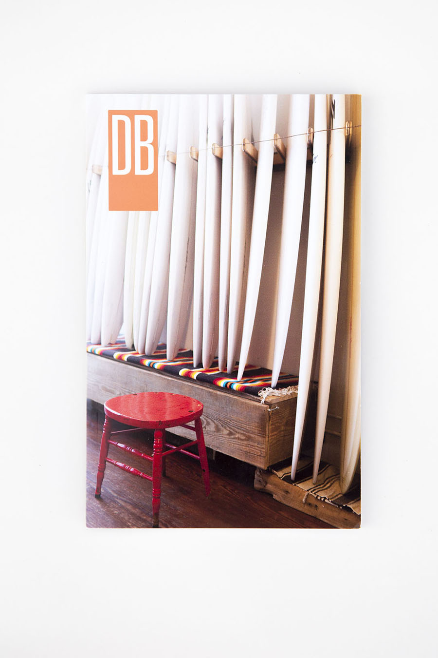
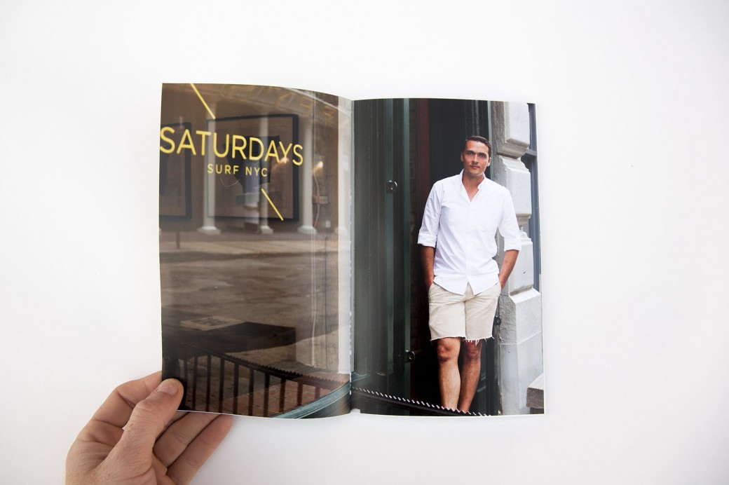
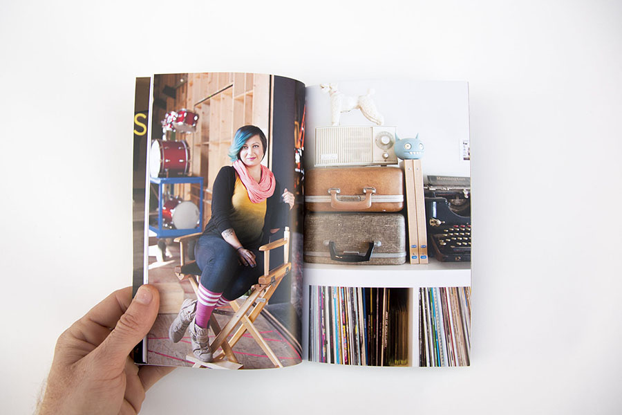
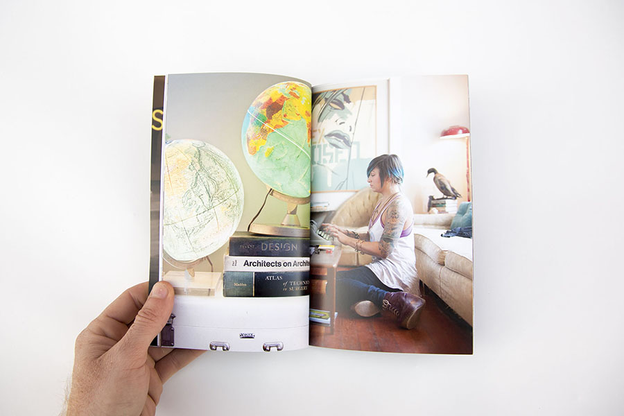
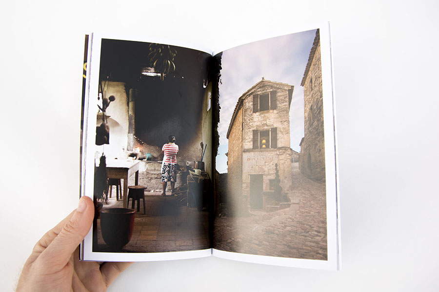
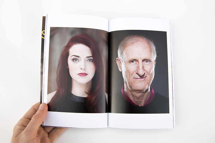
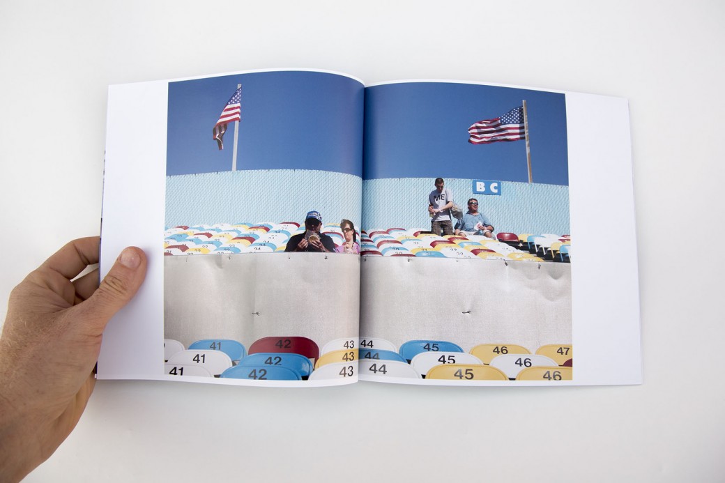
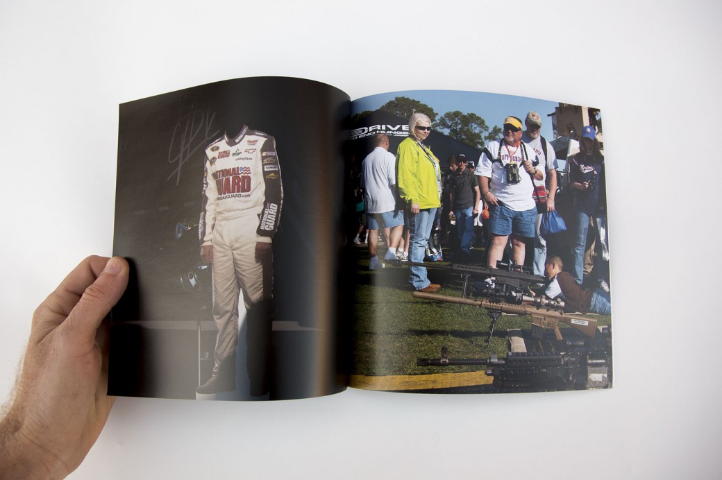
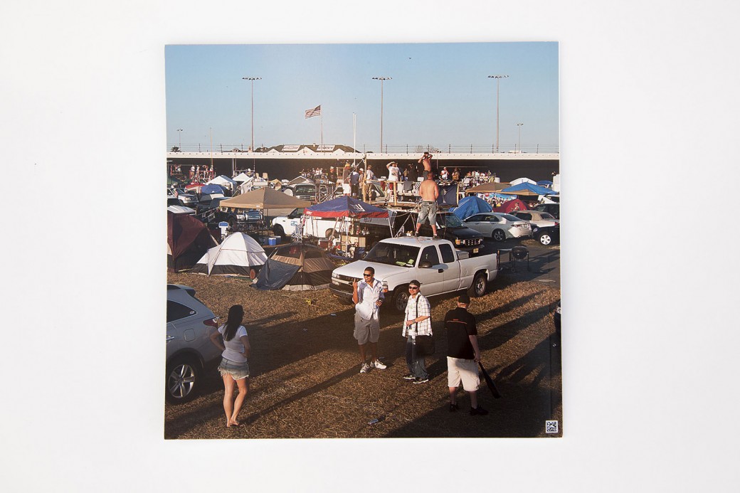
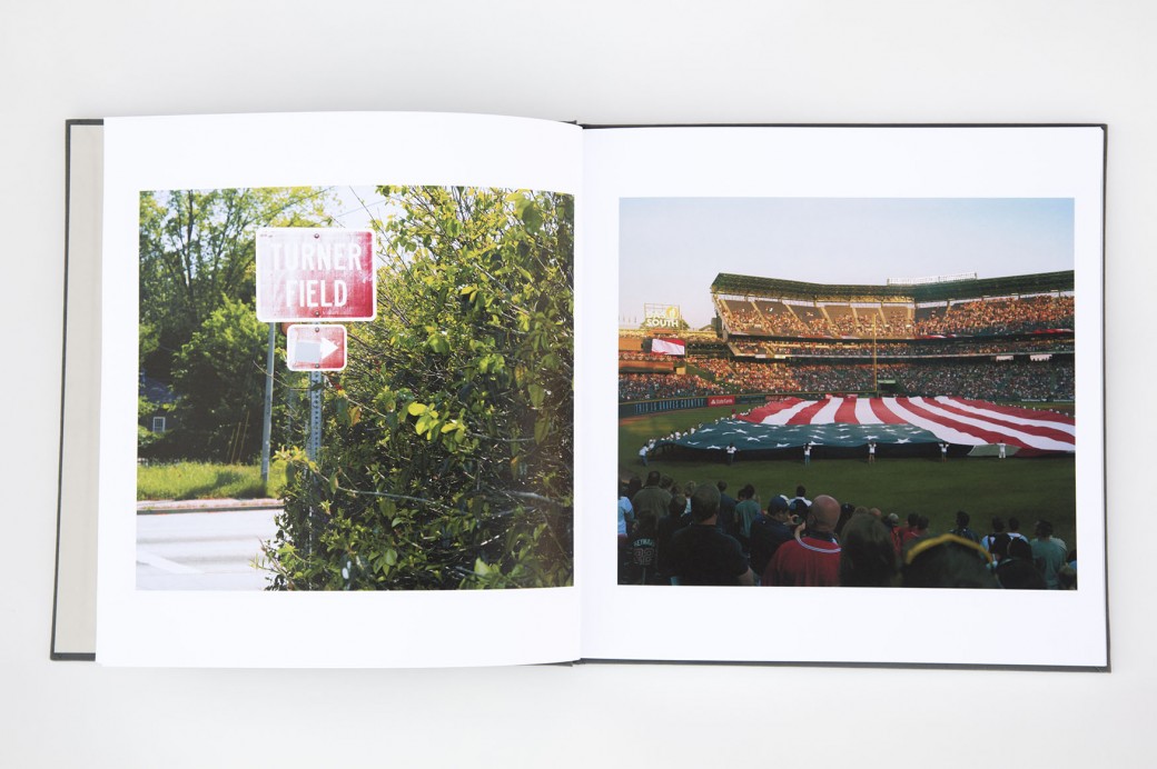
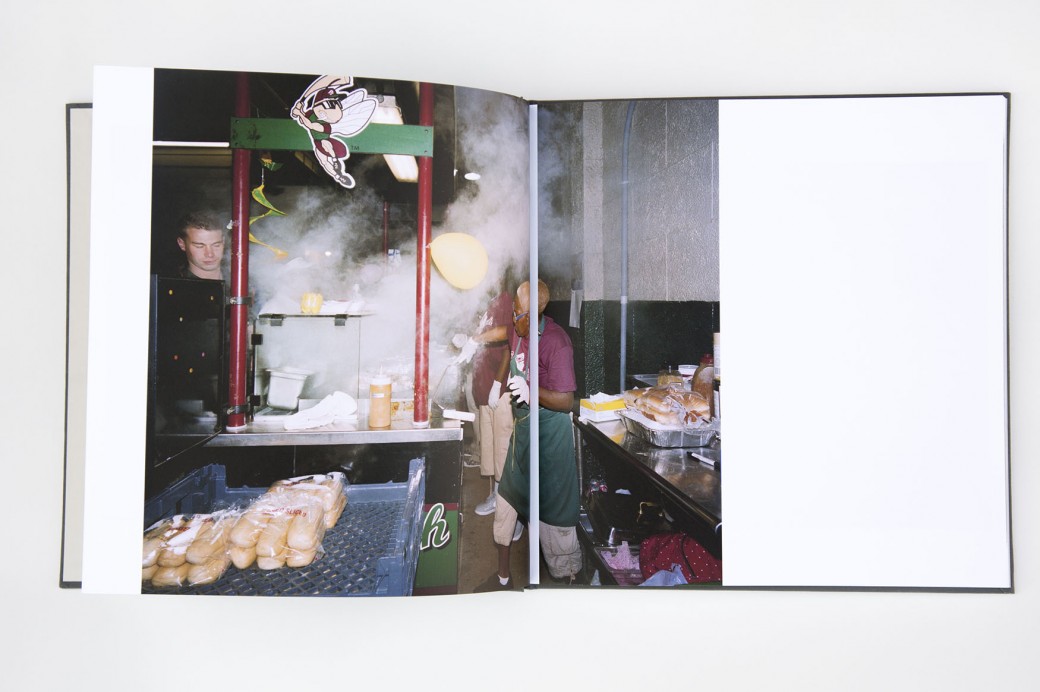
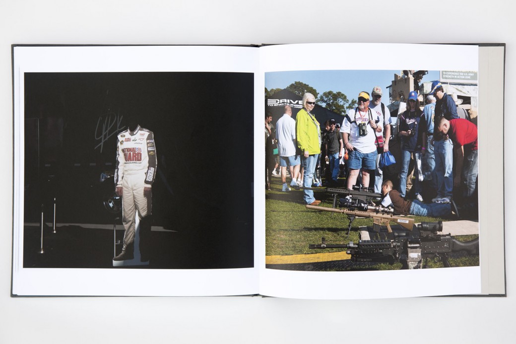
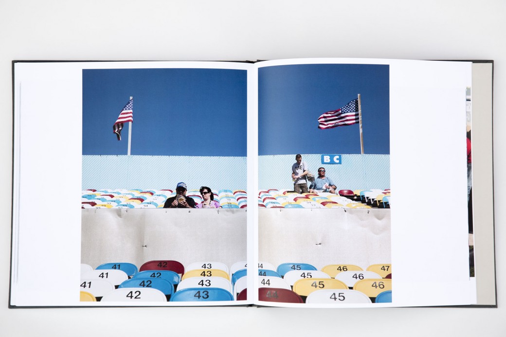
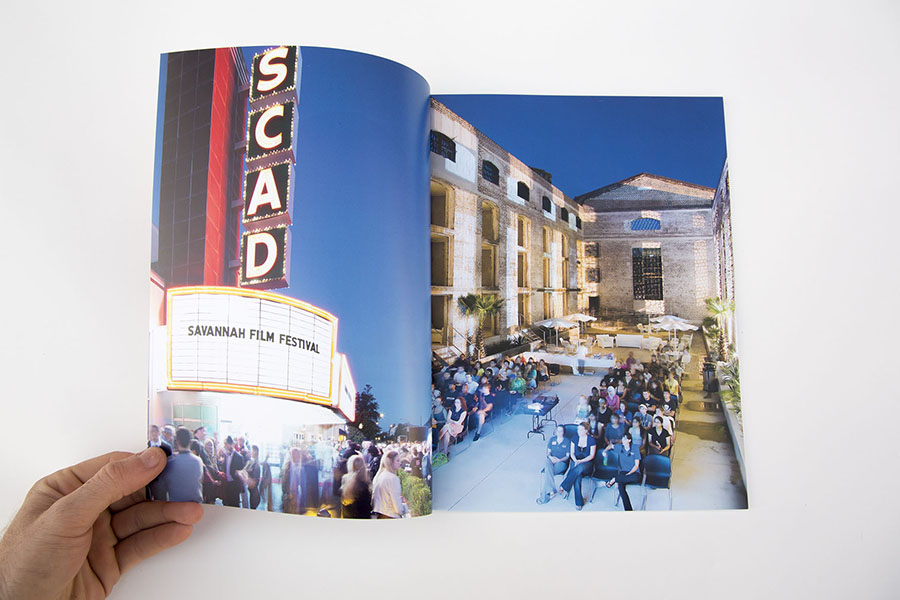
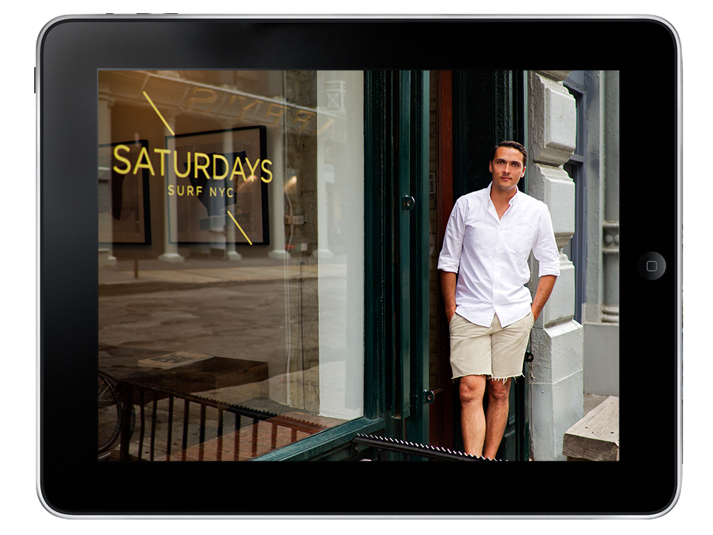
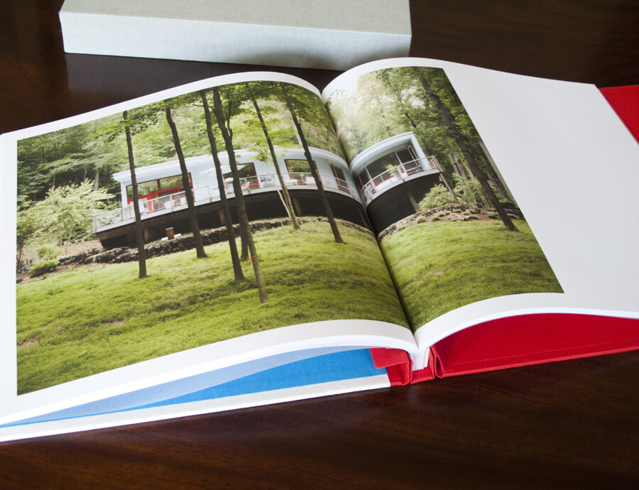
Dennis Burnett recently relocated to Austin from Savannah and was looking for help with editing and presenting his work. We put together three presentations:

  • A personal projects book (printed by blurb on their new proline paper with cloth cover)
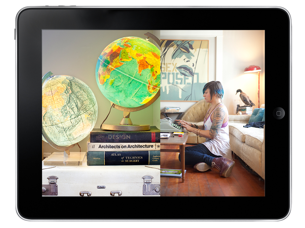
  • An iPad presentation of his editorial work
  • An editorial magazine leave behind (printed by magcloud)
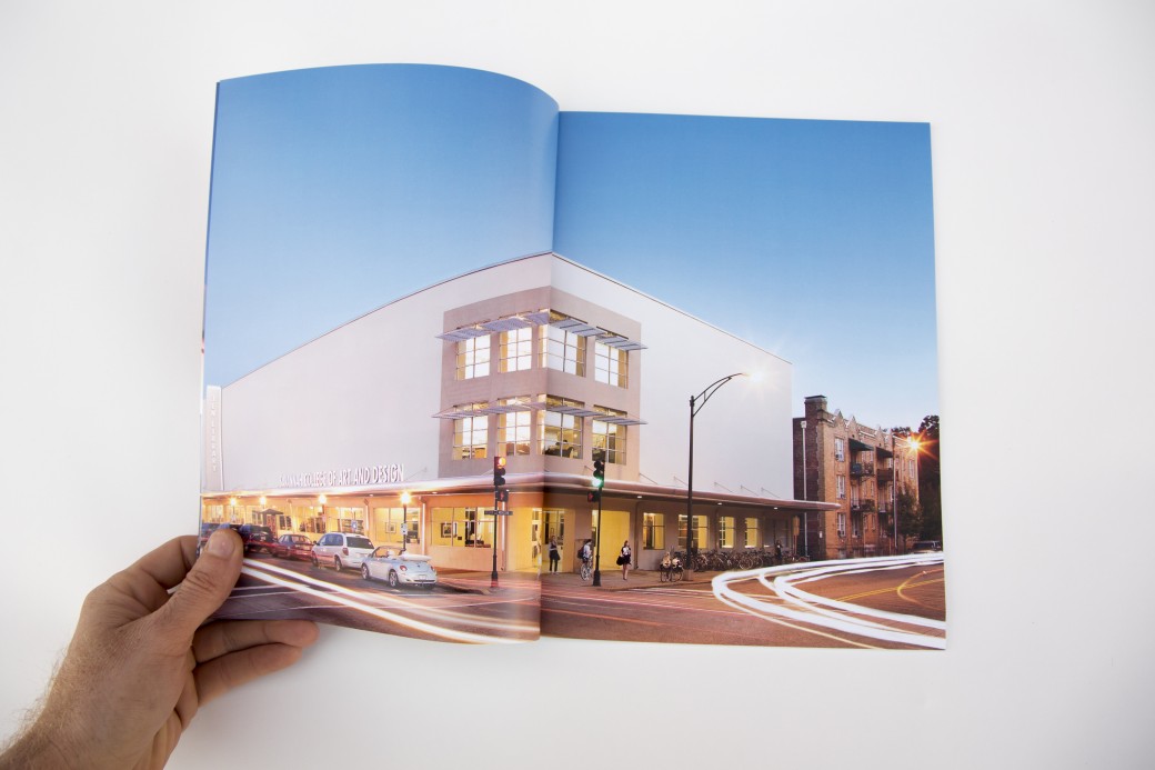
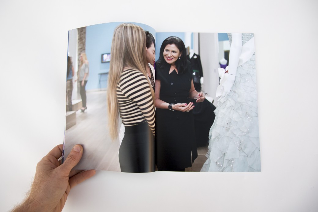
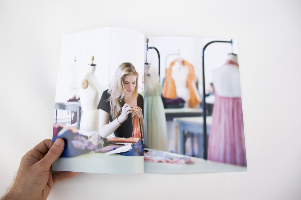
  • A magazine highlighting the work lifestyle, architectural and interiors work he did for SCAD (also printed by magcloud)

Dennis showed this work at the Texas Photo Roundup portfolio reviews and received very encouraging feedback.

Travel by Handstand Photo Editing

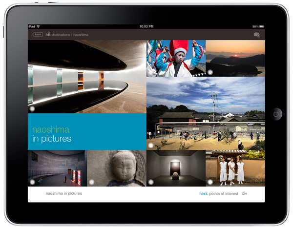
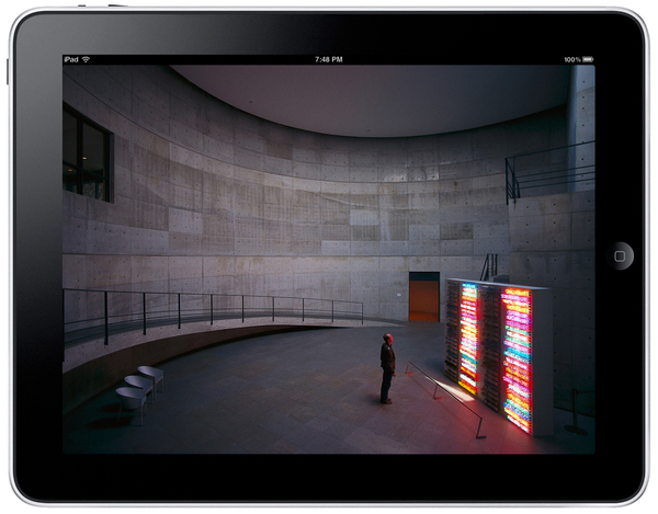
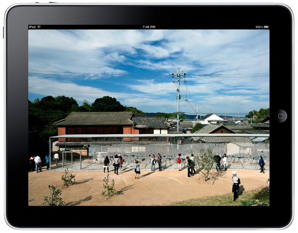
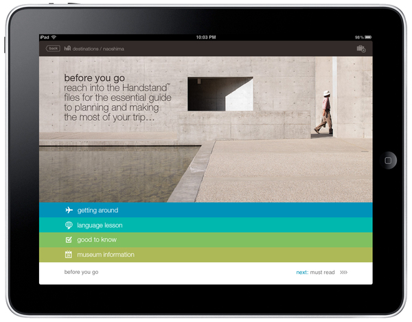
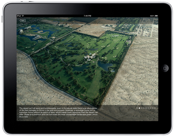
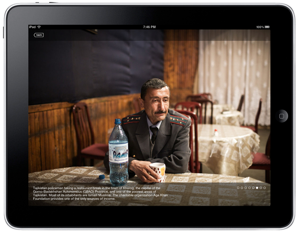
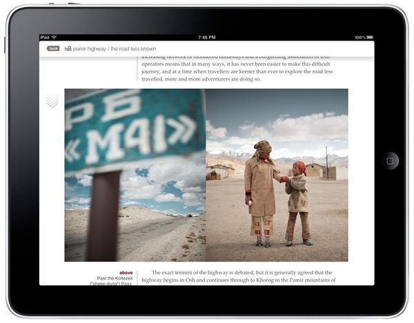
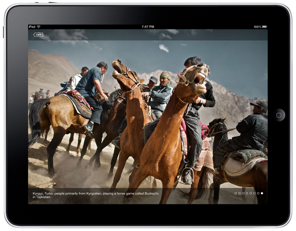
Travel by Handstand is a beautiful app for the iPad that features original photography and writing. As photo editor, I was responsible for all research, licensing and commissioning of photography.

Unfortunately, production halted on the app, but I'm hoping that the smart folks at Handstand come back with something bigger and better in the future. It's a great team of highly creative publishers.

Here are some screenshots from some of my favorite stories, including the Pamir Highway by Matthieu Paley and a commissioned assignment on Charleston by Paul Zoeller.


Kimberly Davis

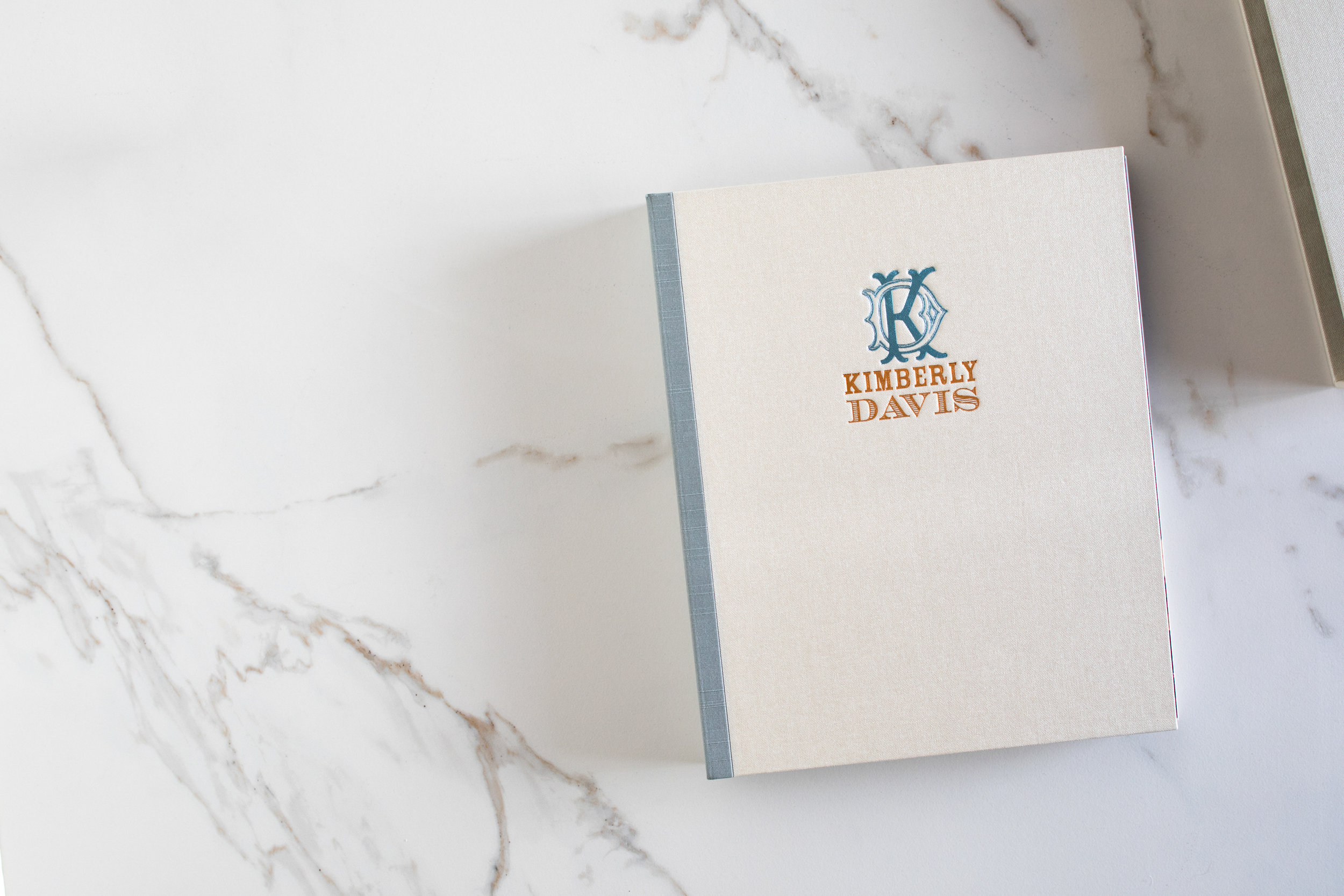
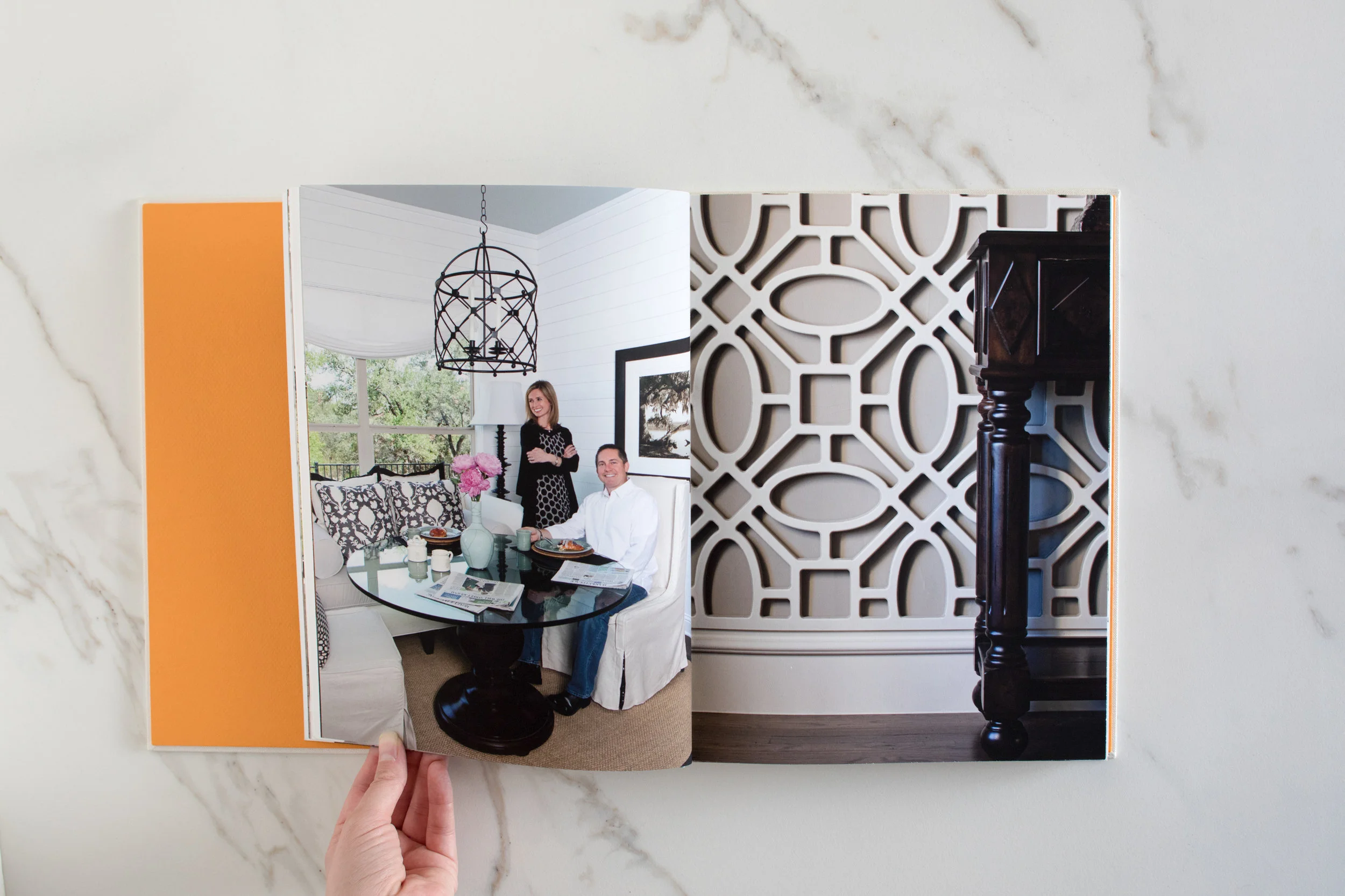
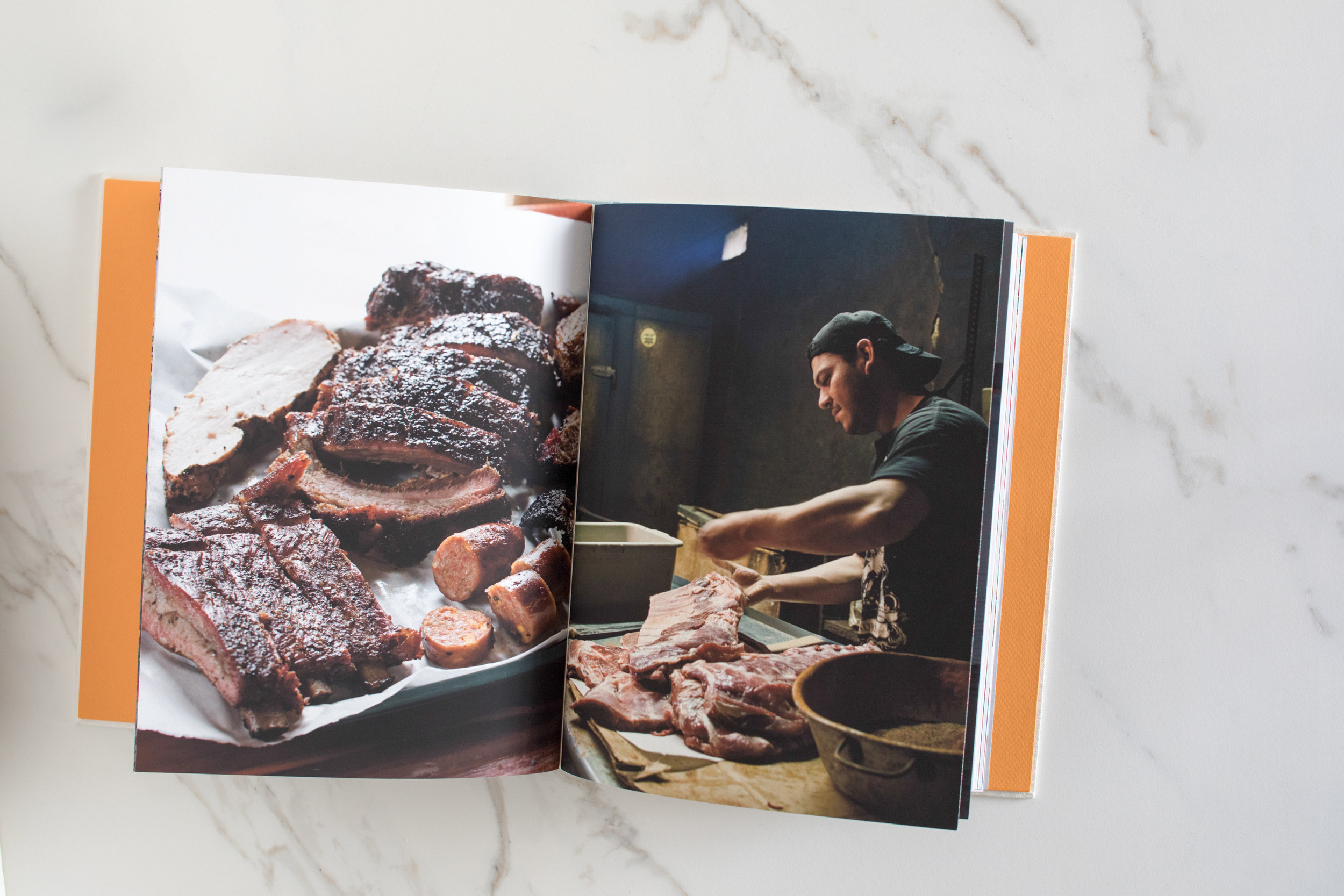
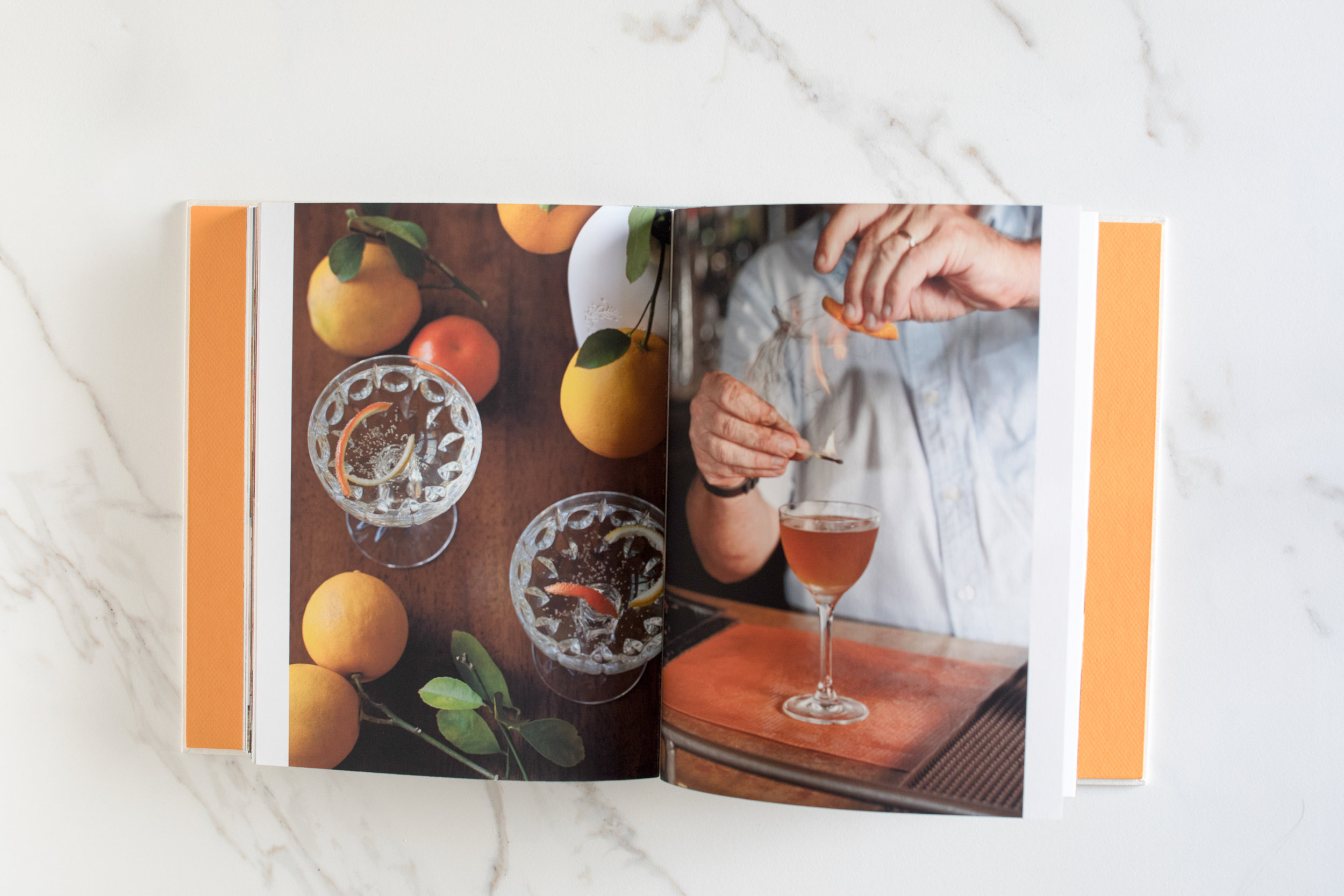
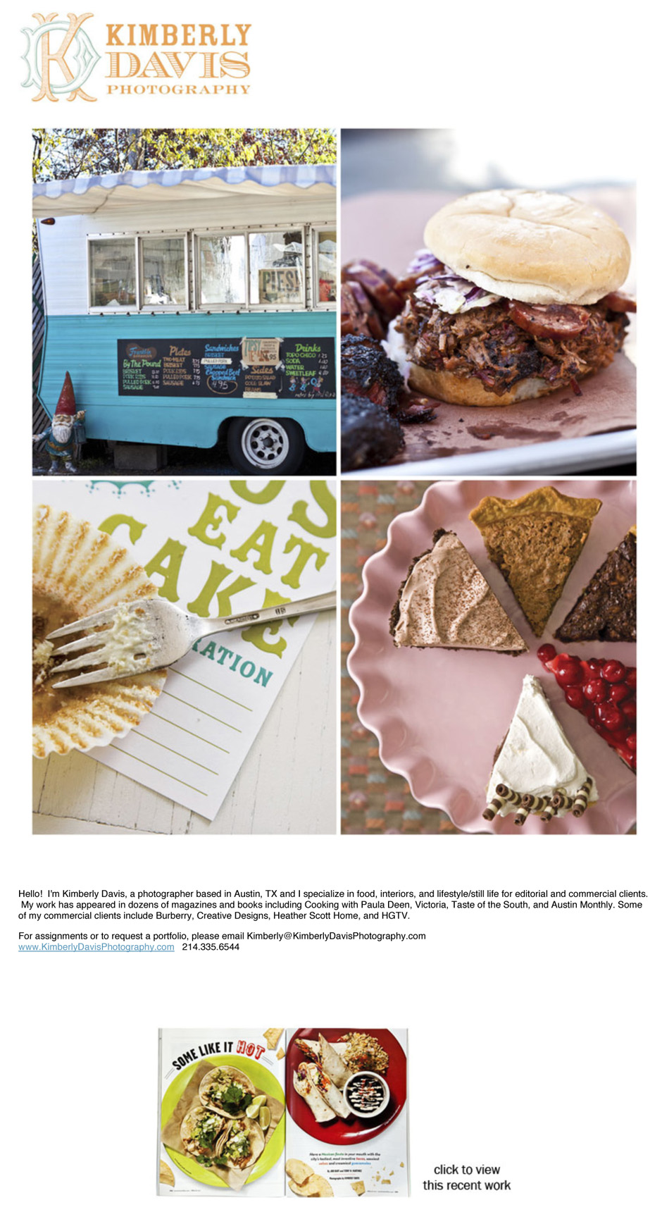
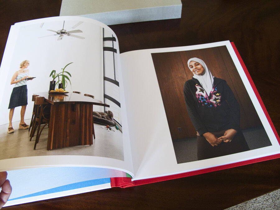
Kimberly Davis is an Austin-based interiors and food photographer with a real love for all things smoky (BBQ) and pretty (interiors).  She and I started working together in 2011 to help her fine tune her web presentation, create a print portfolio (the book was custom made by Jace at Cloverleaf Studio), and create a marketing plan.

Print Portfolio:

KimberlyDavisPhotography001.jpg
KimberlyDavisPhotography002.jpg

Email Newsletter/Promos:

Promo1Food-1.jpg
Austin based Home/Interior Photographer

Austin based Home/Interior Photographer

David McNeese Print Portfolio, Website, and Promos

port001.jpg

David McNeese is an Oklahoma-based industrial and corporate photographer with a passion for shooting large-scale projects full of logistical challenges. His studio is frequently tapped to create stunning imagery for energy, oil and gas companies, and large construction firms. David came to me needing to refresh his brand identity, overhaul his website and develop a plan for targeting clients with the kinds of large scale jobs that he excels at. We started by going through all of his images and choosing ones that best show off his corporate storytelling skills. We then worked with Livebooks to create a custom website. Once the website was launched, we announced the new look through email and print promotions designed by Nathan Ryan.

We also developed new print portfolios, built by Scott Mullenberg's Mullenberg Design Studio. David had the opportunity to show the new portfolios off at a portfolio review in Austin in February, where he received very positive feedback from art buyers and reps.

New website:

Screen Shot 2012-07-26 at 2.11.19 PM

Screen Shot 2012-07-26 at 2.11.19 PM

Screen Shot 2012-07-17 at 2.36.52 PM

Screen Shot 2012-07-17 at 2.36.52 PM

Screen Shot 2012-07-17 at 2.41.02 PM

Screen Shot 2012-07-17 at 2.41.02 PM

Print Portfolio:

port001.jpg

port001

port020

port020

port005

port005

11x17" foldout double sides print promo:

_MG_9764

_MG_9764

_MG_9766

_MG_9766

_MG_9768

_MG_9768

E-promo:

McNeese-Newsletter_FIN

McNeese-Newsletter_FIN

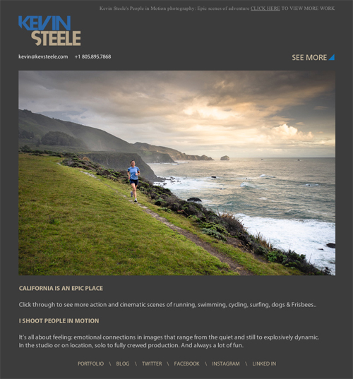
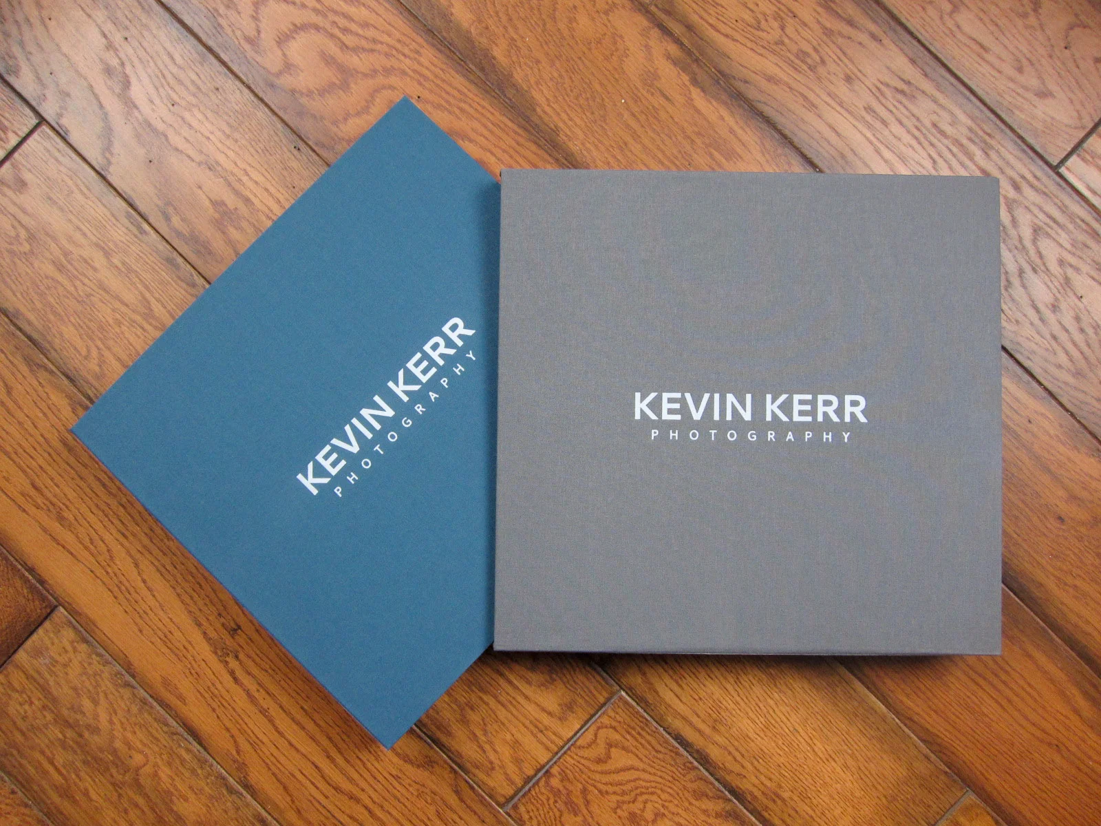
Kevin Kerr Website, Print Portfolio and Print Promo

website.jpg
120426_family-0906-2

120426_family-0906-2

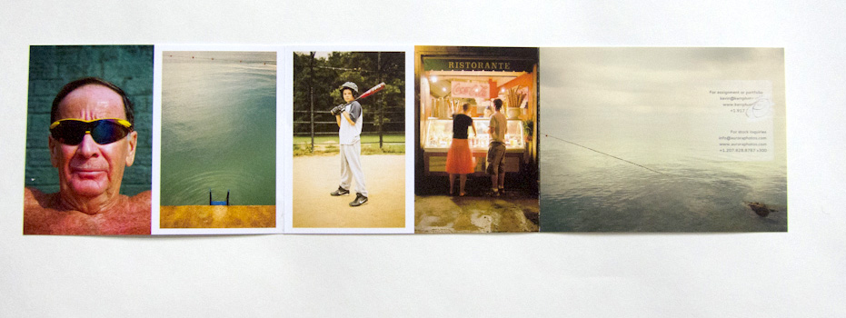
NYC-based travel photographer Kevin Kerr and I worked together to re-edit his web and print portfolios, create a new print promotion, build targeted mailing lists and define who his top priority clients should be.

IMG_0375

IMG_0375

IMG_0377

IMG_0377

website.jpg

website

Case Study: Seattle-based Mike Kane

PROMO_KANE_01a.jpg

Seattle-based Mike Kane was looking to improve his freelance career after many years in newspaper photojournalism. As with most projects, rethinking his approach started with us looking through his archive of images. In addition to his great in-depth documentary work, he also had a body of work that would work well for a variety of editorial and corporate clients.  The way he shows life in the Pacific Northwest was especially interesting to me, and I thought it would be good to highlight a mix of editorial portraiture, landscapes, and documentary images.

Picture 13
Picture 13

New promotional materials

PROMO_KANE_01a.jpg
PROMO_KANE_01a
PROMO_KANE_03a
PROMO_KANE_03a
PROMO_KANE_02a
PROMO_KANE_02a

Jason Dailey

Jason Dailey is a Kansas City-based corporate and editorial photographer. He was looking for some help in refocusing the work he shows on his website. We started with re-editing everything to show his strengths, especially with portraiture. We then created a new print promo and portfolio for him to take on meetings. Since launching the new work, he has picked up new clients in editorial, healthcare and higher education sectors.

Jennifer Whitney Print Portfolio and Promotions

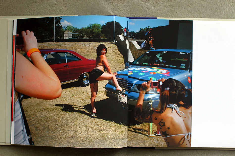
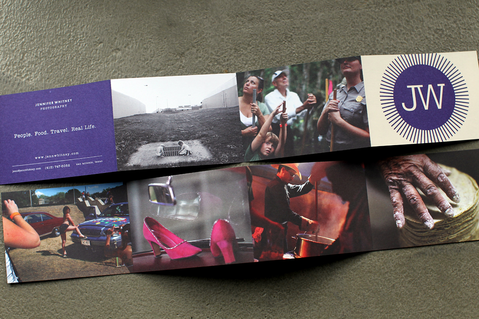
I worked with San Antonio-based Jennifer Whitney on re-editing her work, building a new website, creating the first of a series of print and email promos and creating a new, custom print portfolio. Scott Mullenberg built the portfolio and designer Doris Palmeros did the new logo and branding as well as designing the first printed promo piece.  

MULLENBERG Portfolio jw 001

MULLENBERG Portfolio jw 001

MULLENBERG Portfolio jw 002

MULLENBERG Portfolio jw 002

MULLENBERG Portfolio jw 003

MULLENBERG Portfolio jw 003

promo jw 02.jpg

promo jw 02.jpg

promo jw 03.jpg

promo jw 03.jpg

promo jw 04.jpg

promo jw 04.jpg

Amy Eckert

eckert_website.png

Amy Eckert, a commercial and editorial photographer (and also a fine artist and McKnight fellow) hired me to help her revamp her website and portfolio in the lead up to a move to Los Angeles. We started by talking about her goals, which include expanding her commercial client base and making sure that people knew she was based in LA. I went through all of her work and re-edited the images to appeal to the clients she is trying to reach. We reorganized the structure of her galleries as well.

We worked together, along with Scott Mullenberg at portfoliodesignstudio.com, to design a new print book with bold colors and a beautiful handmade slipcase.

Amy did all of the printing herself (which she says she really enjoys doing), on Pina Zangaro double sided bright white smooth matte, pre-scored.

Once everything was live, we created an email blast announcing the move to LA and encouraging people to come to the new site.

Tiffany Brown Marketing Campaign

spring_promo04.jpg
spring_promo03
spring_promo03

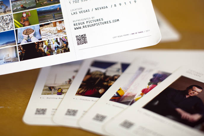
Las Vegas-based Tiffany Brown needed a marketing campaign that would announce her move from staff newspaper photographer to the freelance editorial and commercial market. Since Las Vegas is such a travel destination, we decided on a campaign built around the theme of boarding passes. With designer de-mo.org, we created a stunning promo consisting of 6 "boarding passes" sent out in a zip-sealed Mylar bag. We also created a print giveaway promotion and a coordinated email promo.

Read more about Tiffany's rebranding process on her blog.

Matt Nager

Picture-103.png

I recently wrapped up work with Matt Nager. Matt is a very talented portrait and documentary photographer whose old website was obscuring a lot of his strongest work. We started by talking about his strengths, defining what his main goals were and establishing the best way to spend his marketing dollars to reach those goals. We completely overhauled the website, resulting in a fresh and streamlined site powered by aphotofolio.com. His previous site featured too many choices of stories for editors to go through, so the new site is all about delivering his best images efficiently so that busy editors don't miss the strongest work.

We also put together a print promo (quantity 750 printed by paperchase.net) announcing his upcoming move to Denver. The promo features images that highlight his strengths in portraiture, travel and documentary.

My personal favorite part of our project was developing the print portfolio (I just love print books!). Matt teamed up with the very talented Scott Mullenberg at portfoliodesignstudio.com.  Scott sent a variety of fabric samples for us to consider. We narrowed down the choices to a palette of blues and browns and finally decided on what you see below. I edited and sequenced Matt's work to highlight his diversity but also to show that he approaches all of his subjects with a consistent personal style and vision.

I am really happy with the finished product. Matt traveled to NYC and DC and got 23 meetings in just a little over a week. Upon returning home, Matt said "I think editors really liked having a physical book, it honestly made a huge difference." Many editors mentioned loving the colors as well. Actually showing your book to a lot of clients is the best way to gauge if the edit and sequence are right, and Matt might make a few tweaks to the book. But the overall impression was that "the sequencing was really great and showed off (his) versatility."

Of course now the real work begins... all of the follow up marketing that will help Matt capitalize on the the momentum we have built. To help with that, I created a year long marketing plan for him that incorporates suggestions for print promos, newsletters, social media and in person meetings.

Best of luck with the next year Matt!

American Youth Book Editing & Event

Produced the American Youth book, a collection of photographs about young people shot by the photographers of Redux Pictures. The book received a lot of great press, including praise from Readers Digest, The Washington Post, Photo District News, NPR, The Daily Beast, Time.com and numerous photo blogs.

Organized a traveling exhibition which was shown at The New York Photo Festival, LOOK3 The Festival of the Photograph, The Minneapolis Center for Photography and the Rochester Institute of Technology. Each of these exhibitions generated their own press.

ay_look3.jpg
aylaunce2.jpg
aycover.jpg