Sarah Lim Website, Print Portfolio and Marketing

Screen-Shot-2013-04-02-at-1.30.51-PM1.png

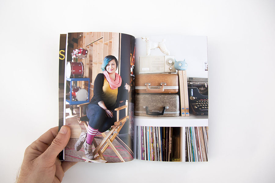
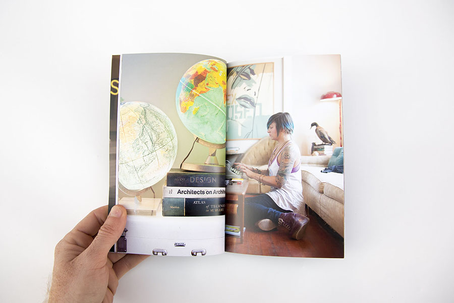
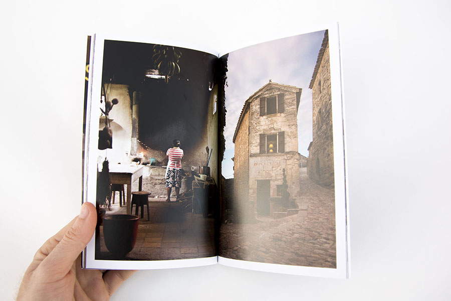
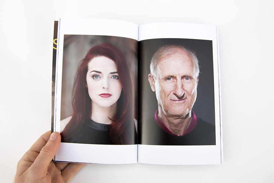
Sarah Lim, an Austin-based editorial photographer, contacted me because she was having trouble making sense of her various types of images. She had travel and documentary and lit studio portraits and natural light environmental portraits. There were a lot of strong images among the folders on her hard drive, but they were having a hard time getting along. We started by first talking about the kind of work that she would like to be getting. Then we started editing her work so that it was a bit more focused and showed off her strengths. We announced the revised edits via email newsletters and print promos, and since then Sarah has shown work in her custom print portfolio (which she hand carved her logo into... yes, you read that correctly) to a variety of clients at in person meetings and portfolio reviews.

Since reworking her portfolios she has started working with a much wider range of clients including Texas Monthly, Austin Monthly, The New York Times, AAA, Inked and others. Texas Monthly has been using Sarah since September 2012 for their monthly travel column, The Wanderer.

Sarah was kind enough to share her thoughts on the process:

"Jasmine is fantastic!  I was just getting started and didn't know my ass from my elbow, but she kicked me into shape.  The very day my first mailer landed on photo editor's desks, I booked my first national magazine job, and I continue to turn to her for professional advice as my career progresses!  With her re-organization of my website edits, it's like she saw which direction I wanted to head, better than I could and has been instrumental in not only getting me work, but helping me better understand and narrow my own focus as a young photographer.

Seeing it all put together has in turn helped me hone in on my own style.  She's a super nice gal, who's personally invested in the success of her clients.   Alone, I couldn't even make headway to get people to return an email, but Jasmine's expert advice has helped me get the gears moving in the direction I want to head."

Jennifer Whitney's Spring Promo

JAWX2282.jpg

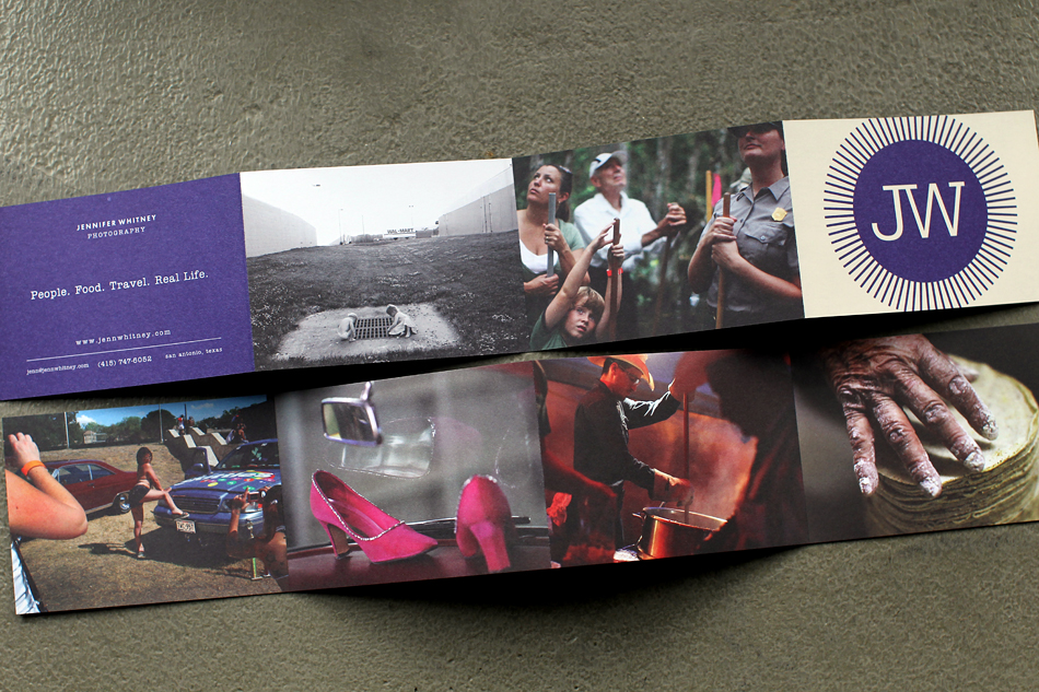
Jennifer Whitney's spring promo is out, and it's a beautiful custom envelope with four different bodies of work each with its own trifold insert. The themes of each card are: Everyday moments that make up our daily lives, commercial work she shot for Cooking Channel during SXSW 2012, food, and her series on election season called “the vote”, including coverage of RNC 2012 in Tampa.


Lissa Gotwals Website

Screen-Shot-2013-03-29-at-1.19.04-PM.png

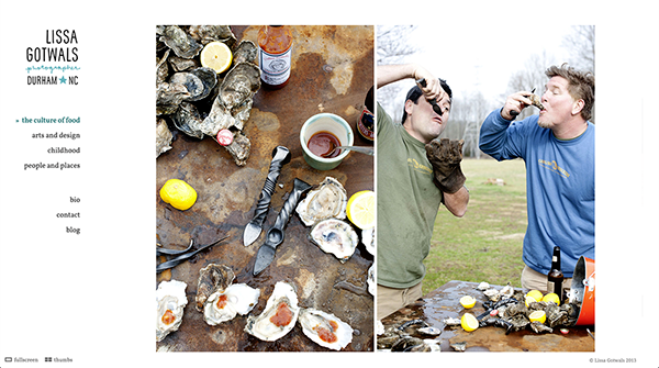
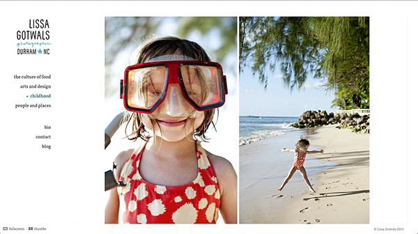
Lissa Gotwals is a Durham, North Carolina-based lifestyle, entertaining and portrait photographer. Her work is full of life and energy, showing the connections that people have between each other, the Earth and the food we grow and eat. Amidst the daily celebrations of life, there are quiet moments that are filled with nostalgia without being overly sentimental. The work feels real and genuine. Her new website puts that work front and center, showing off her great use of color and ease of capturing real moments. In the next few weeks, we'll be sending out a print promo announcing the new work. Stay tuned!


Donna Alberico Website

Screen-Shot-2013-03-10-at-8.00.56-PM.png

NYC-based commercial and editorial photographer Donna Alberico came to me looking for help with editing her work for a new website. She has a mix of documentary and portrait work, and needed a way to mix the genres that made sense, felt cohesive but kept the documentary spirit of her work front and center. We decided to center her new website around a variety of galleries, including:

4 documentary projects: Truckers, Autism, Slaughter and Day at the Races 2 galleries centered around themes: Pursuit of Beauty (a fascinating look at the lengths people go to attain beauty, from childhood to adulthood) and Hanging with Celebs (a tongue in cheek look at behind the scenes celebrity culture)


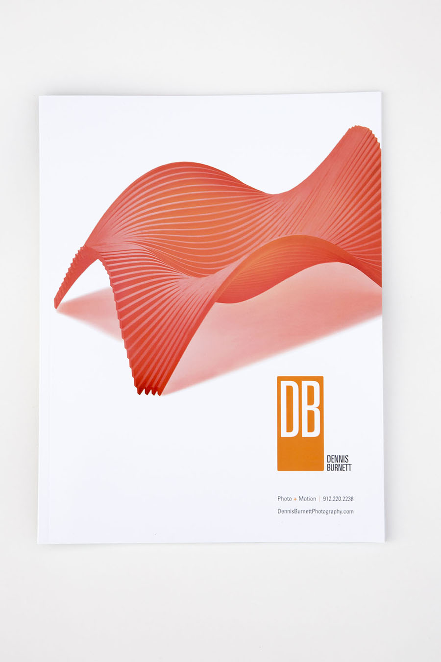
Dennis Burnett

DB_editorialcommercial_promo_02.jpg

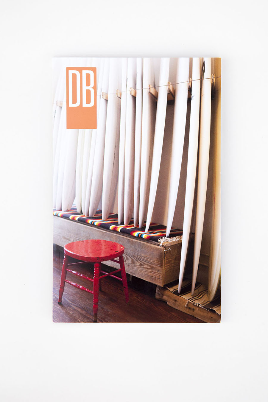
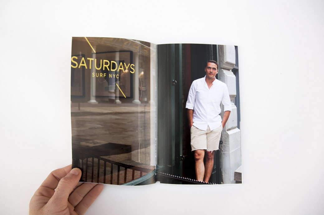
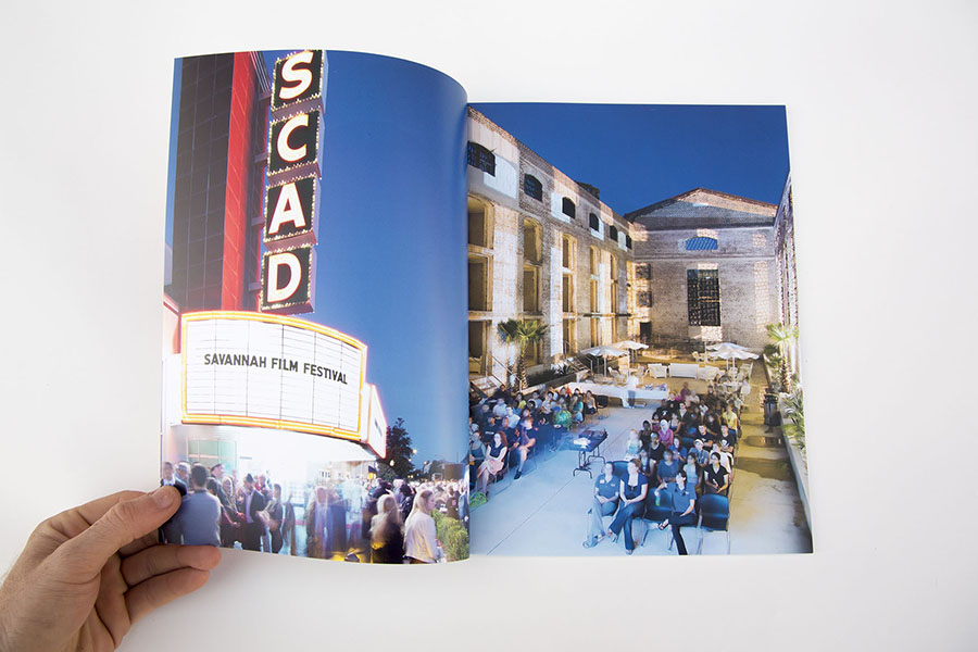
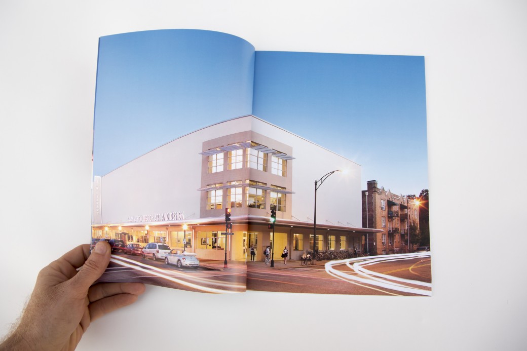
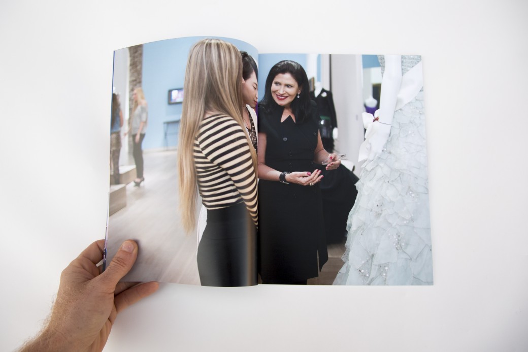
Dennis Burnett recently relocated to Austin from Savannah and was looking for help with editing and presenting his work. We put together three presentations:

  • A personal projects book (printed by blurb on their new proline paper with cloth cover)
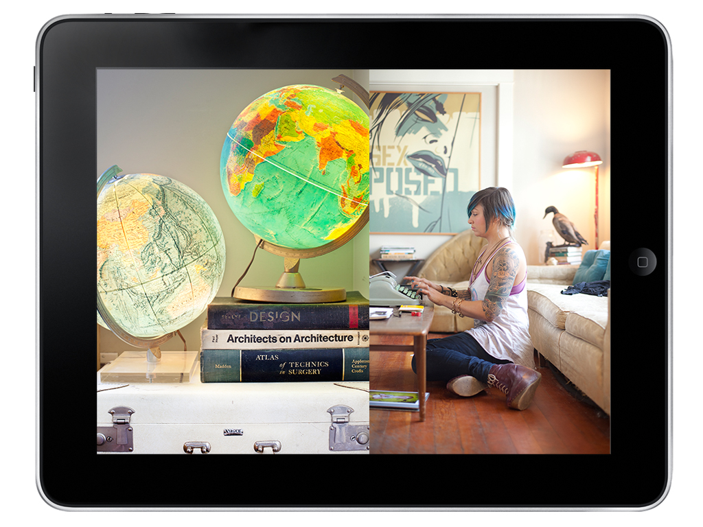
  • An iPad presentation of his editorial work
  • An editorial magazine leave behind (printed by magcloud)
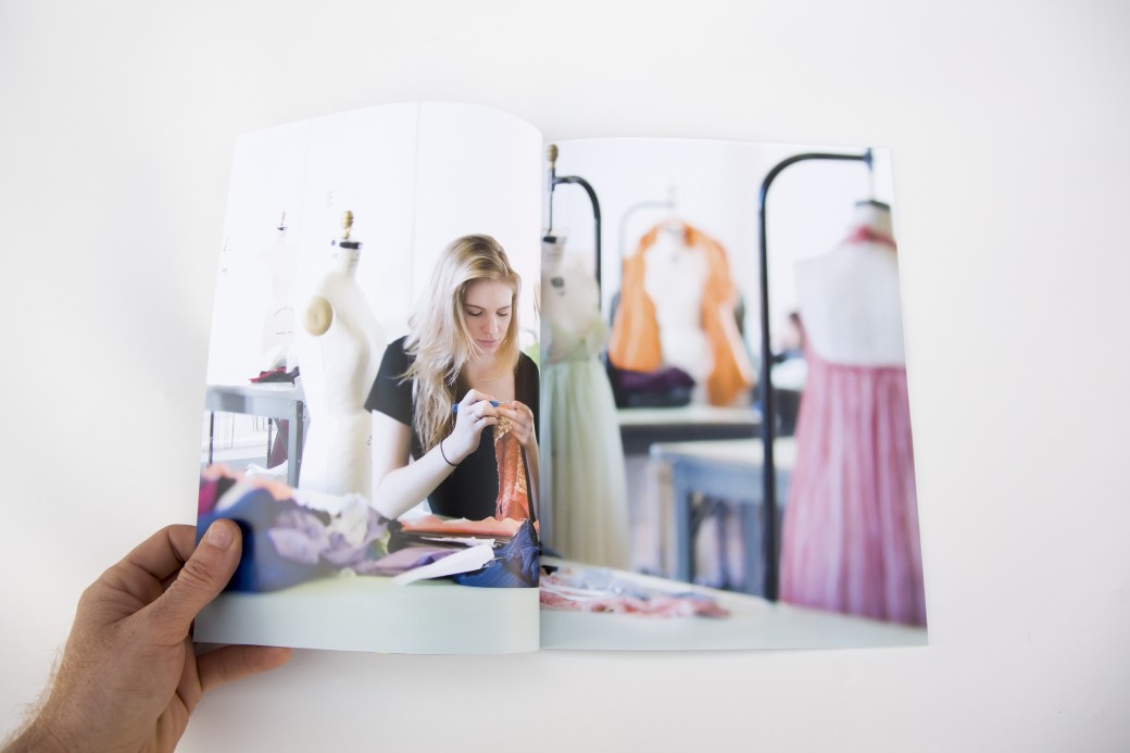
  • A magazine highlighting the work lifestyle, architectural and interiors work he did for SCAD (also printed by magcloud)

Dennis showed this work at the Texas Photo Roundup portfolio reviews and received very encouraging feedback.

Case Study: Benjamin Spell

31.jpg

Benjamin Spell is a Brooklyn-based portrait and lifestyle photographer. Our work together started with a new edit of his existing body of work. Ben had a strong collection of work but it was muddled by imagery that was too different either stylistically or in subject matter. We tightened up his edit by focusing on a cohesive look that was more polished and focused on lifestyle imagery. Ben had a custom portfolio built by Scott Mullenberg, which has started showing to prospective clients in the NYC area.

Together we brainstormed about potential personal projects that would help beef up the portfolio or become the foundation for a new promotional piece. We decided on a series focused on the shopkeepers of Williamsburg, Brooklyn. Our goal was for Ben to create a cohesive body of work that highlights his great portraiture as well as evocative details and atmospheric shots.  The images turned out great and were used in a trifold card that went out to 500 potential clients, as well as an emailer that went out to a larger list.

Kimberly Davis

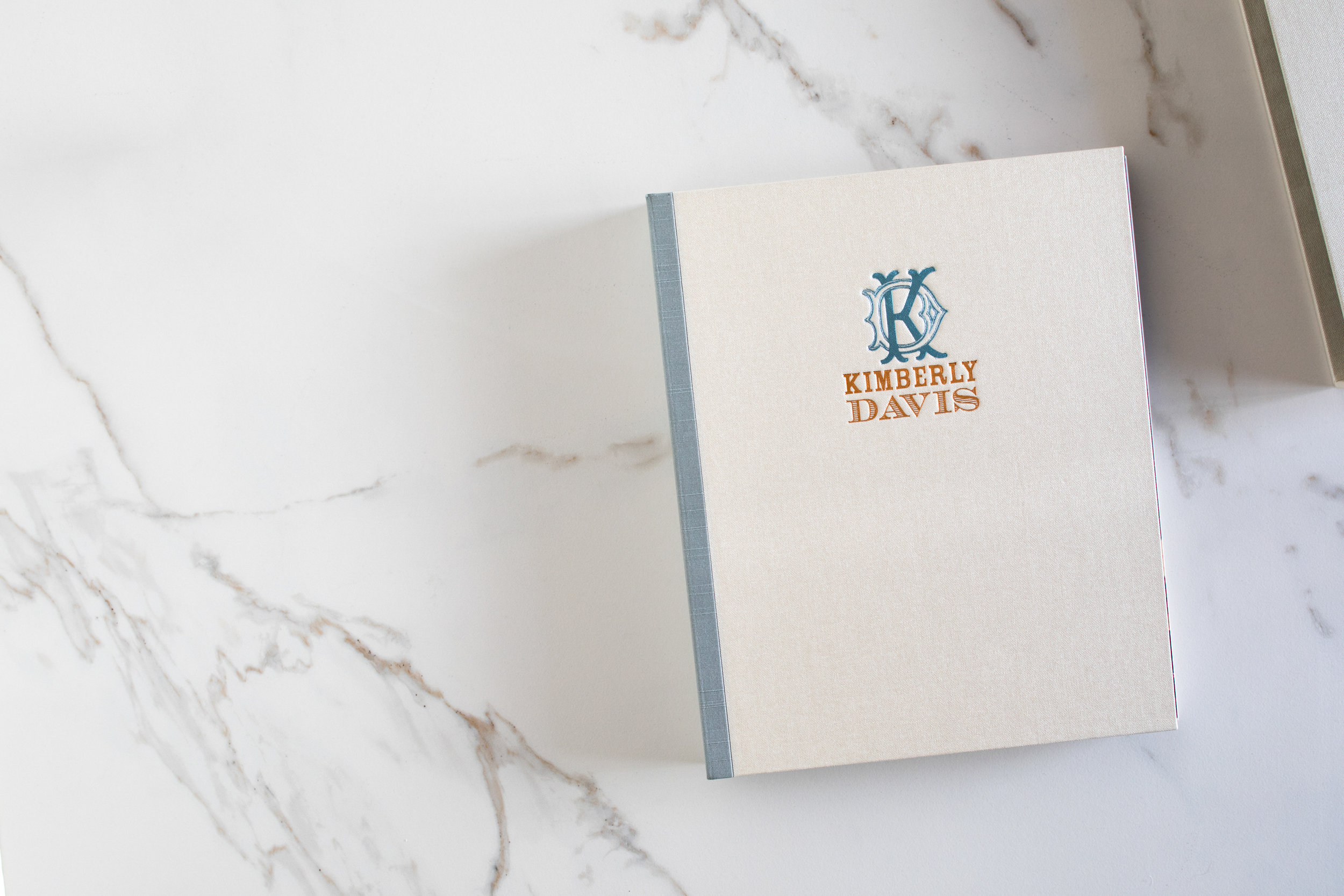
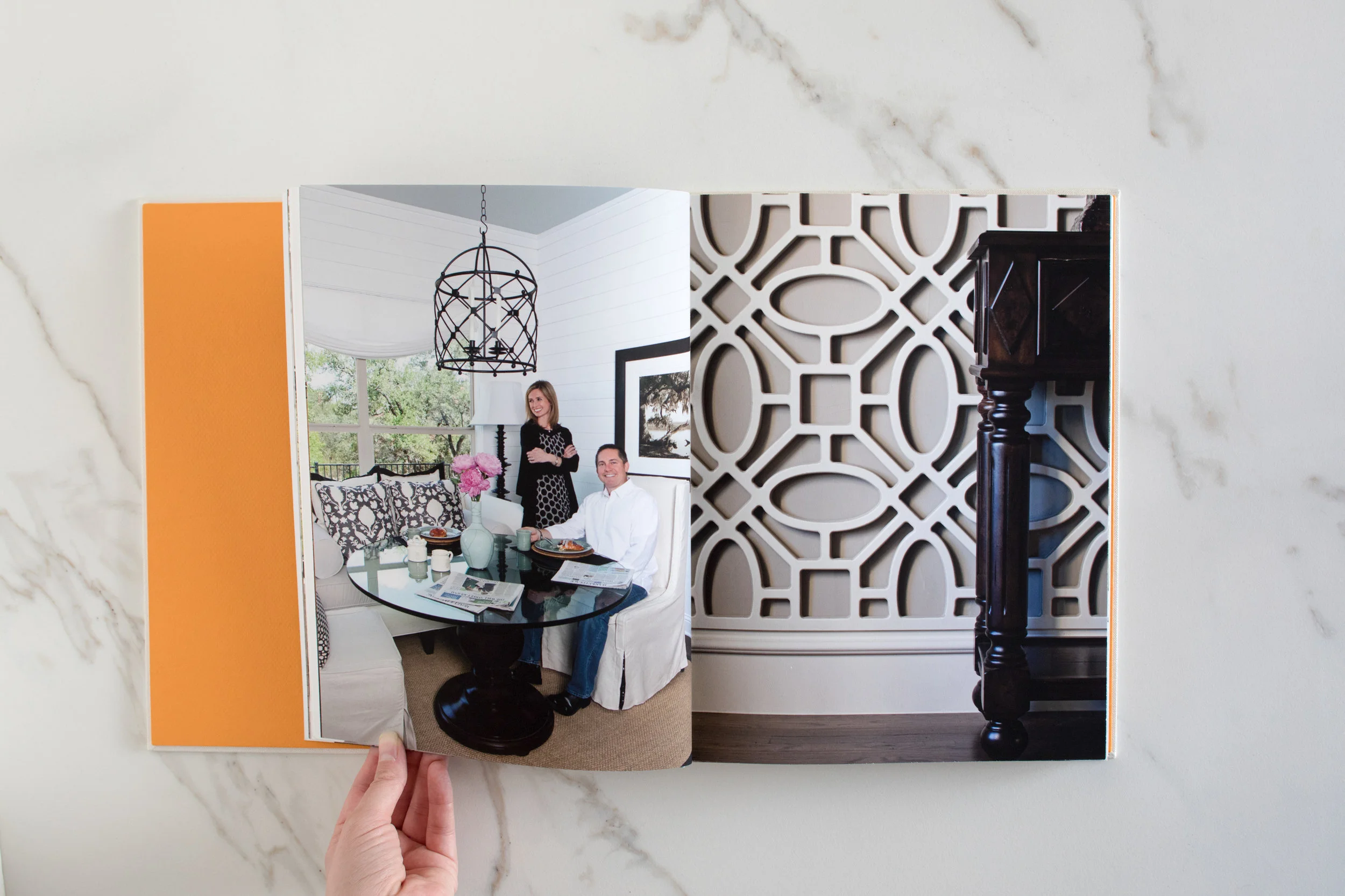
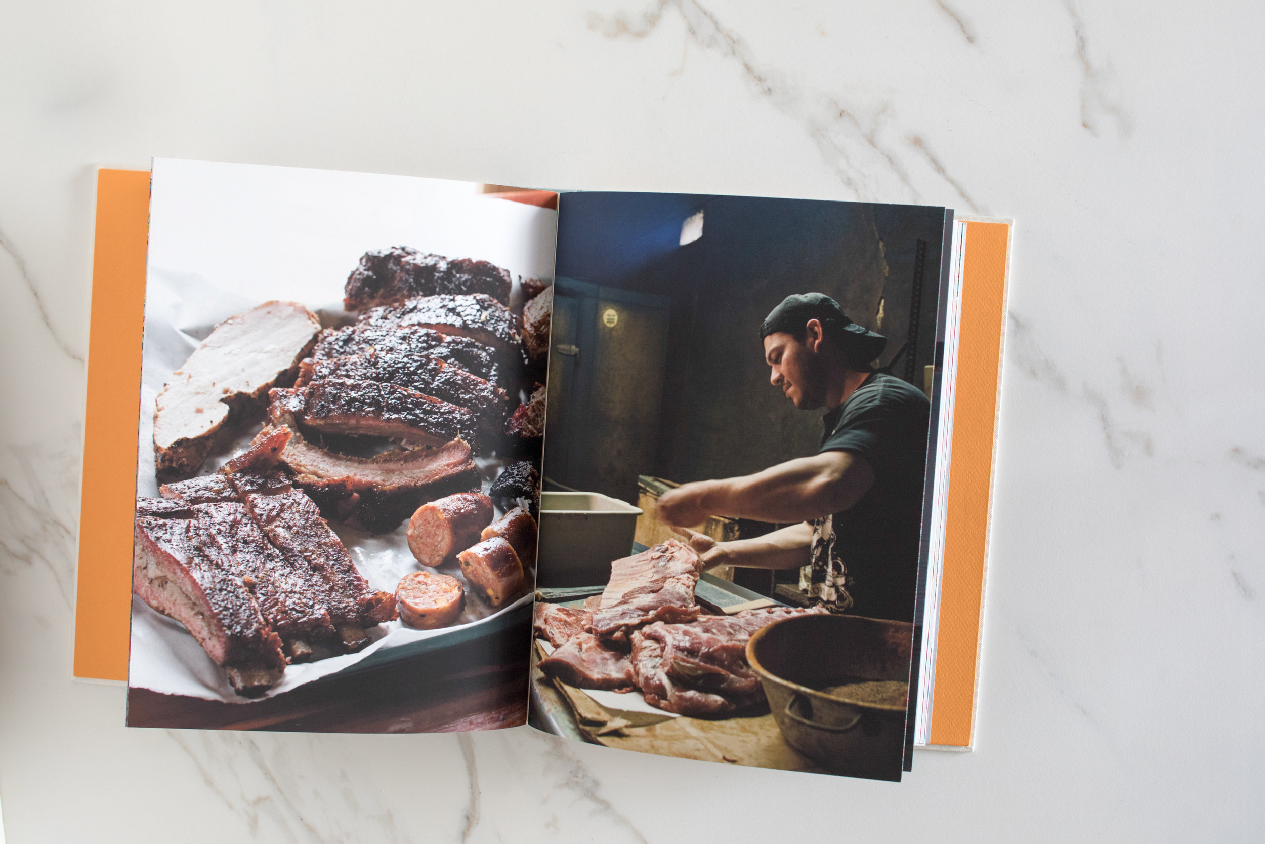
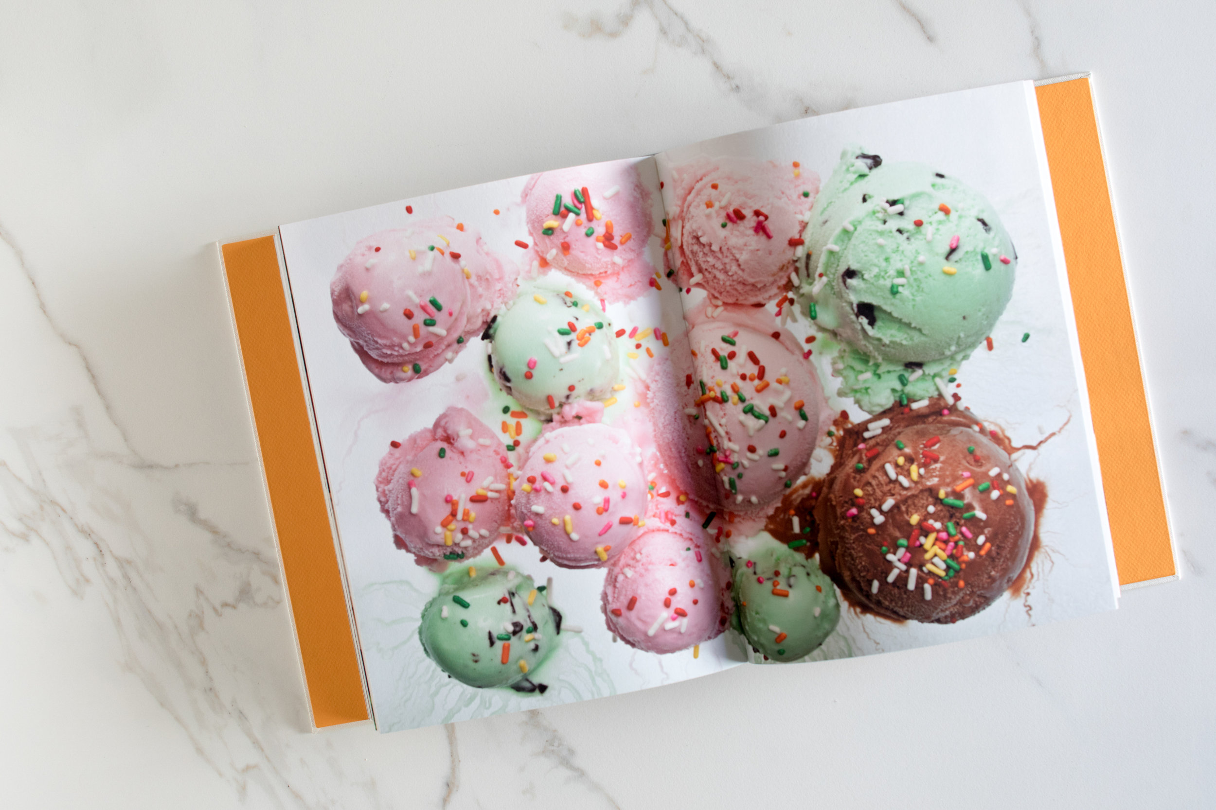
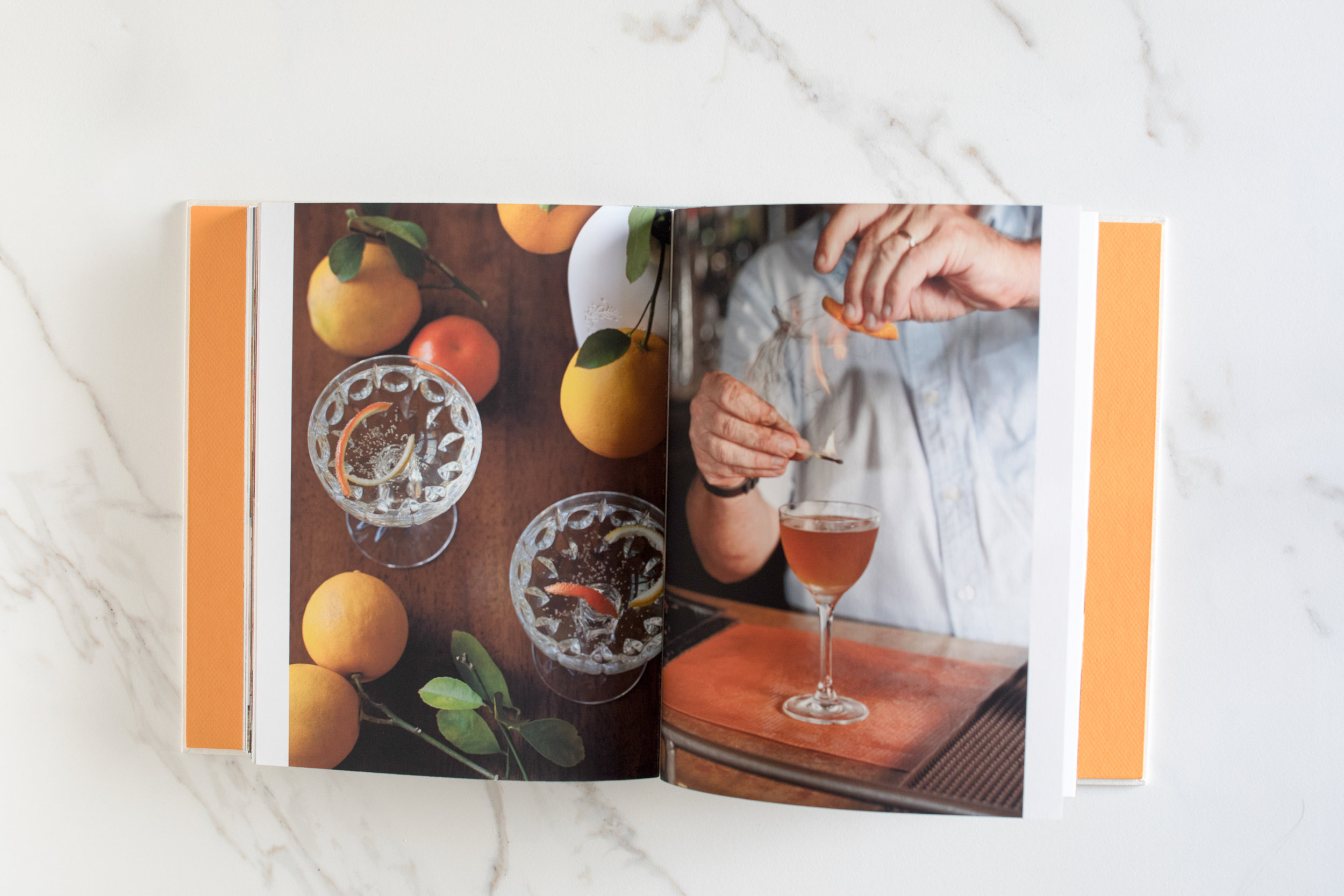
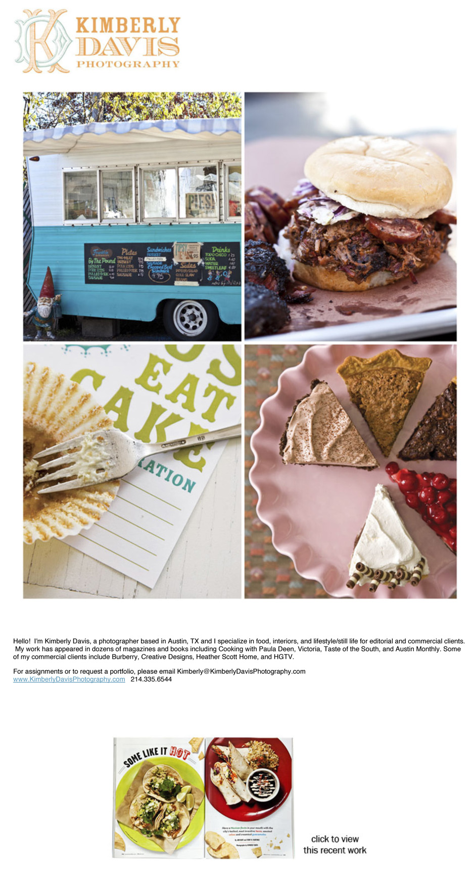
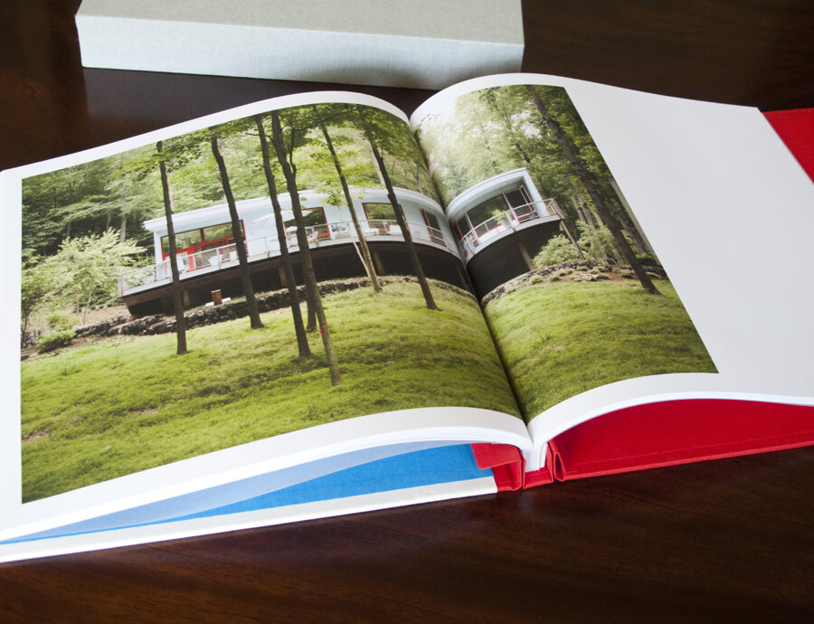
Kimberly Davis is an Austin-based interiors and food photographer with a real love for all things smoky (BBQ) and pretty (interiors).  She and I started working together in 2011 to help her fine tune her web presentation, create a print portfolio (the book was custom made by Jace at Cloverleaf Studio), and create a marketing plan.

Print Portfolio:

KimberlyDavisPhotography001.jpg
KimberlyDavisPhotography002.jpg

Email Newsletter/Promos:

Promo1Food-1.jpg
Austin based Home/Interior Photographer

Austin based Home/Interior Photographer

David McNeese Print Portfolio, Website, and Promos

port001.jpg

David McNeese is an Oklahoma-based industrial and corporate photographer with a passion for shooting large-scale projects full of logistical challenges. His studio is frequently tapped to create stunning imagery for energy, oil and gas companies, and large construction firms. David came to me needing to refresh his brand identity, overhaul his website and develop a plan for targeting clients with the kinds of large scale jobs that he excels at. We started by going through all of his images and choosing ones that best show off his corporate storytelling skills. We then worked with Livebooks to create a custom website. Once the website was launched, we announced the new look through email and print promotions designed by Nathan Ryan.

We also developed new print portfolios, built by Scott Mullenberg's Mullenberg Design Studio. David had the opportunity to show the new portfolios off at a portfolio review in Austin in February, where he received very positive feedback from art buyers and reps.

New website:

Screen Shot 2012-07-26 at 2.11.19 PM

Screen Shot 2012-07-26 at 2.11.19 PM

Screen Shot 2012-07-17 at 2.36.52 PM

Screen Shot 2012-07-17 at 2.36.52 PM

Screen Shot 2012-07-17 at 2.41.02 PM

Screen Shot 2012-07-17 at 2.41.02 PM

Print Portfolio:

port001.jpg

port001

port020

port020

port005

port005

11x17" foldout double sides print promo:

_MG_9764

_MG_9764

_MG_9766

_MG_9766

_MG_9768

_MG_9768

E-promo:

McNeese-Newsletter_FIN

McNeese-Newsletter_FIN

Kevin Kerr Website, Print Portfolio and Print Promo

website.jpg
120426_family-0906-2

120426_family-0906-2

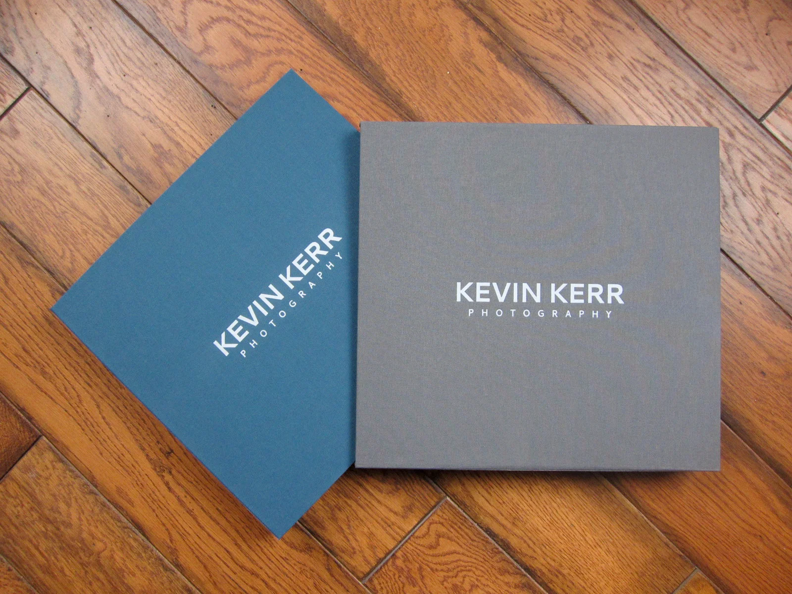
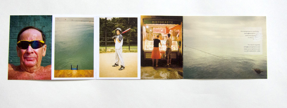
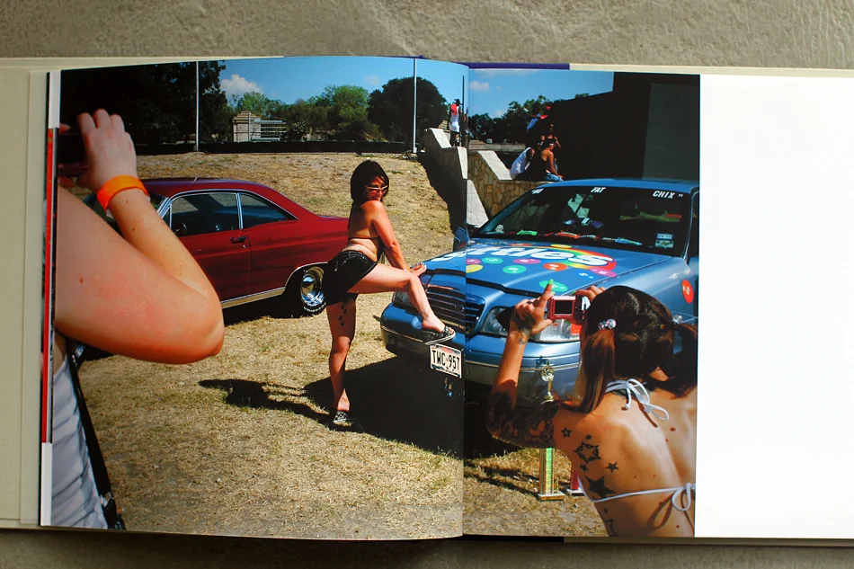
NYC-based travel photographer Kevin Kerr and I worked together to re-edit his web and print portfolios, create a new print promotion, build targeted mailing lists and define who his top priority clients should be.

IMG_0375

IMG_0375

IMG_0377

IMG_0377

website.jpg

website

Case Study: Seattle-based Mike Kane

PROMO_KANE_01a.jpg

Seattle-based Mike Kane was looking to improve his freelance career after many years in newspaper photojournalism. As with most projects, rethinking his approach started with us looking through his archive of images. In addition to his great in-depth documentary work, he also had a body of work that would work well for a variety of editorial and corporate clients.  The way he shows life in the Pacific Northwest was especially interesting to me, and I thought it would be good to highlight a mix of editorial portraiture, landscapes, and documentary images.

Picture 13
Picture 13

New promotional materials

PROMO_KANE_01a.jpg
PROMO_KANE_01a
PROMO_KANE_03a
PROMO_KANE_03a
PROMO_KANE_02a
PROMO_KANE_02a

Jason Dailey

Jason Dailey is a Kansas City-based corporate and editorial photographer. He was looking for some help in refocusing the work he shows on his website. We started with re-editing everything to show his strengths, especially with portraiture. We then created a new print promo and portfolio for him to take on meetings. Since launching the new work, he has picked up new clients in editorial, healthcare and higher education sectors.

Jennifer Whitney Print Portfolio and Promotions

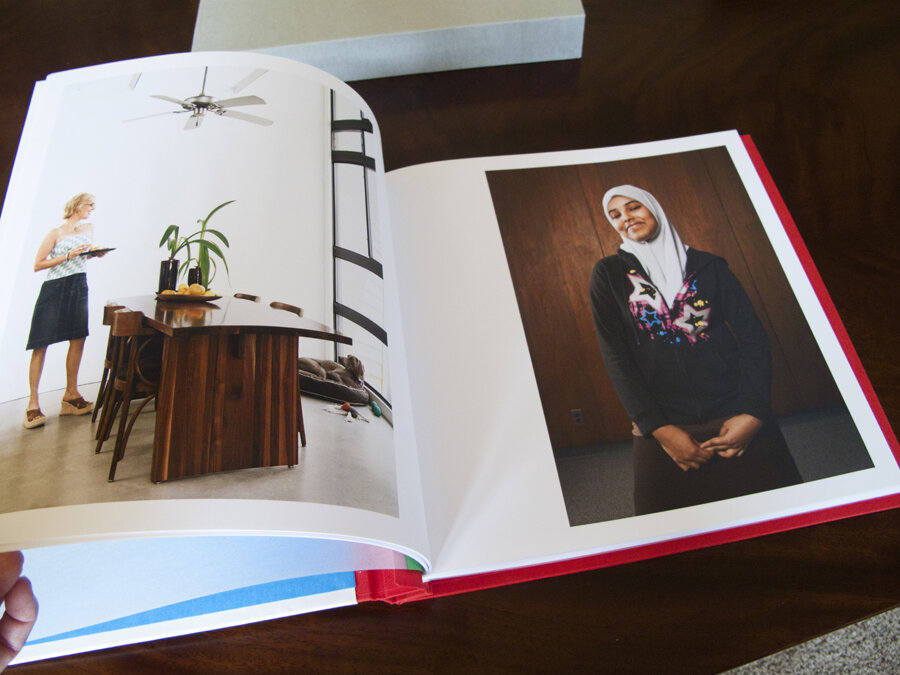
I worked with San Antonio-based Jennifer Whitney on re-editing her work, building a new website, creating the first of a series of print and email promos and creating a new, custom print portfolio. Scott Mullenberg built the portfolio and designer Doris Palmeros did the new logo and branding as well as designing the first printed promo piece.  

MULLENBERG Portfolio jw 001

MULLENBERG Portfolio jw 001

MULLENBERG Portfolio jw 002

MULLENBERG Portfolio jw 002

MULLENBERG Portfolio jw 003

MULLENBERG Portfolio jw 003

promo jw 02.jpg

promo jw 02.jpg

promo jw 03.jpg

promo jw 03.jpg

promo jw 04.jpg

promo jw 04.jpg

Amy Eckert

eckert_website.png

Amy Eckert, a commercial and editorial photographer (and also a fine artist and McKnight fellow) hired me to help her revamp her website and portfolio in the lead up to a move to Los Angeles. We started by talking about her goals, which include expanding her commercial client base and making sure that people knew she was based in LA. I went through all of her work and re-edited the images to appeal to the clients she is trying to reach. We reorganized the structure of her galleries as well.

We worked together, along with Scott Mullenberg at portfoliodesignstudio.com, to design a new print book with bold colors and a beautiful handmade slipcase.

Amy did all of the printing herself (which she says she really enjoys doing), on Pina Zangaro double sided bright white smooth matte, pre-scored.

Once everything was live, we created an email blast announcing the move to LA and encouraging people to come to the new site.

Case Study: Kainaz Amaria

amaria_promo_image.jpg

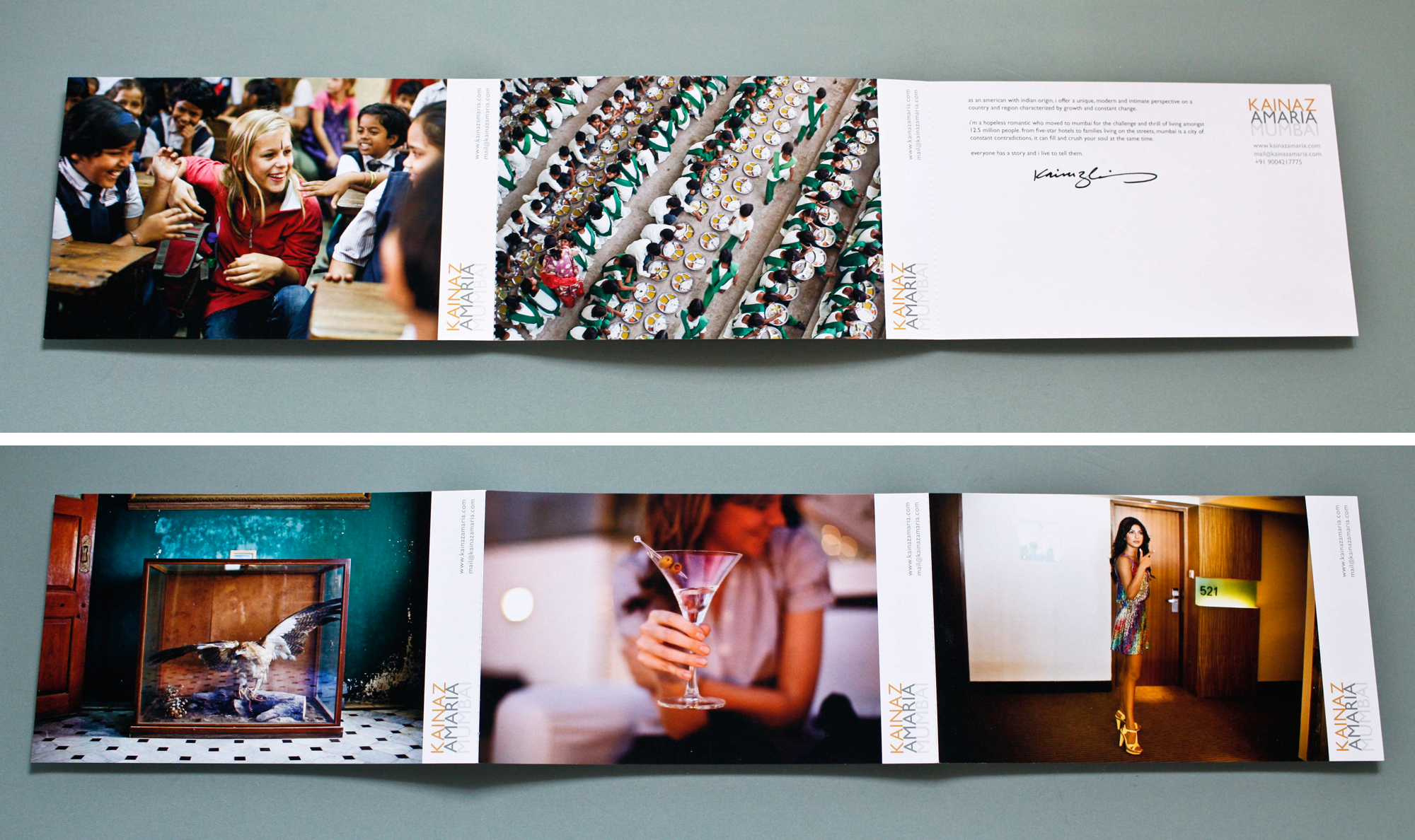
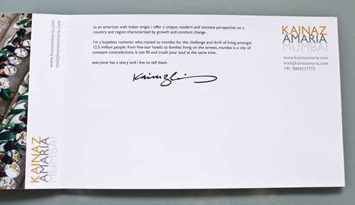
Kainaz Amaria needed help focusing her website and print portfolio edits to better convey the kind of work she wants to be known for. We talked about her style and where she wants to see her business go in the next couple of years. Then we got to work re-editing all of her images. We created new, more streamlined galleries on her site and built a print portfolio that reflected the changes.

After we completed the editing, we worked on print promo concepts. We knew we wanted to be able to show a variety of images and make a great first impression. Originally, we had a stack of 6 promo cards in a custom slip case printed in India. Unfortunately, the quality of the printing wasn't up to par and we had to start over. San Diego-based Modern Postcard came to the rescue with a custom printing solution that worked with Kainaz's budget. In the end, we modified the original idea to create one card that folds out. The card is 6x9 inches when folded, and folds out to 6x27 inches. Each panel is perforated so that clients can keep just one image if they want to.

Kainaz included a personal letter of introduction and her signature, and hand addressed all of her envelopes. I think it lends a very personal touch.


Tiffany Brown Marketing Campaign

spring_promo04.jpg
spring_promo03
spring_promo03

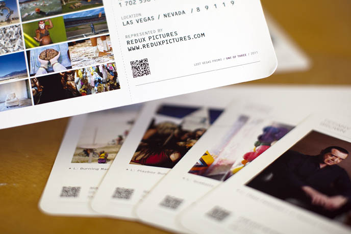
Las Vegas-based Tiffany Brown needed a marketing campaign that would announce her move from staff newspaper photographer to the freelance editorial and commercial market. Since Las Vegas is such a travel destination, we decided on a campaign built around the theme of boarding passes. With designer de-mo.org, we created a stunning promo consisting of 6 "boarding passes" sent out in a zip-sealed Mylar bag. We also created a print giveaway promotion and a coordinated email promo.

Read more about Tiffany's rebranding process on her blog.

Matt Nager

Picture-103.png

I recently wrapped up work with Matt Nager. Matt is a very talented portrait and documentary photographer whose old website was obscuring a lot of his strongest work. We started by talking about his strengths, defining what his main goals were and establishing the best way to spend his marketing dollars to reach those goals. We completely overhauled the website, resulting in a fresh and streamlined site powered by aphotofolio.com. His previous site featured too many choices of stories for editors to go through, so the new site is all about delivering his best images efficiently so that busy editors don't miss the strongest work.

We also put together a print promo (quantity 750 printed by paperchase.net) announcing his upcoming move to Denver. The promo features images that highlight his strengths in portraiture, travel and documentary.

My personal favorite part of our project was developing the print portfolio (I just love print books!). Matt teamed up with the very talented Scott Mullenberg at portfoliodesignstudio.com.  Scott sent a variety of fabric samples for us to consider. We narrowed down the choices to a palette of blues and browns and finally decided on what you see below. I edited and sequenced Matt's work to highlight his diversity but also to show that he approaches all of his subjects with a consistent personal style and vision.

I am really happy with the finished product. Matt traveled to NYC and DC and got 23 meetings in just a little over a week. Upon returning home, Matt said "I think editors really liked having a physical book, it honestly made a huge difference." Many editors mentioned loving the colors as well. Actually showing your book to a lot of clients is the best way to gauge if the edit and sequence are right, and Matt might make a few tweaks to the book. But the overall impression was that "the sequencing was really great and showed off (his) versatility."
Of course now the real work begins... all of the follow up marketing that will help Matt capitalize on the the momentum we have built. To help with that, I created a year long marketing plan for him that incorporates suggestions for print promos, newsletters, social media and in person meetings.

Best of luck with the next year Matt!