David McNeese Print Portfolio, Website, and Promos

port001.jpg

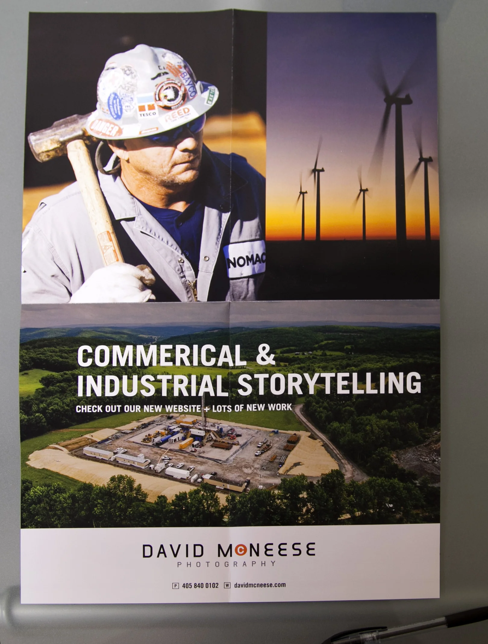
David McNeese is an Oklahoma-based industrial and corporate photographer with a passion for shooting large-scale projects full of logistical challenges. His studio is frequently tapped to create stunning imagery for energy, oil and gas companies, and large construction firms. David came to me needing to refresh his brand identity, overhaul his website and develop a plan for targeting clients with the kinds of large scale jobs that he excels at. We started by going through all of his images and choosing ones that best show off his corporate storytelling skills. We then worked with Livebooks to create a custom website. Once the website was launched, we announced the new look through email and print promotions designed by Nathan Ryan.

We also developed new print portfolios, built by Scott Mullenberg's Mullenberg Design Studio. David had the opportunity to show the new portfolios off at a portfolio review in Austin in February, where he received very positive feedback from art buyers and reps.

New website:

Screen Shot 2012-07-26 at 2.11.19 PM

Screen Shot 2012-07-26 at 2.11.19 PM

Screen Shot 2012-07-17 at 2.36.52 PM

Screen Shot 2012-07-17 at 2.36.52 PM

Screen Shot 2012-07-17 at 2.41.02 PM

Screen Shot 2012-07-17 at 2.41.02 PM

Print Portfolio:

port001.jpg

port001

port020

port020

port005

port005

11x17" foldout double sides print promo:

_MG_9764

_MG_9764

_MG_9766

_MG_9766

_MG_9768

_MG_9768

E-promo:

McNeese-Newsletter_FIN

McNeese-Newsletter_FIN

Kevin Kerr Website, Print Portfolio and Print Promo

website.jpg
120426_family-0906-2

120426_family-0906-2

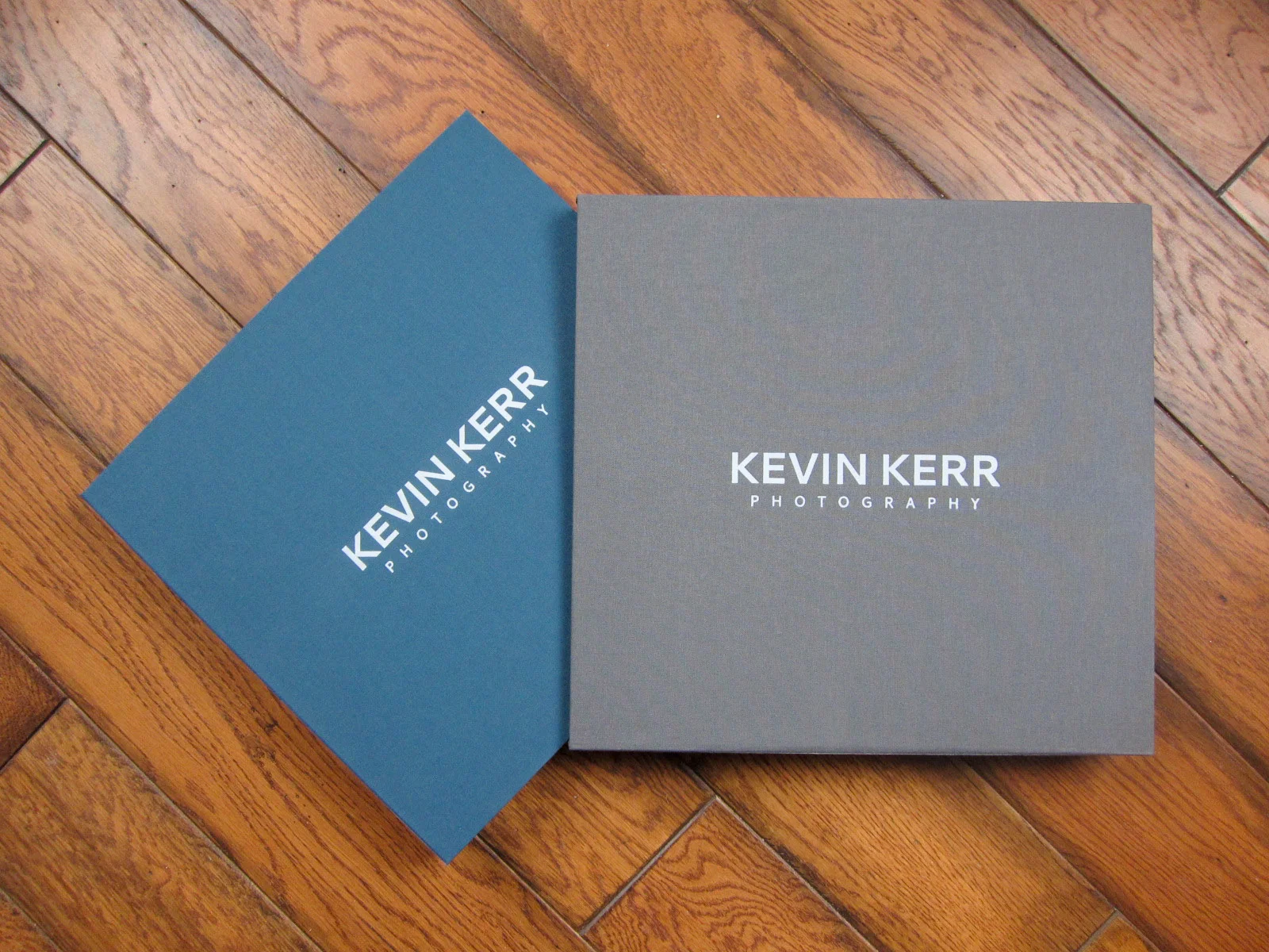
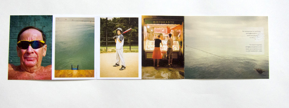
NYC-based travel photographer Kevin Kerr and I worked together to re-edit his web and print portfolios, create a new print promotion, build targeted mailing lists and define who his top priority clients should be.

IMG_0375

IMG_0375

IMG_0377

IMG_0377

website.jpg

website

Case Study: Kainaz Amaria

amaria_promo_image.jpg

Kainaz Amaria needed help focusing her website and print portfolio edits to better convey the kind of work she wants to be known for. We talked about her style and where she wants to see her business go in the next couple of years. Then we got to work re-editing all of her images. We created new, more streamlined galleries on her site and built a print portfolio that reflected the changes.

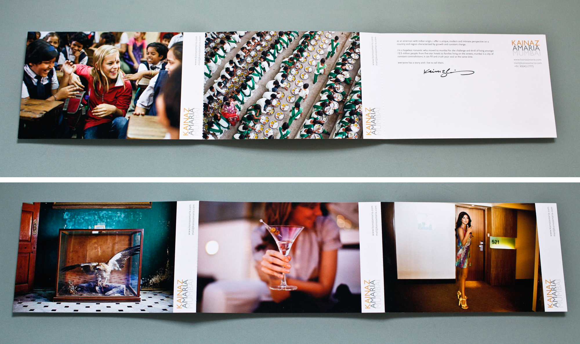
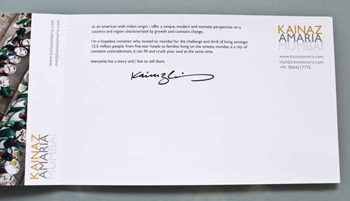
After we completed the editing, we worked on print promo concepts. We knew we wanted to be able to show a variety of images and make a great first impression. Originally, we had a stack of 6 promo cards in a custom slip case printed in India. Unfortunately, the quality of the printing wasn't up to par and we had to start over. San Diego-based Modern Postcard came to the rescue with a custom printing solution that worked with Kainaz's budget. In the end, we modified the original idea to create one card that folds out. The card is 6x9 inches when folded, and folds out to 6x27 inches. Each panel is perforated so that clients can keep just one image if they want to.

Kainaz included a personal letter of introduction and her signature, and hand addressed all of her envelopes. I think it lends a very personal touch.