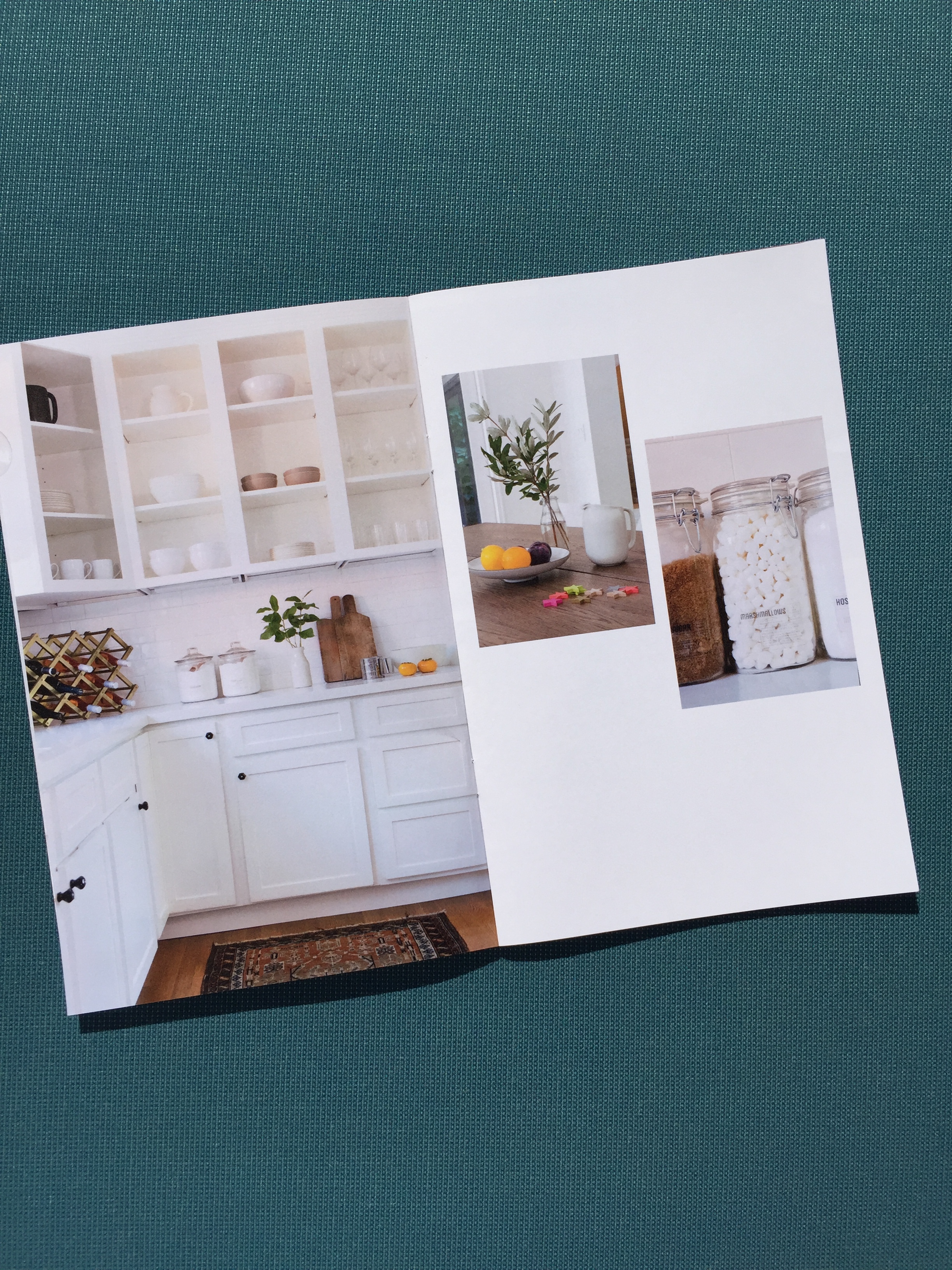
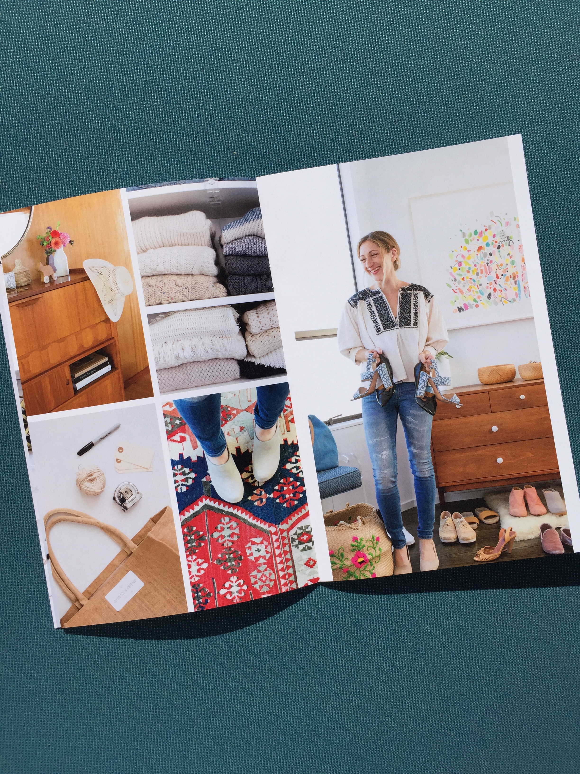
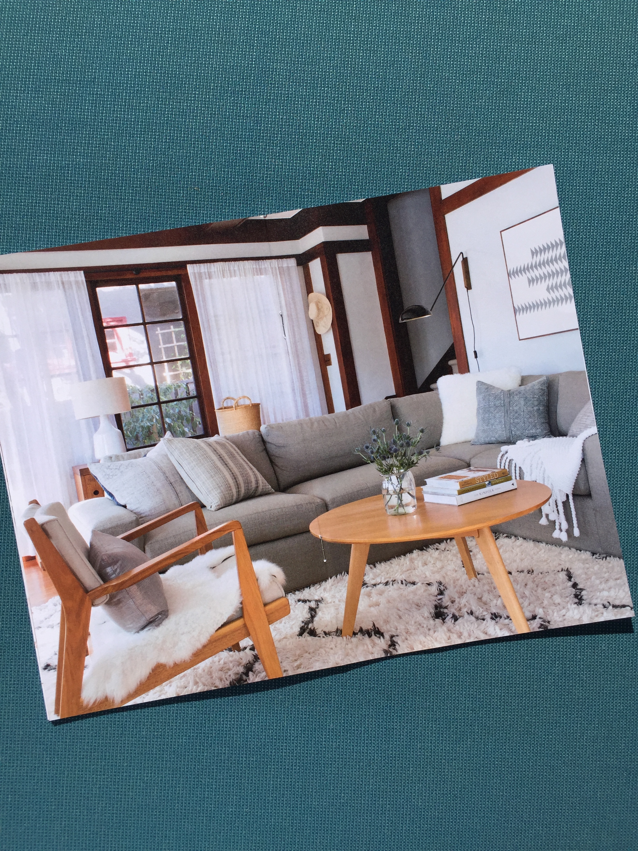
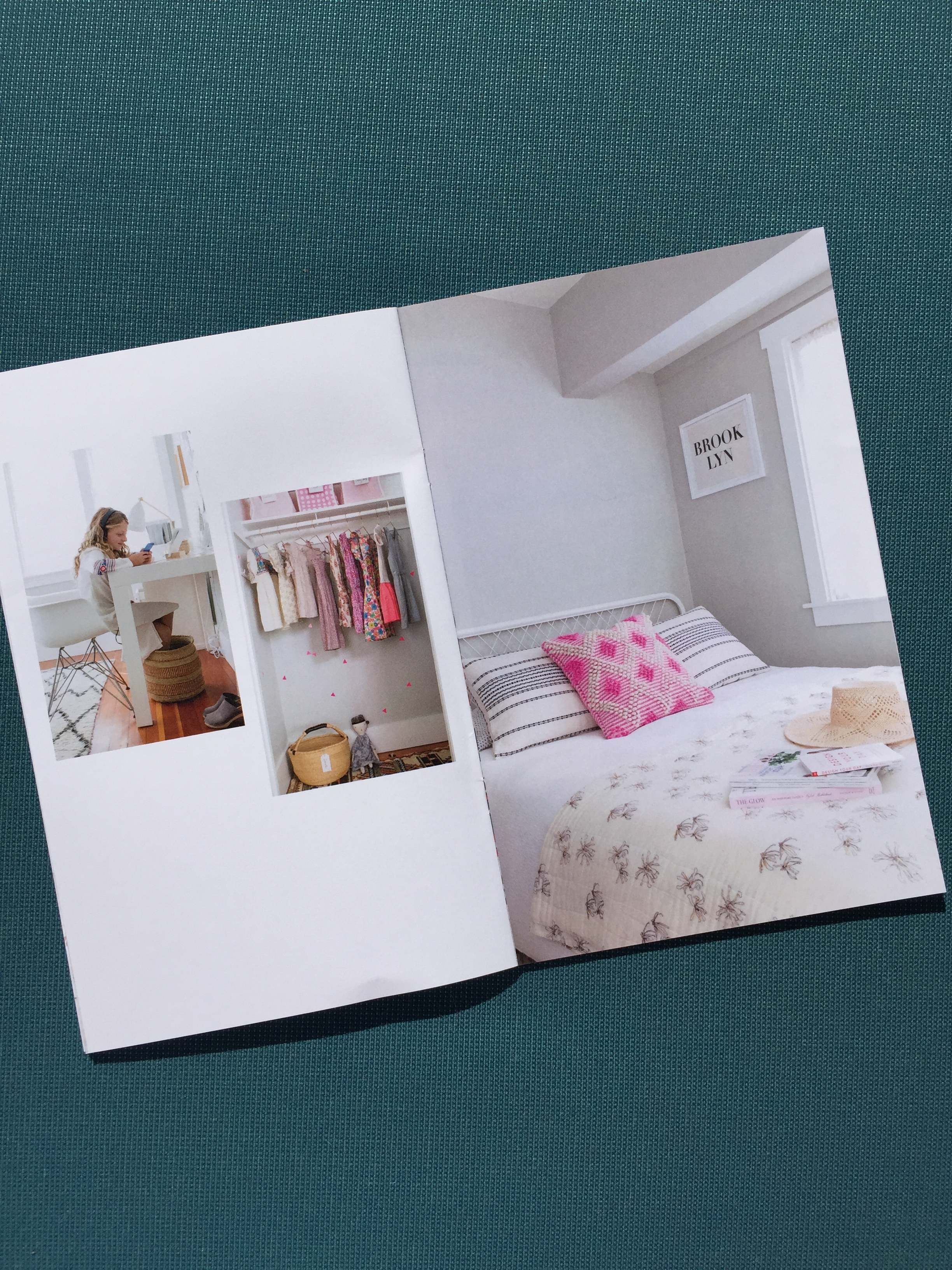
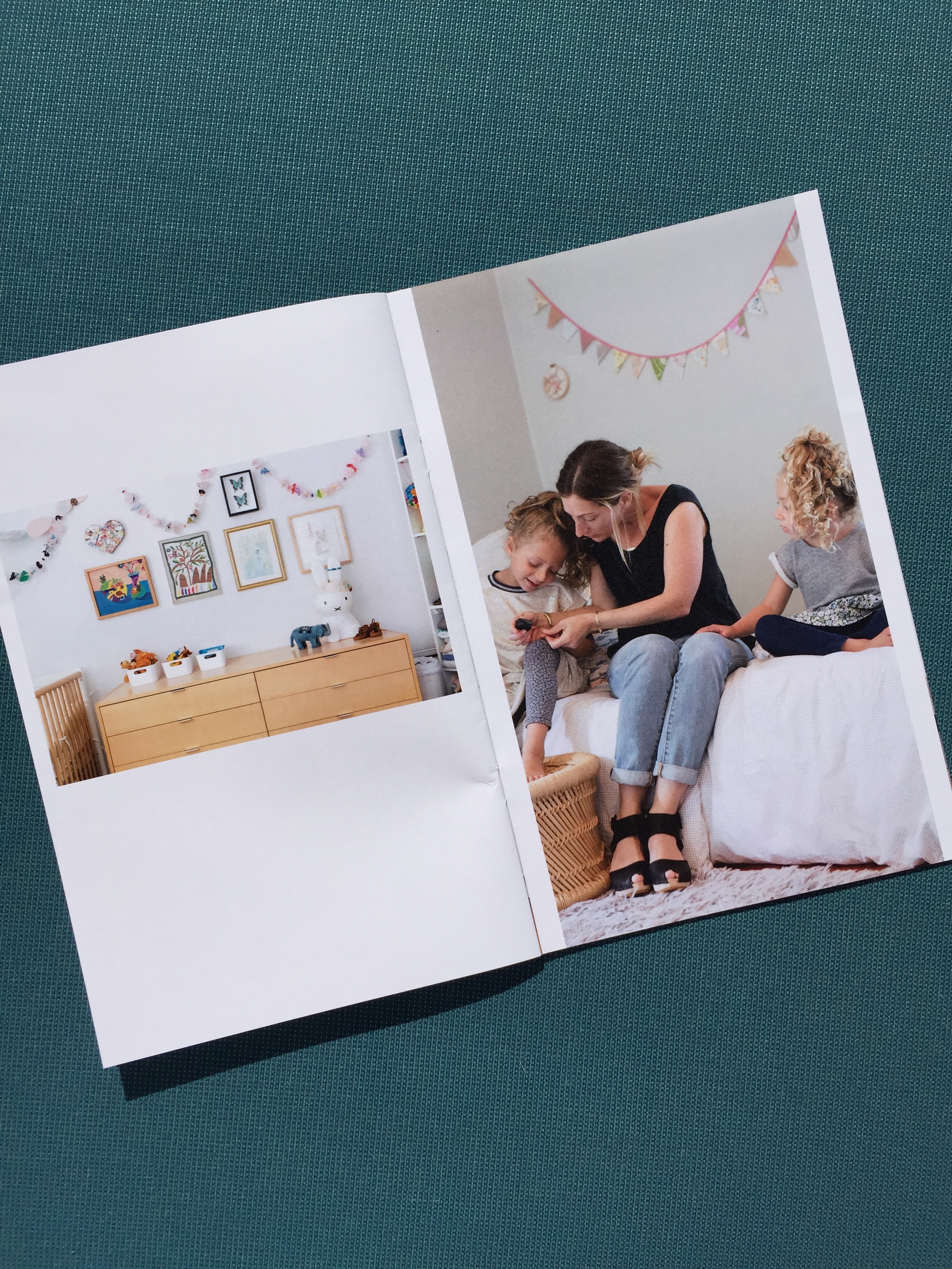
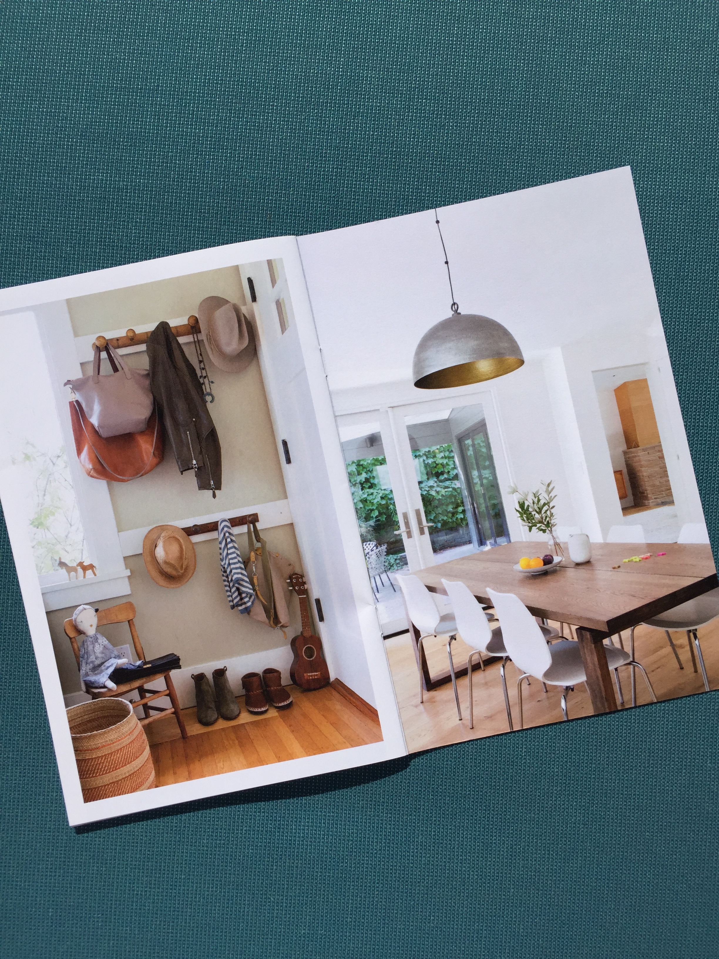
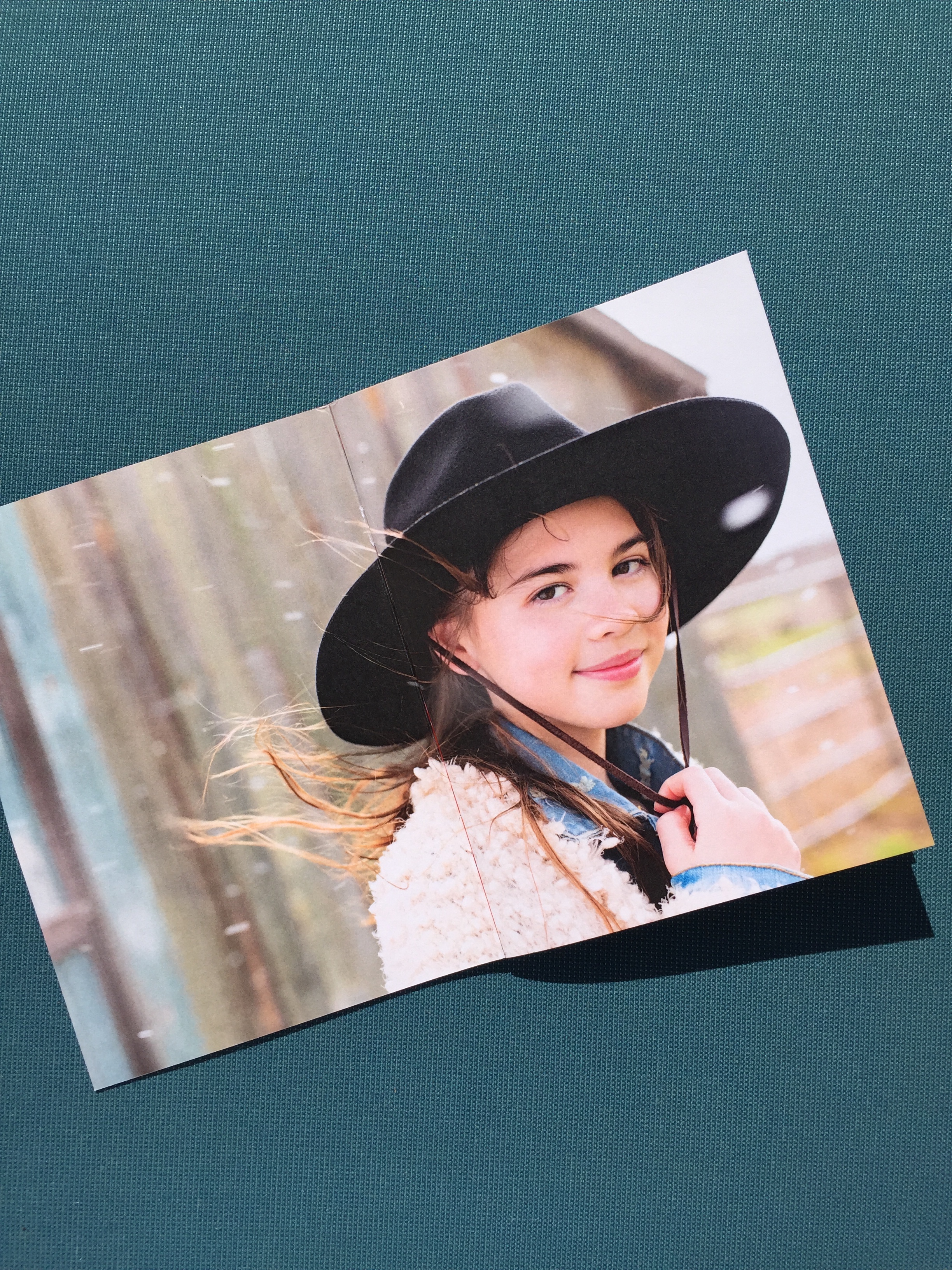
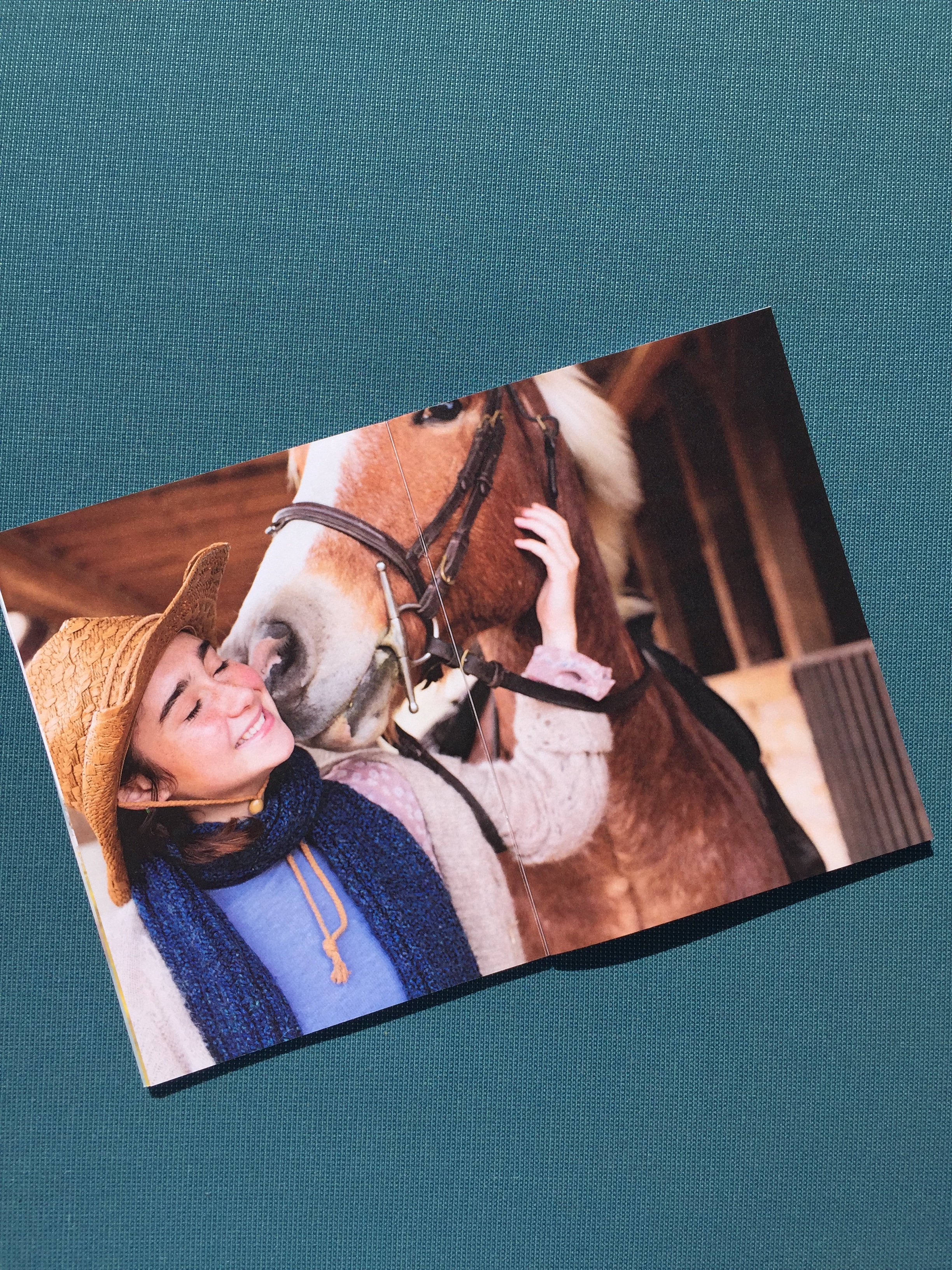
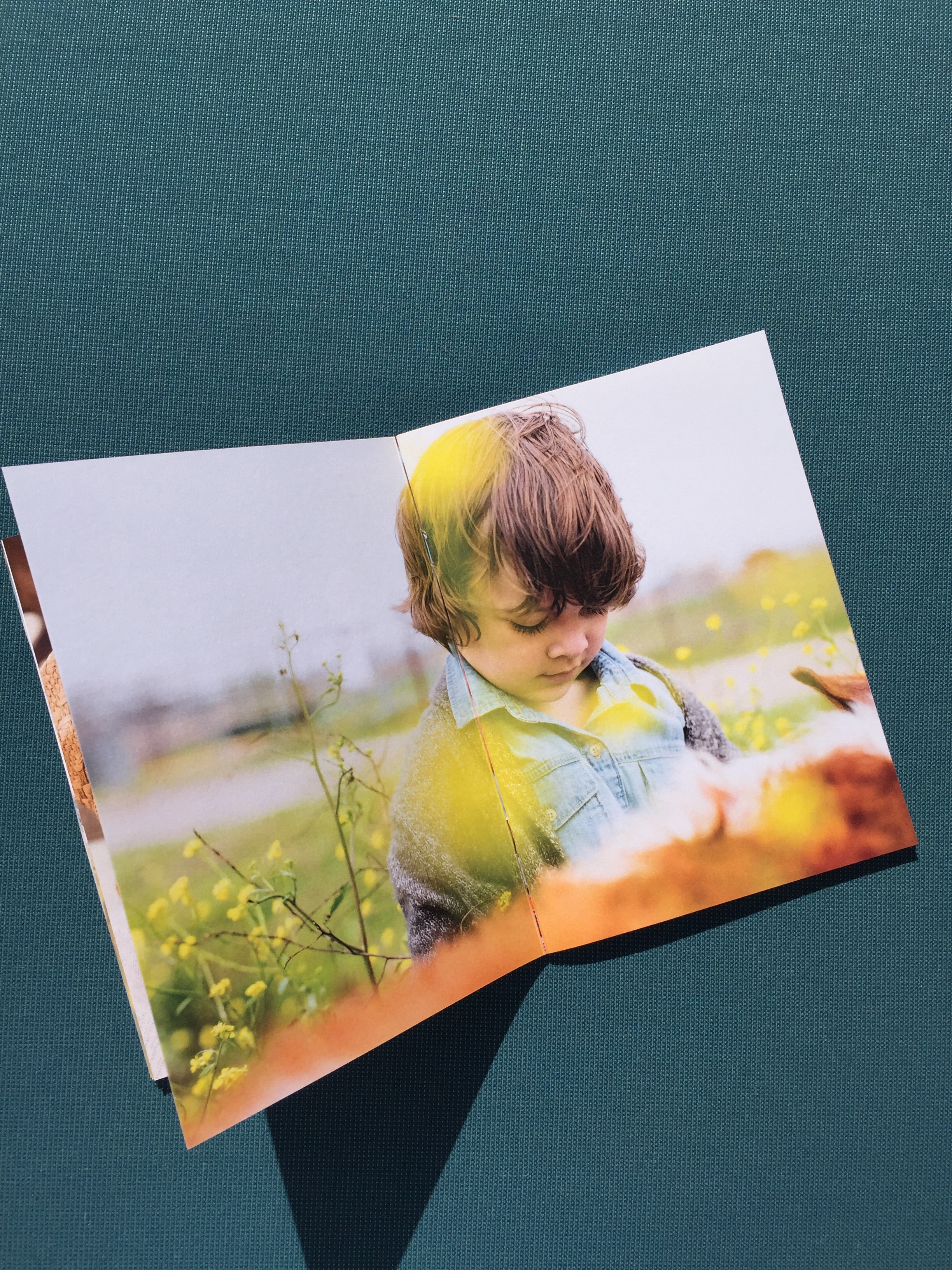
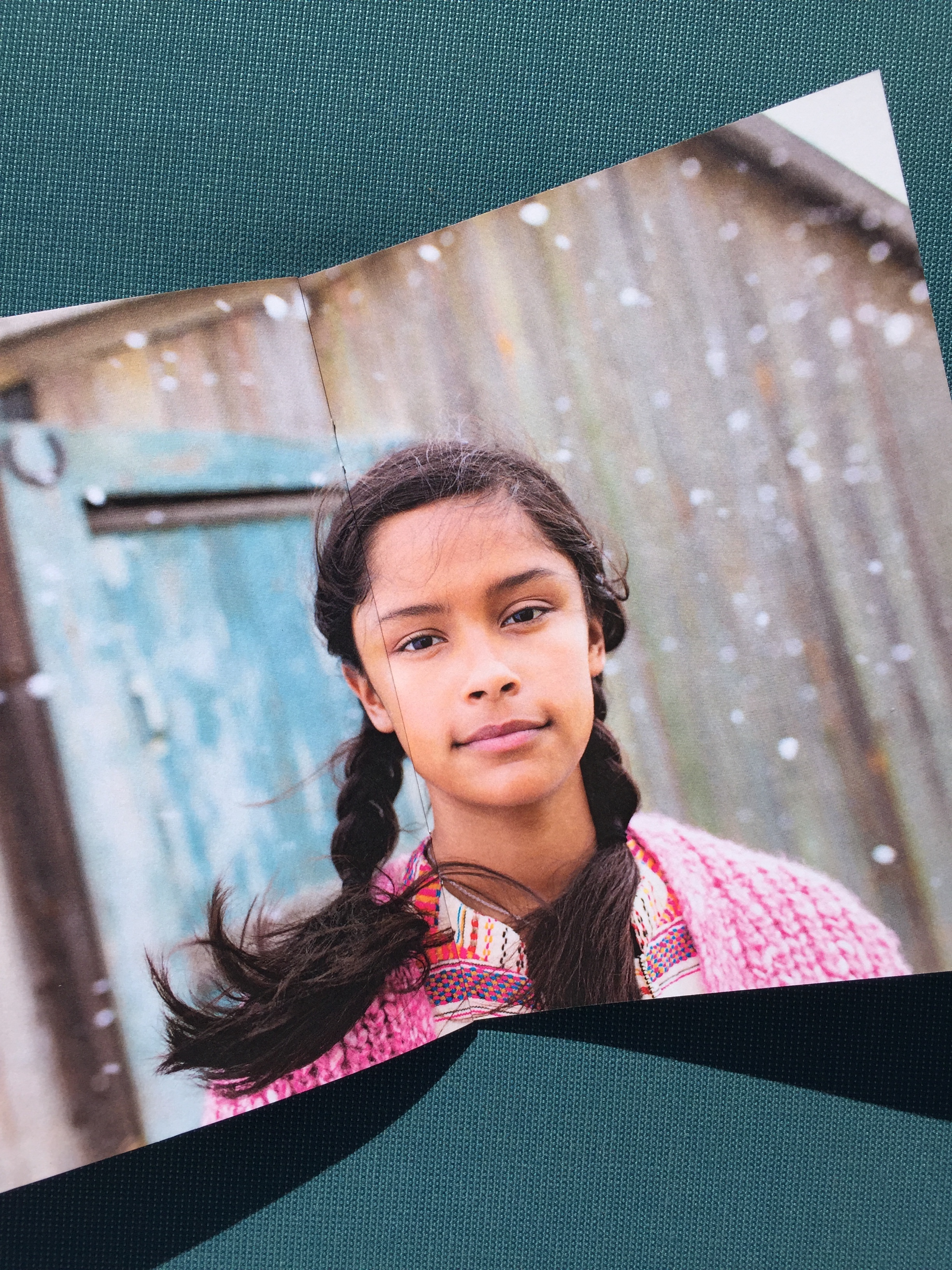
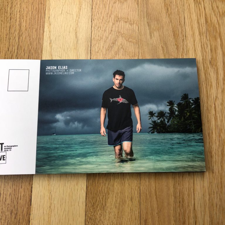
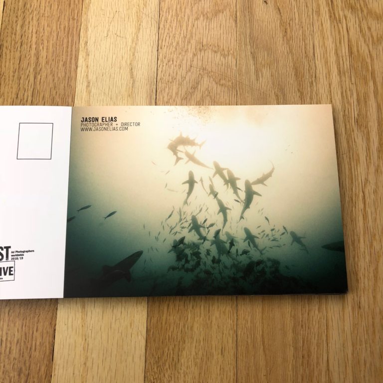
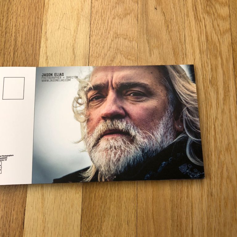
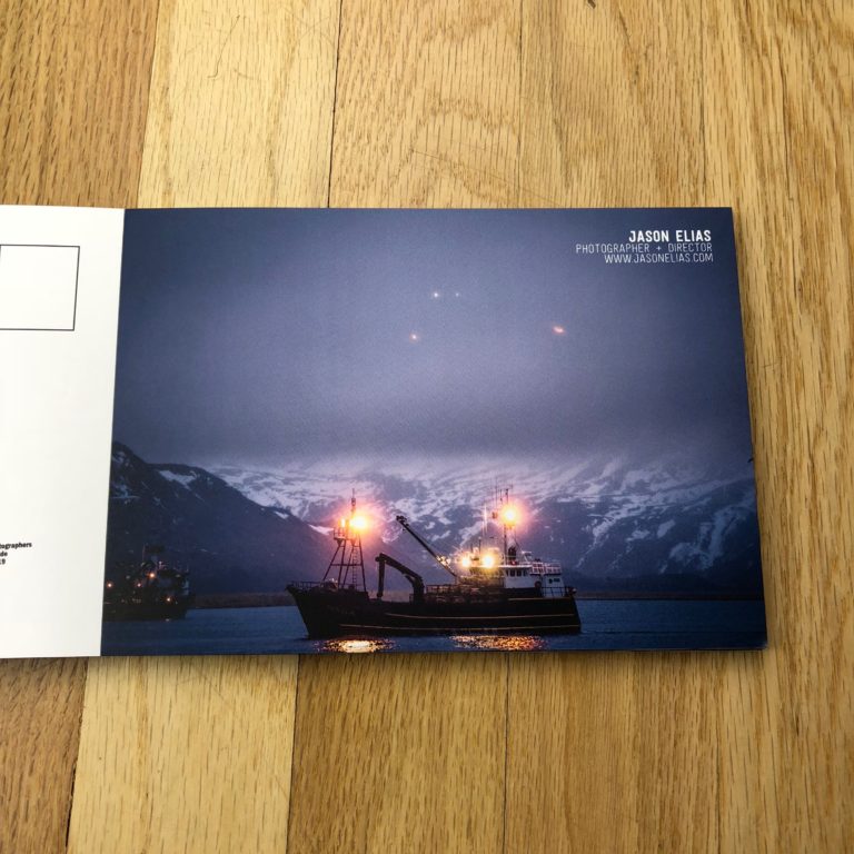
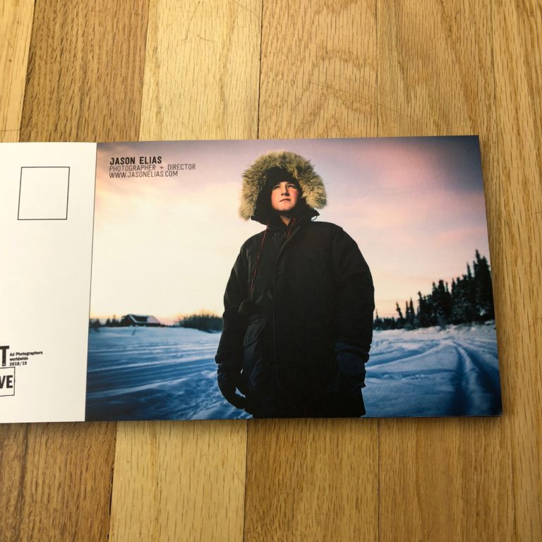
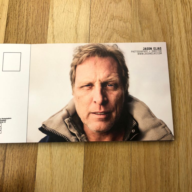
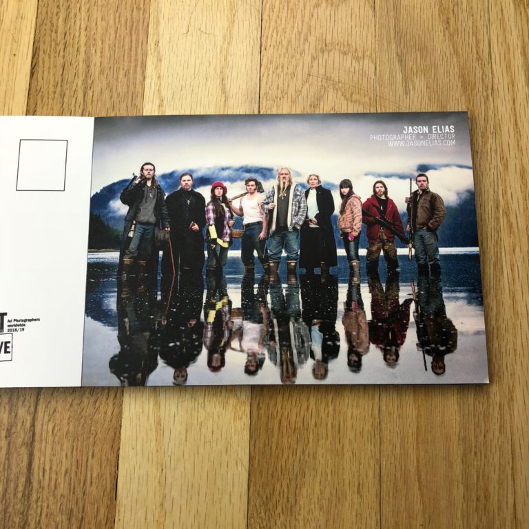
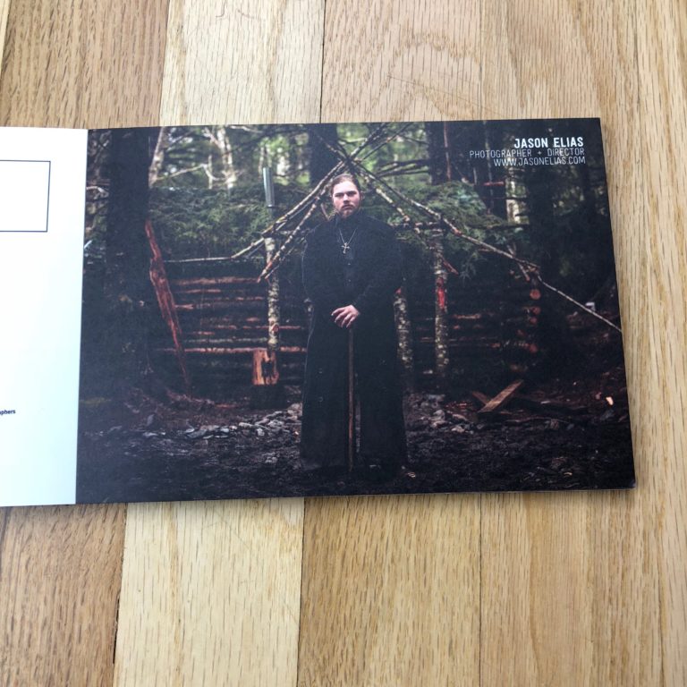
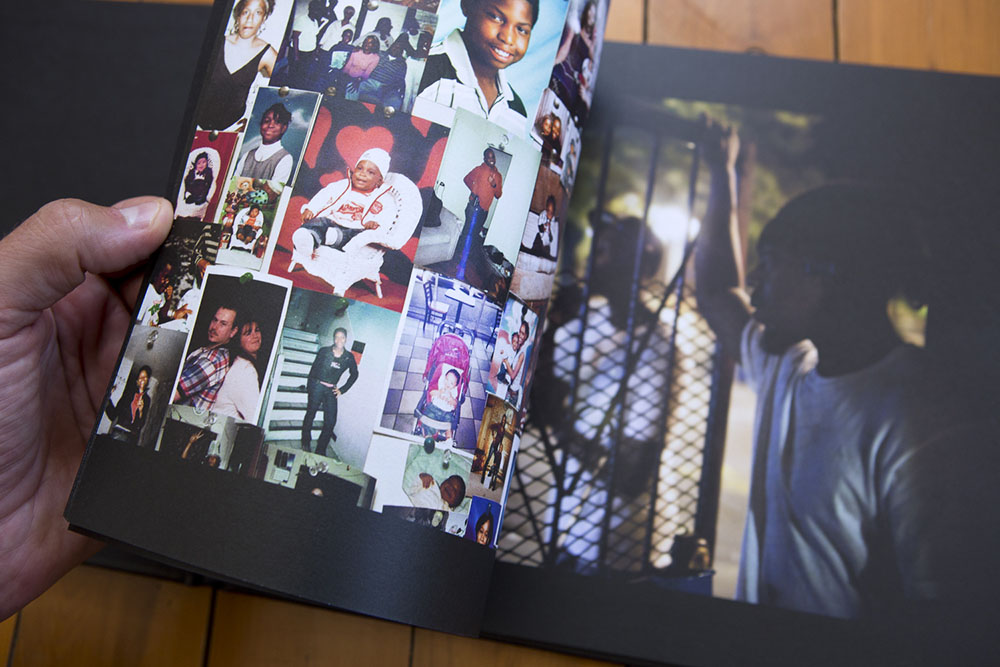
One of my favorite things is working with photographers over the course of many years. Buff and I first did a print promo together in 2015. This fall, we worked on a Volume II of her How We Live zine. The zine is designed by https://beckyplante.com/ and beautifully printed by Paper Chase Press.
Eric Pohl Sotol Promo
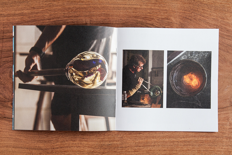
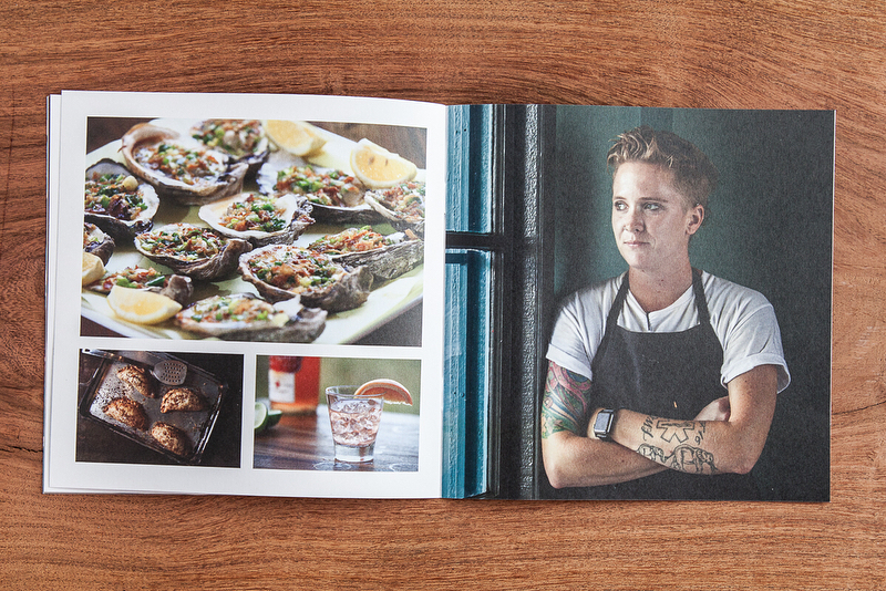
Eric Pohl and I teamed up to create new marketing materials to kick off the fall season. He recently created a body of work for Desert Door, America’s only sotol distillery. I loved the work and thought it would make a great promo piece. This tri-fold card showcases a great mix of portraits, documentary images, cocktails, and details.
Eric is based in the Austin, Texas area and specializes in travel, hospitality, and food. See more of his work at epohl.com.
Tabloid Newspapers for Felicia Graham
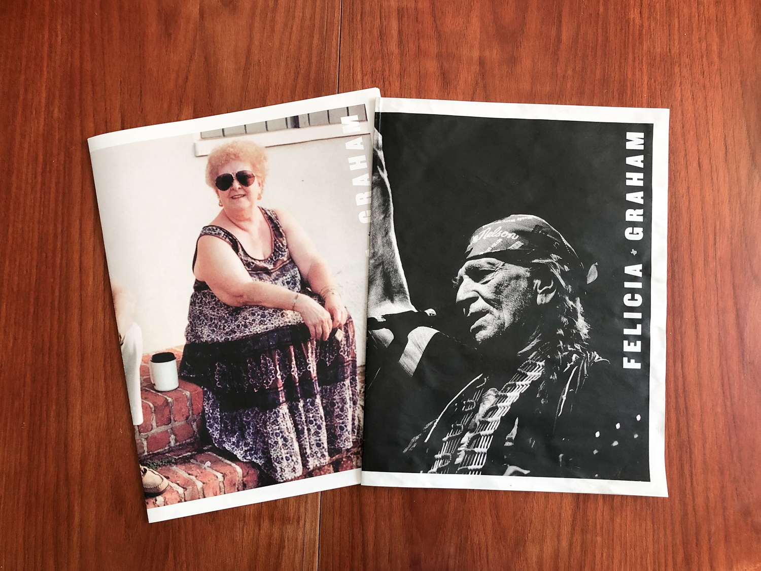
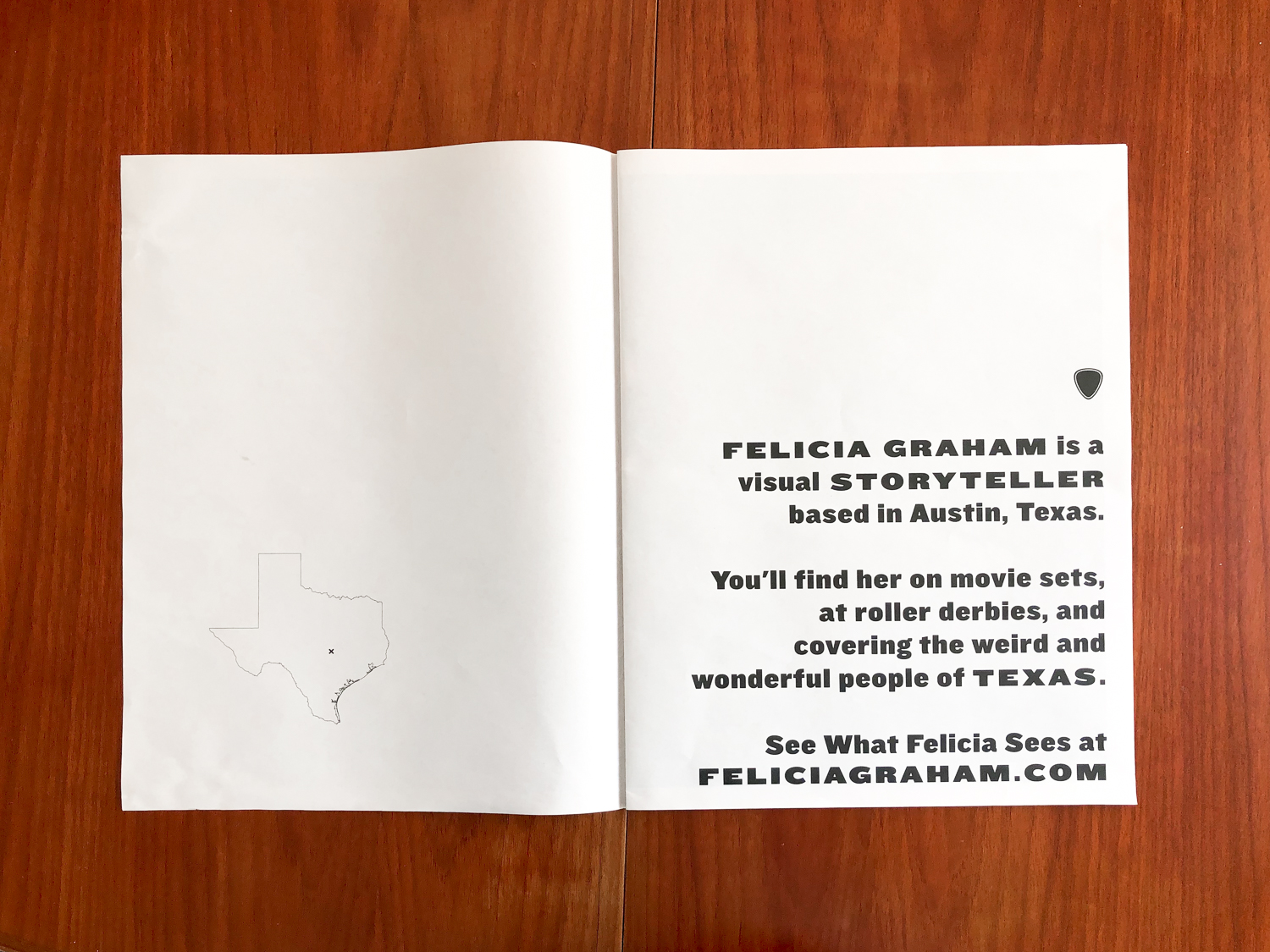
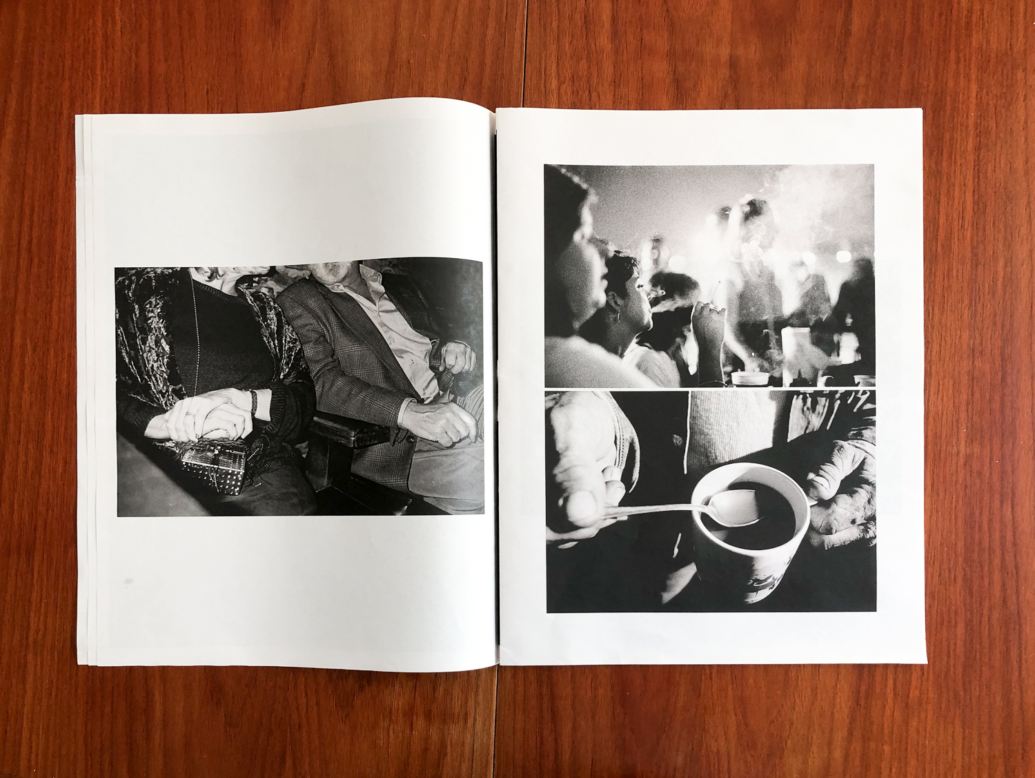
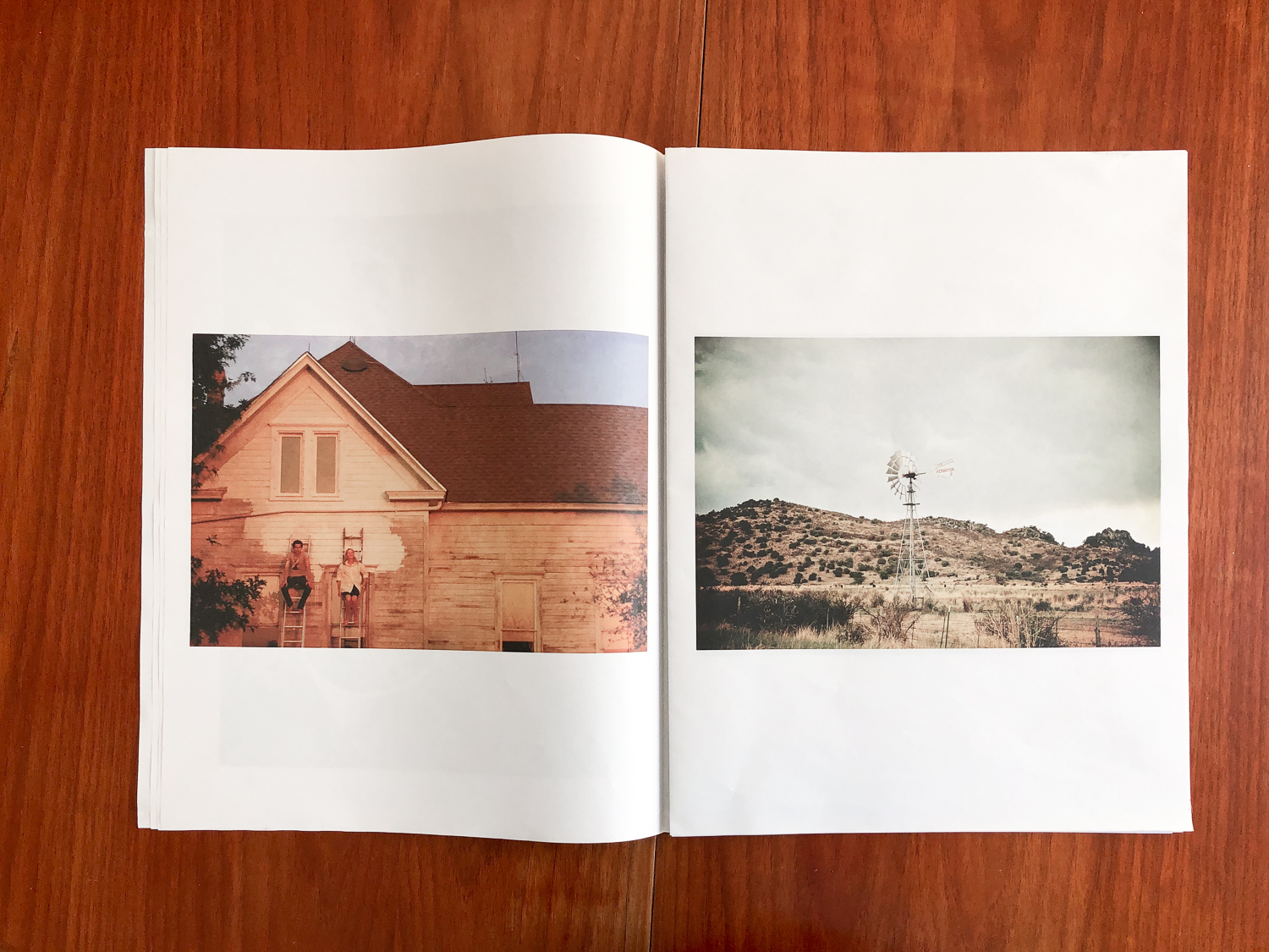
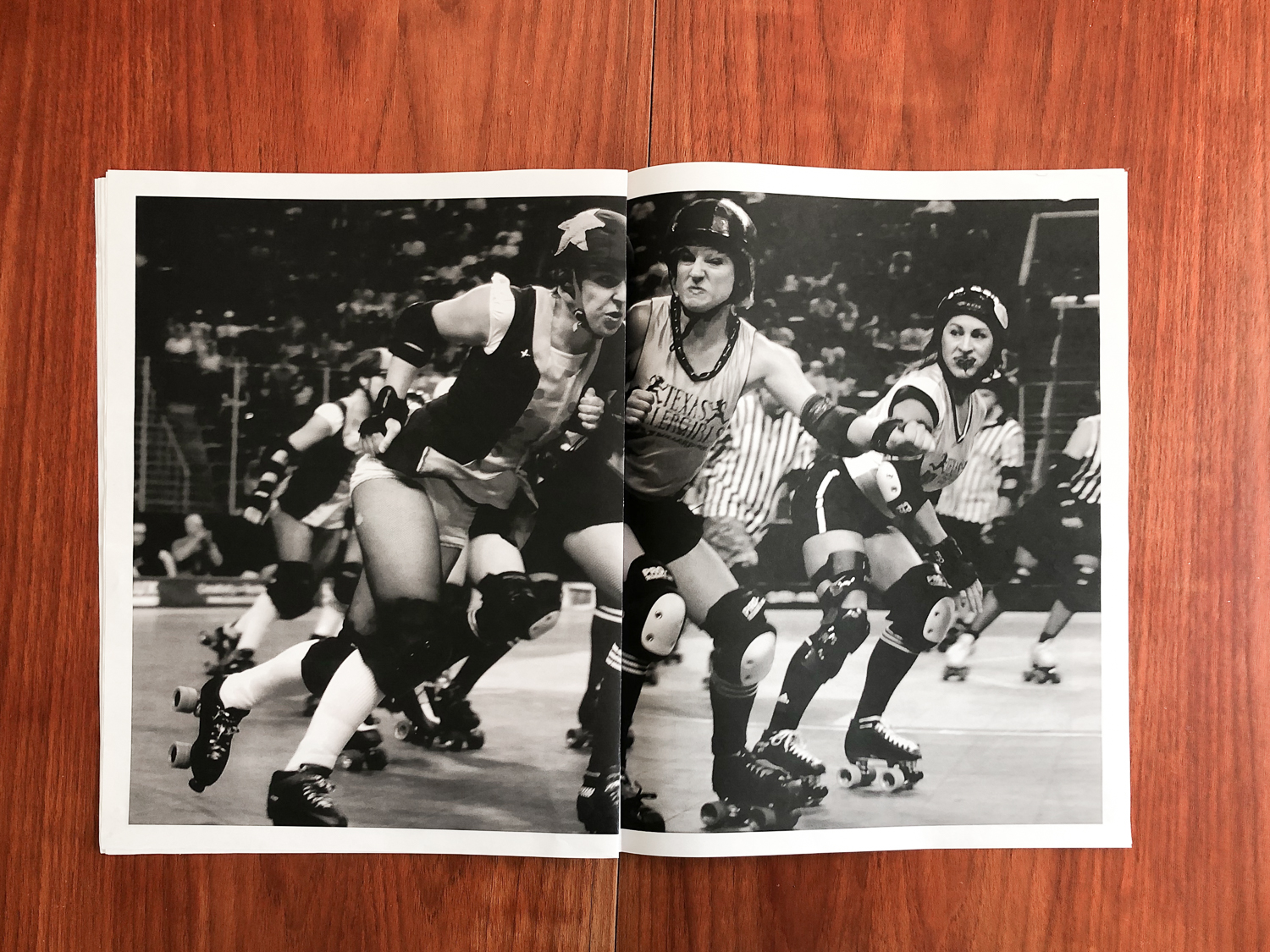
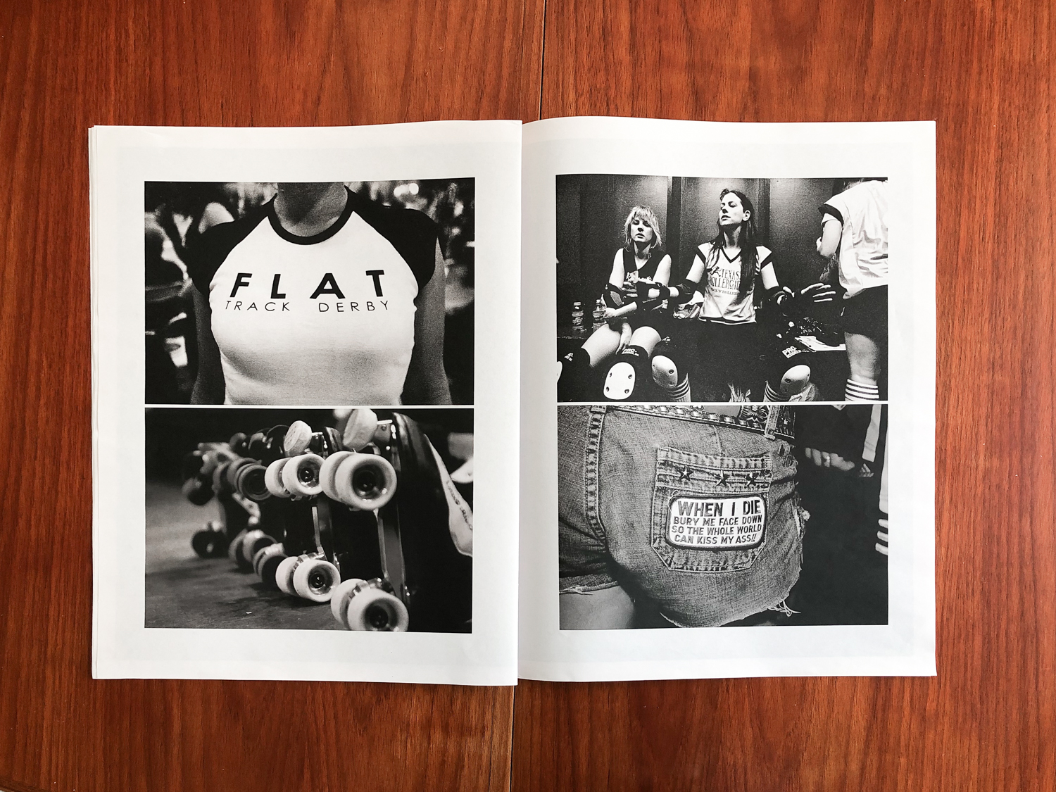
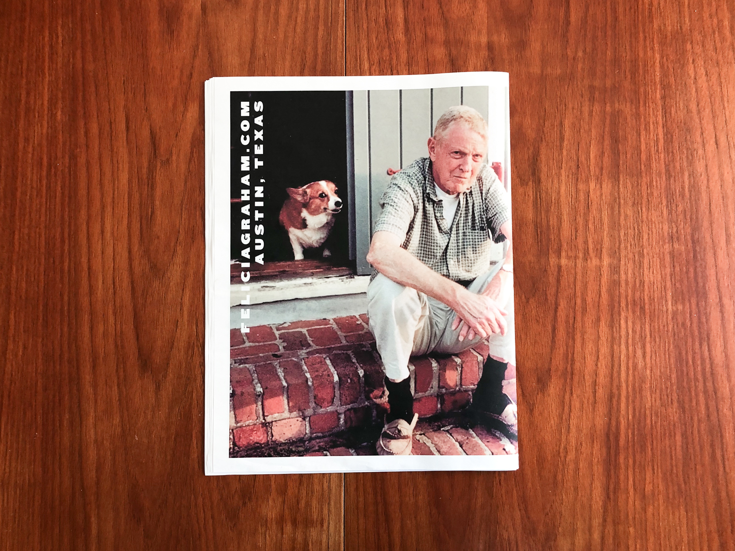
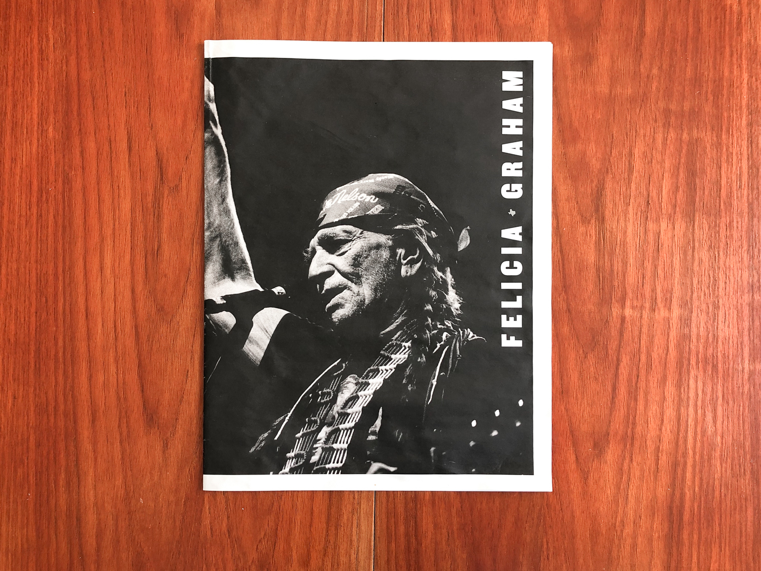
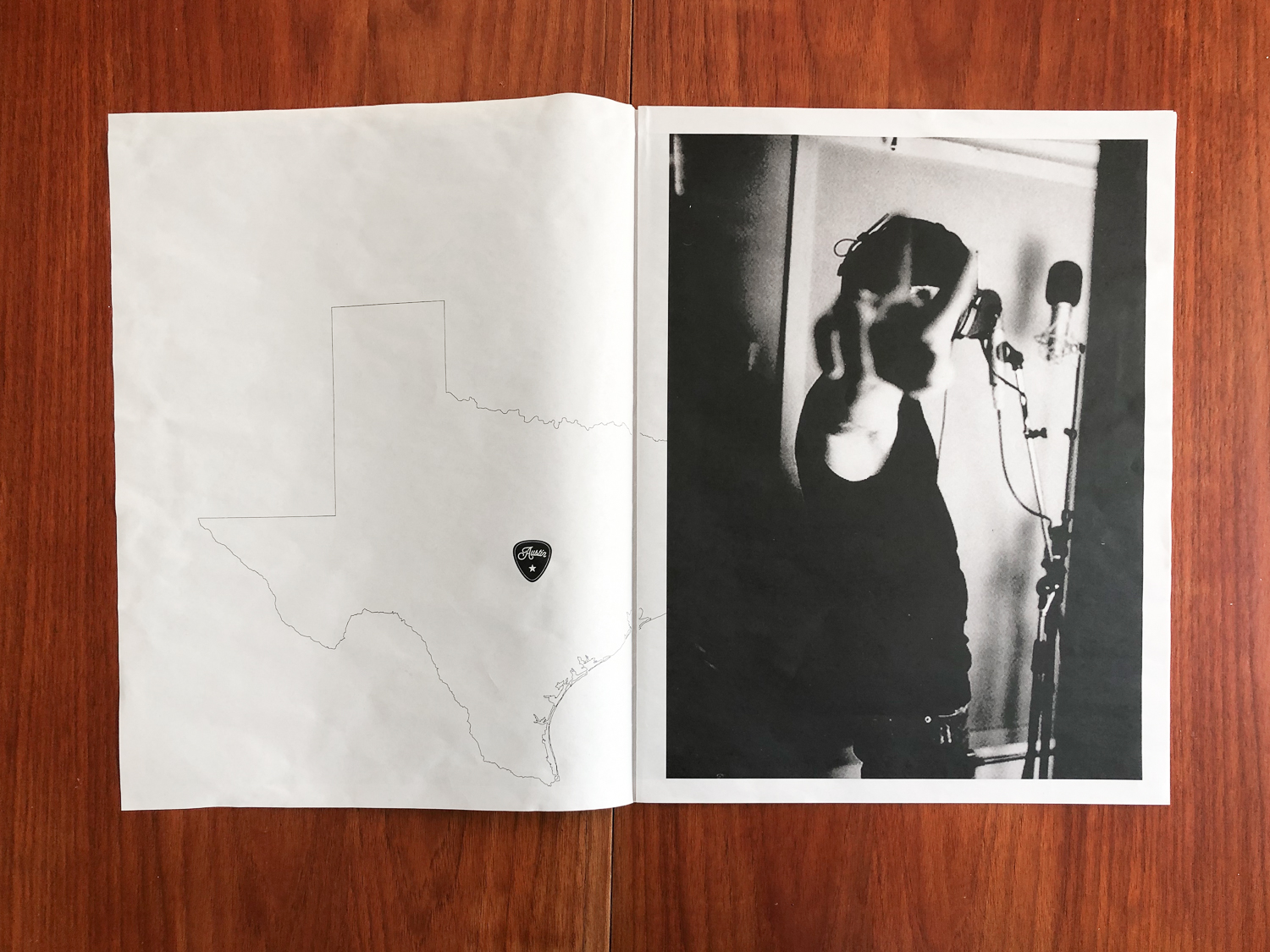
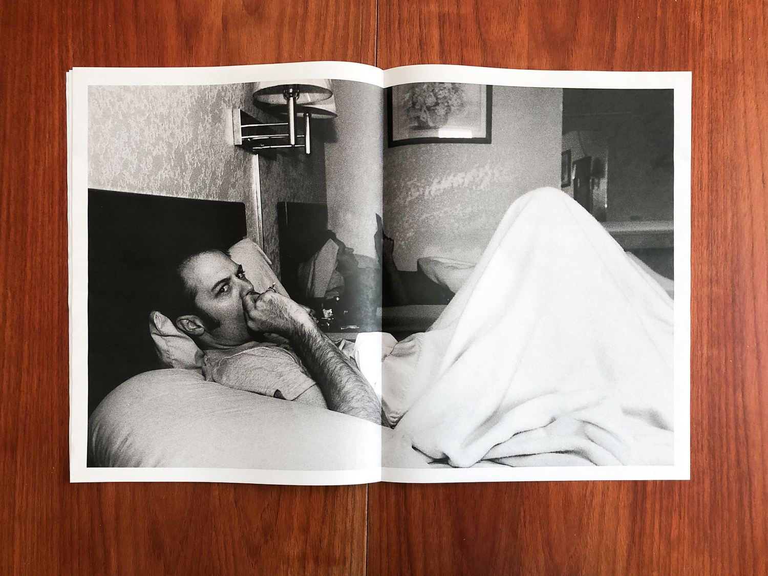
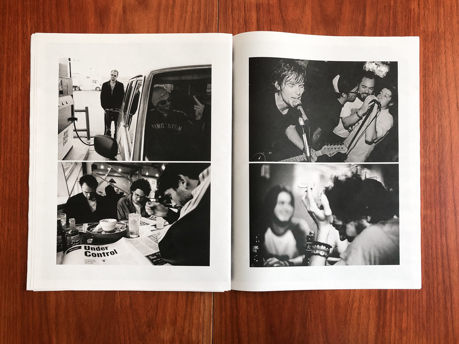
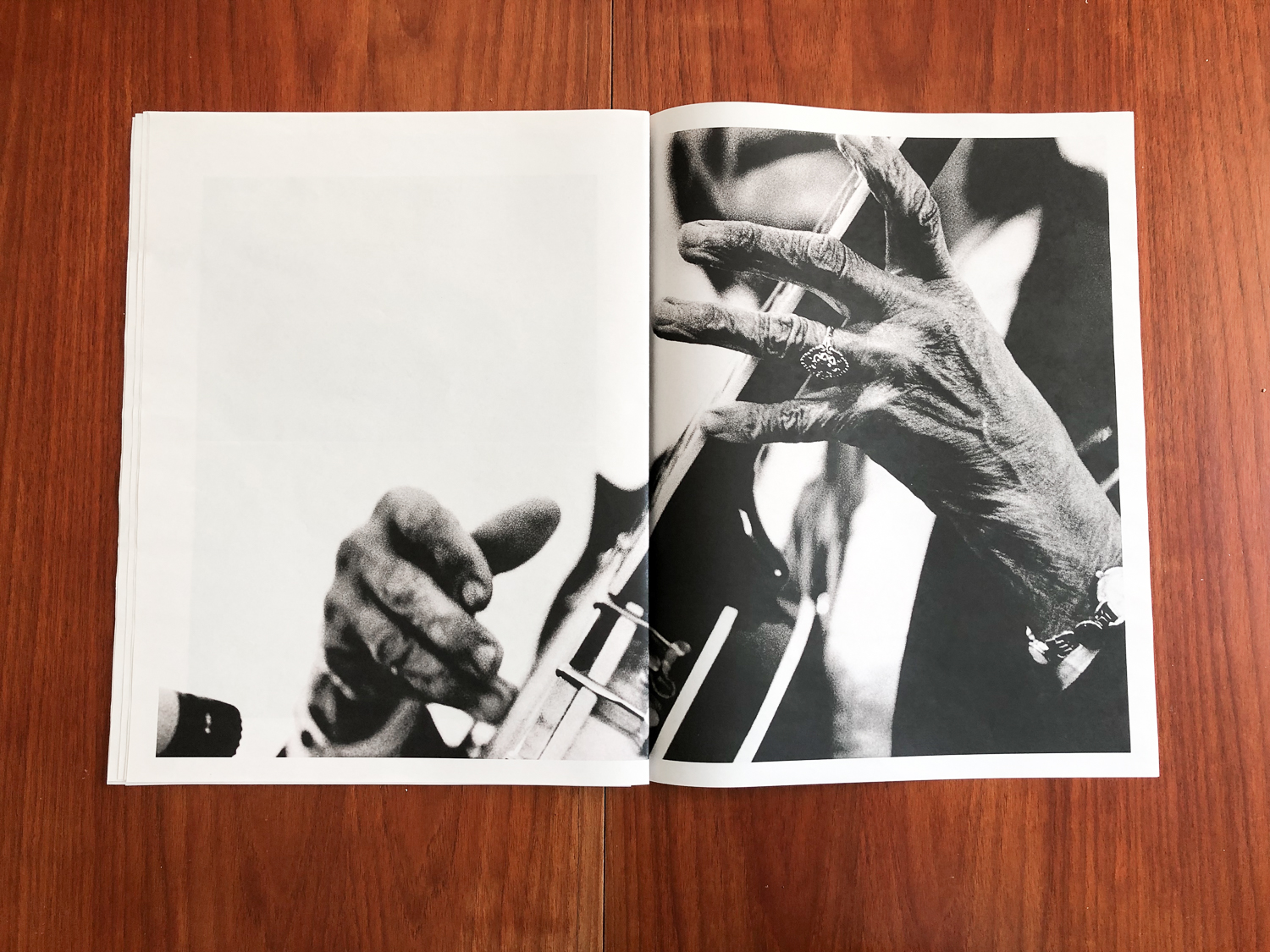
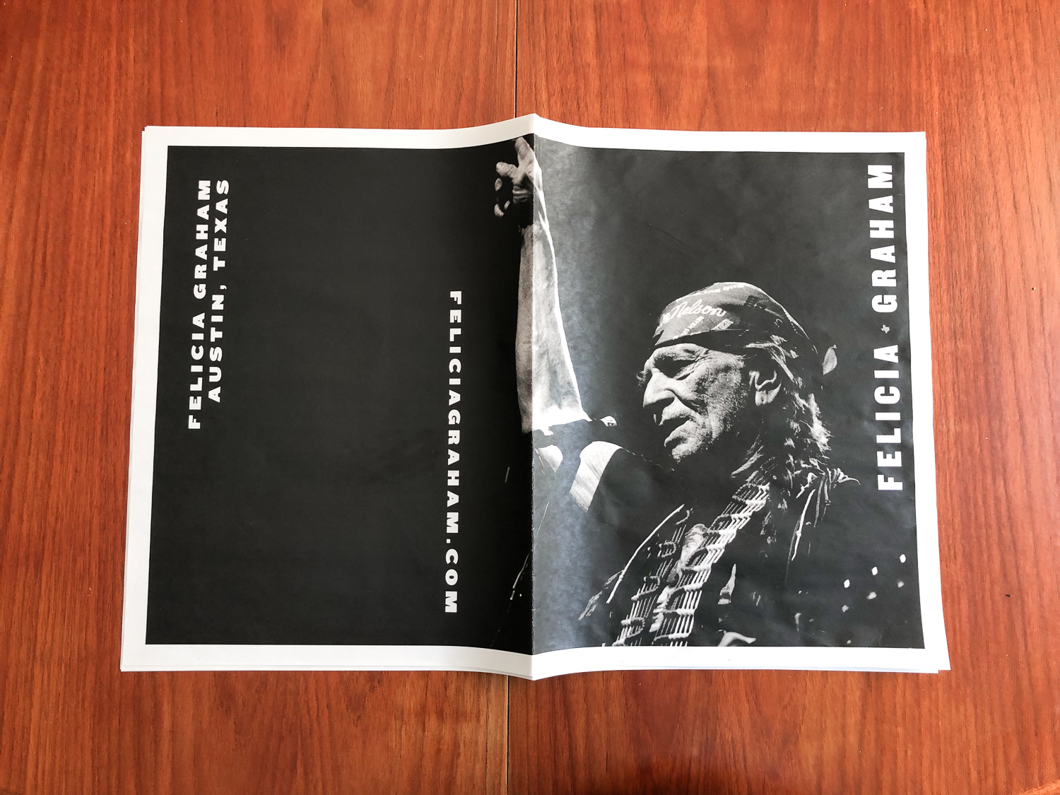
I'm so loving how these promos came out for Austin-based photographer Felicia Graham. We created two different tabloid sized newspapers using Newspaper Club. One promo focuses on her music work (love the behind-the-scenes moments!) and the other showcases her documentary and movie stills work.
Magazine-style Promo for Eric Pohl
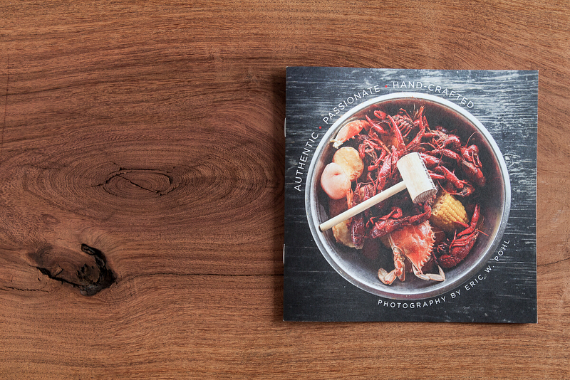
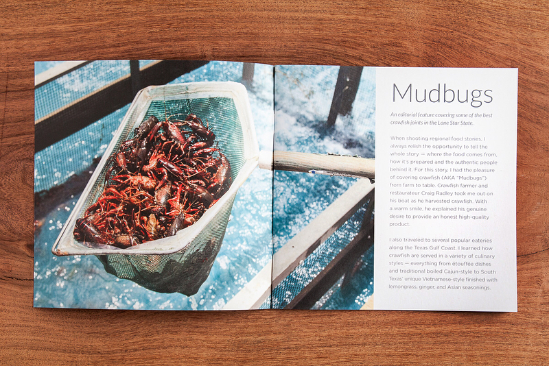
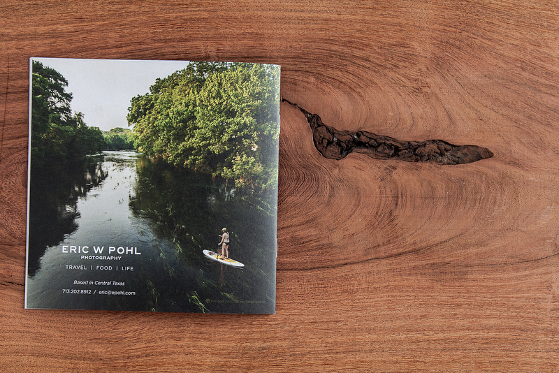
Recently, Eric Pohl and I worked together to create a promo of his work. Eric’s photography primarily focuses on Texas culture, food and places. He also covers travel, landscapes, scenic backroads and the nostalgic and historic side of small towns. His photography has been featured in publications like Austin Monthly, Texas Highways, Texas Parks & Wildlife, and The Local Palate.
More of Eric’s work can be seen here.
Vivian Johnson Website and Interiors Booklet
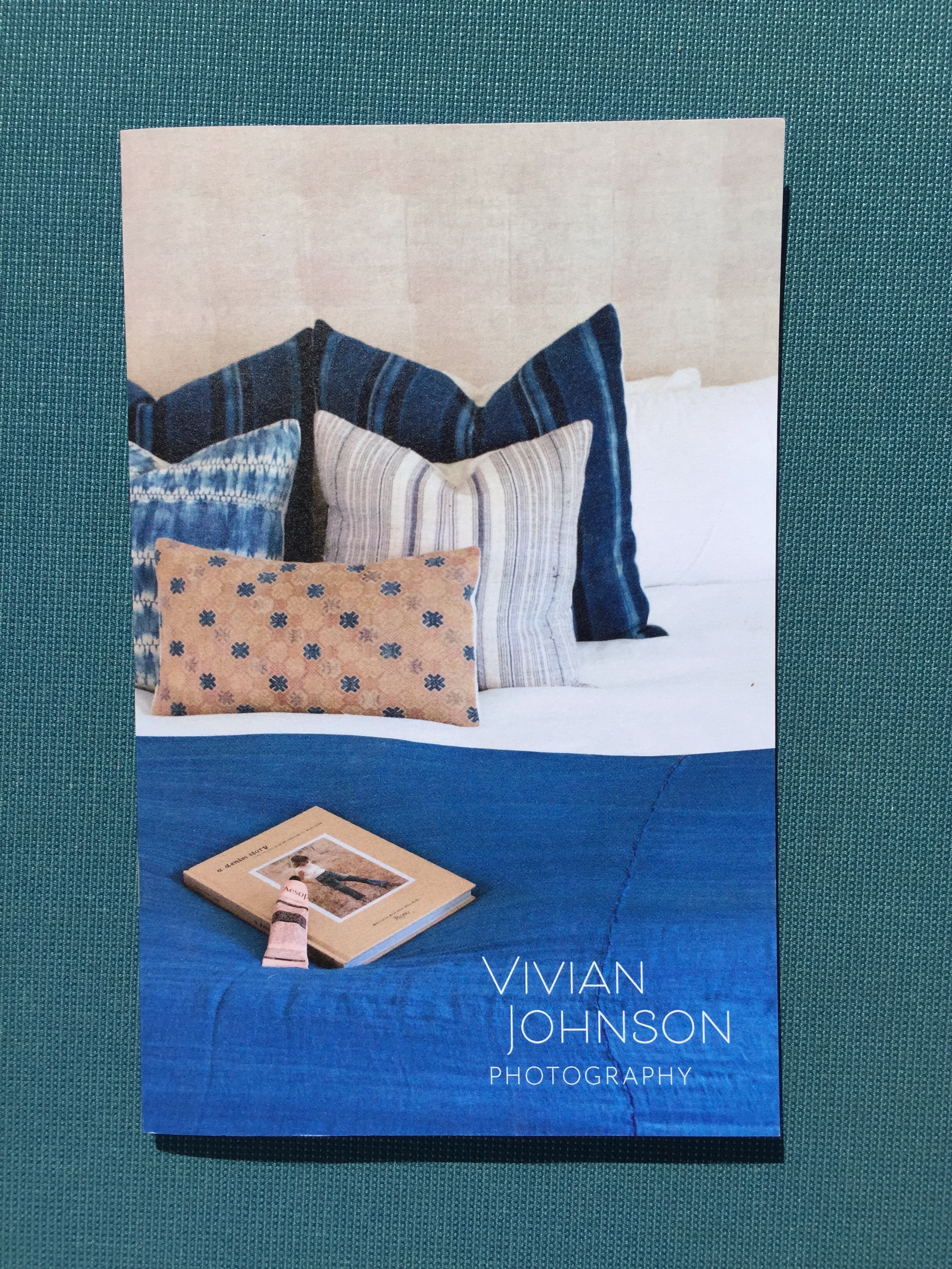
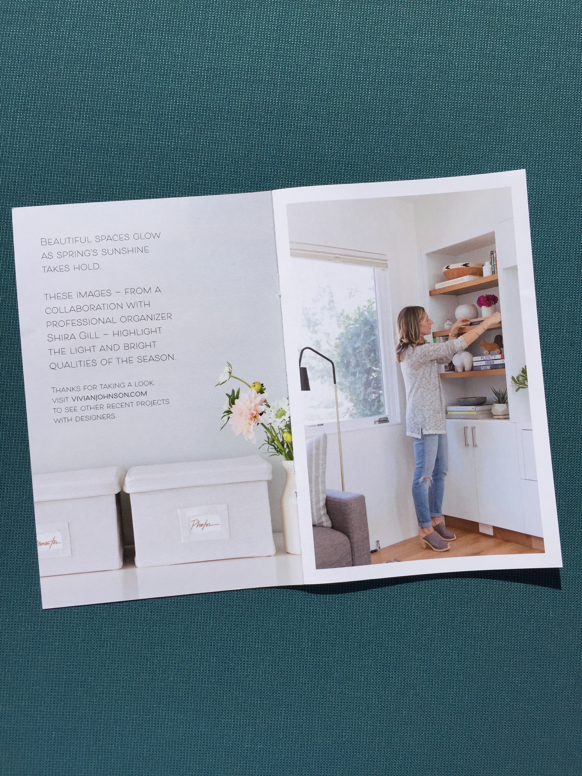
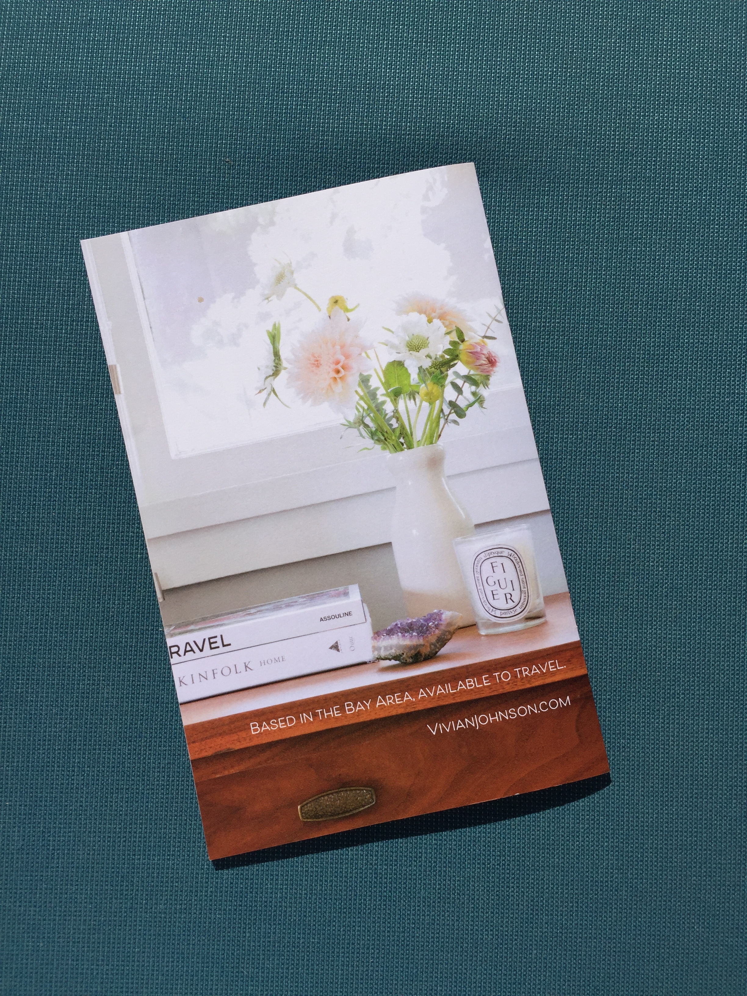
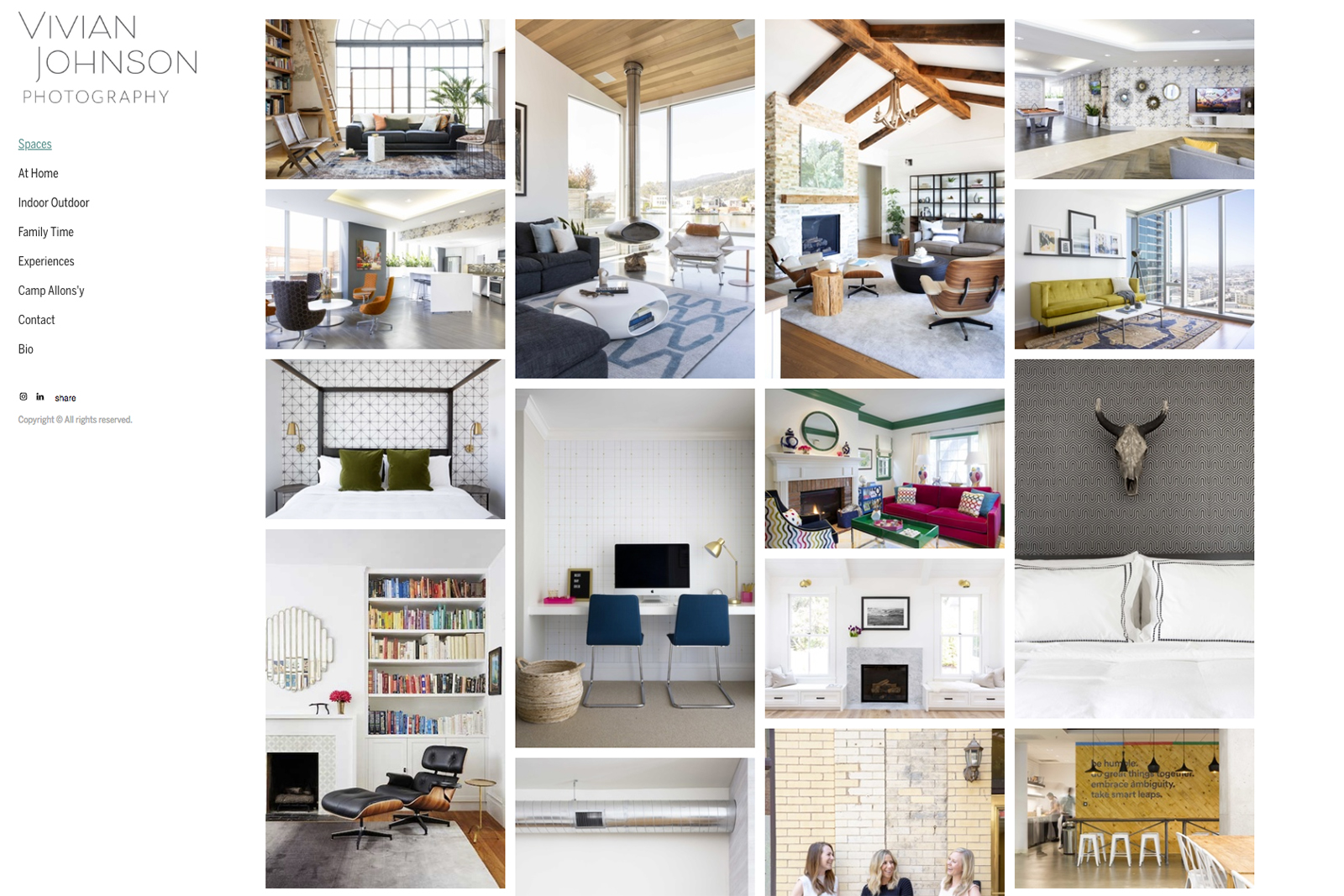
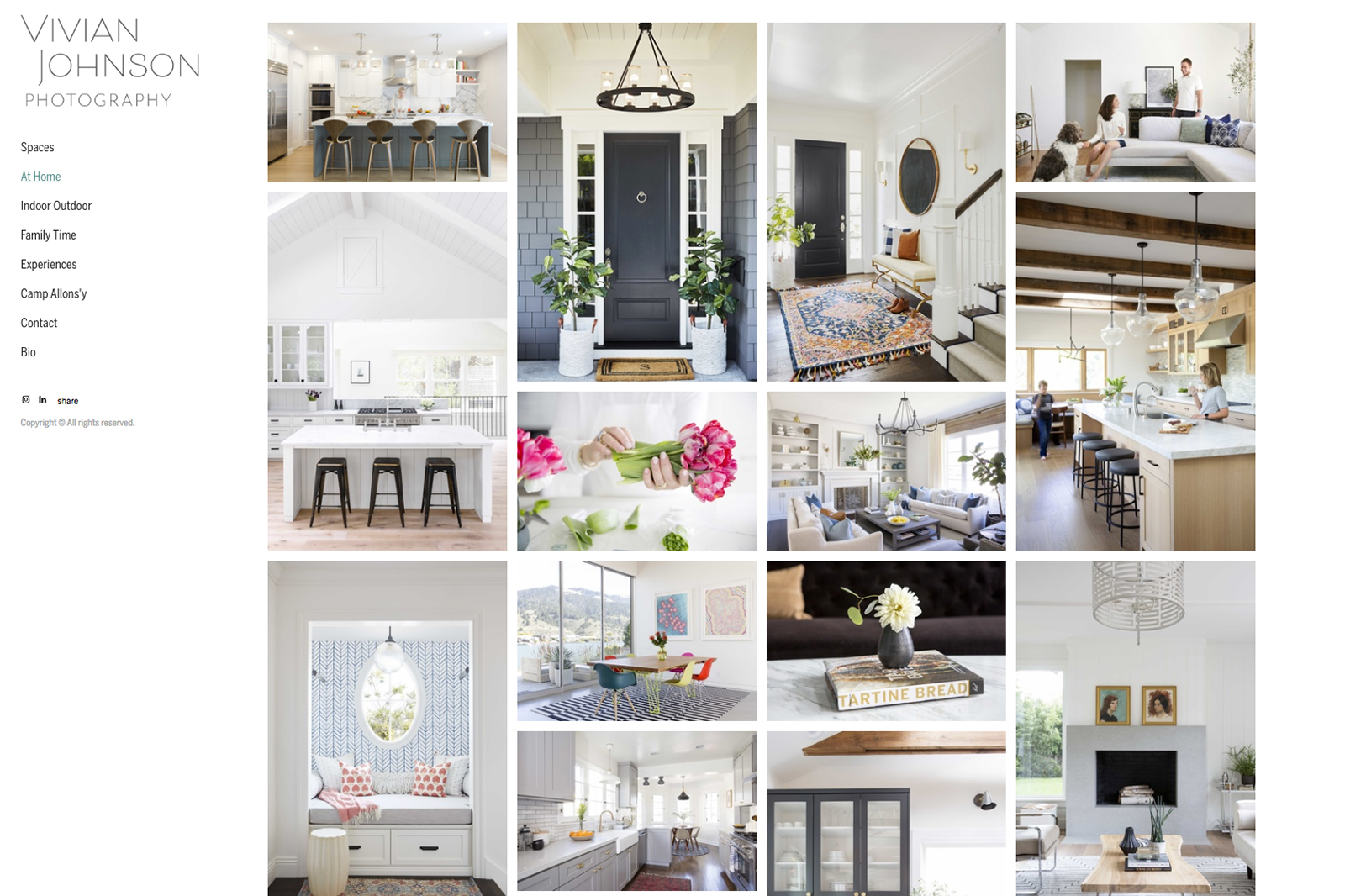
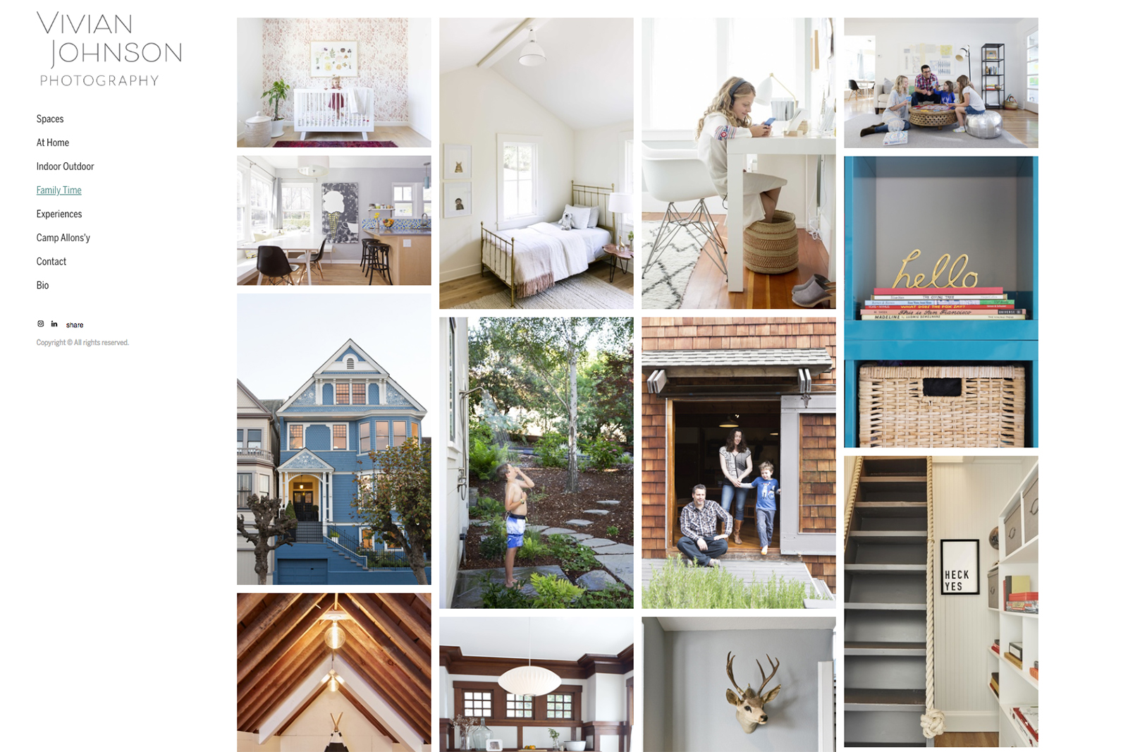
I recently wrapped up working with Oakland-based architecture and lifestyle photographer Vivian Johnson. Interior photography is Vivian’s specialty, and she brings a warm, cozy vibe to every project. She’s also great at incorporating people (designers, families, artists, etc) in her shoots. Her freshly-updated website showcases this work along with her destination storytelling.
In order to share her work with designers, architects and interior goods companies, we created a beautifully-printed booklet, along with a coordinated email promo and graphics for sharing on social.
You can see more of Vivian’s work at www.vivianjohnson.com.
Tosca Radigonda Website and Marketing Promo
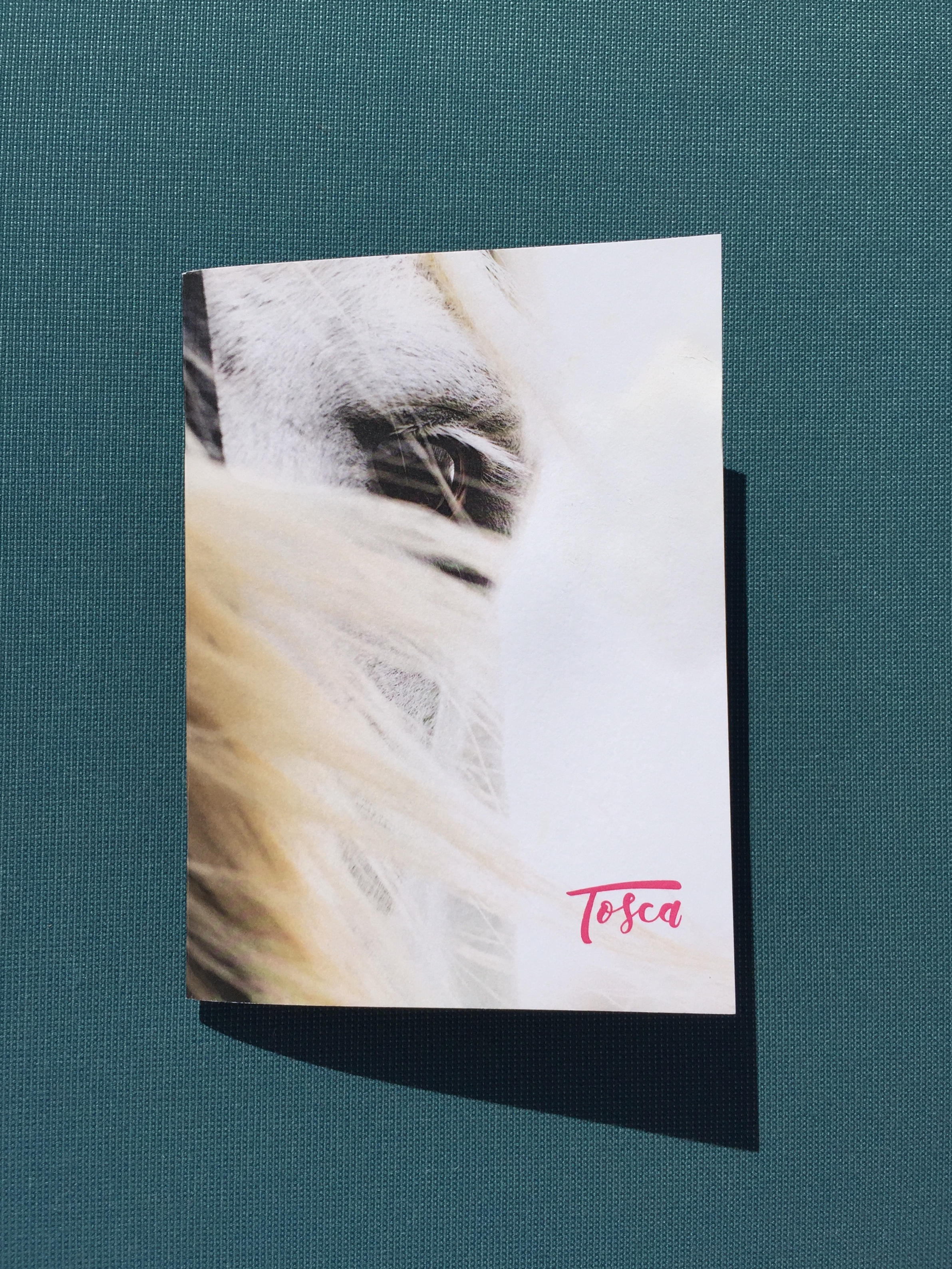
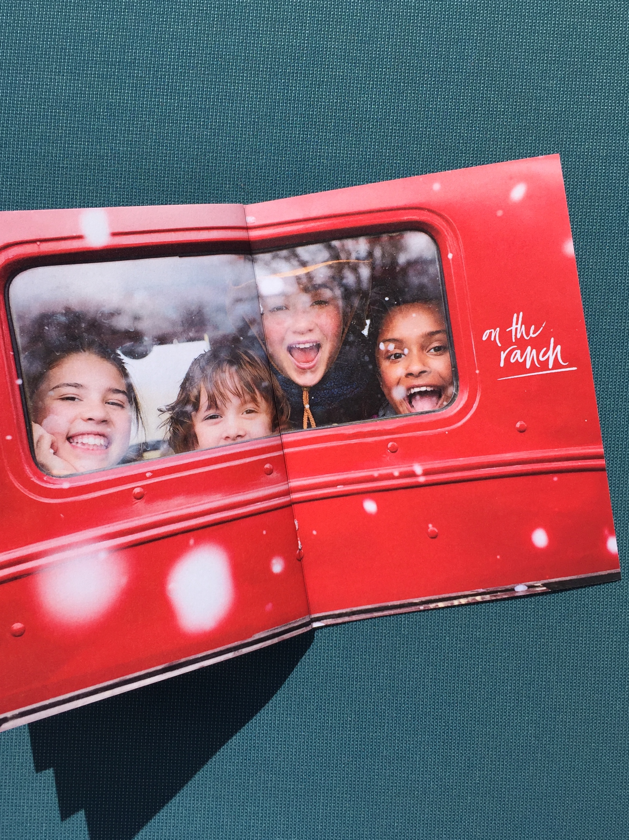
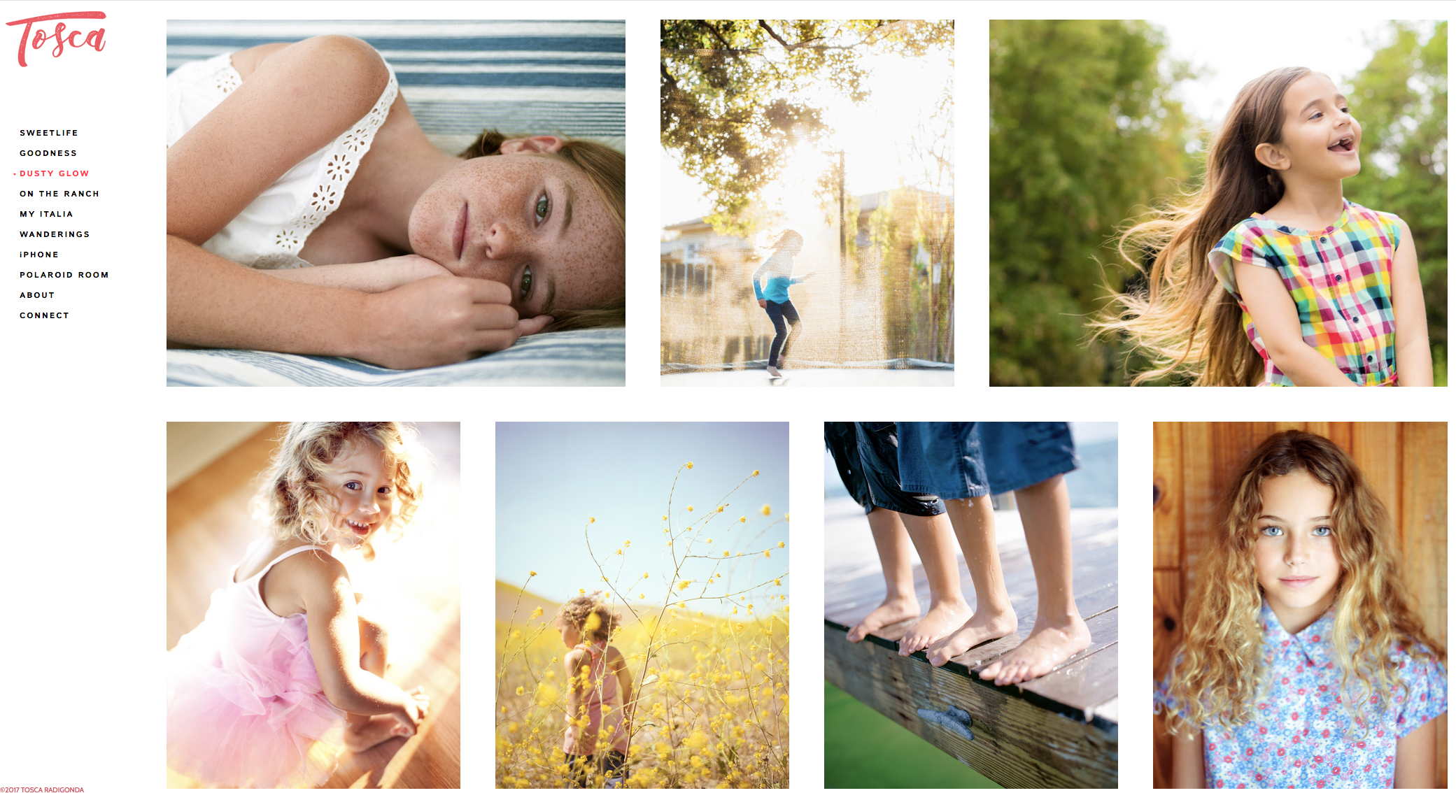
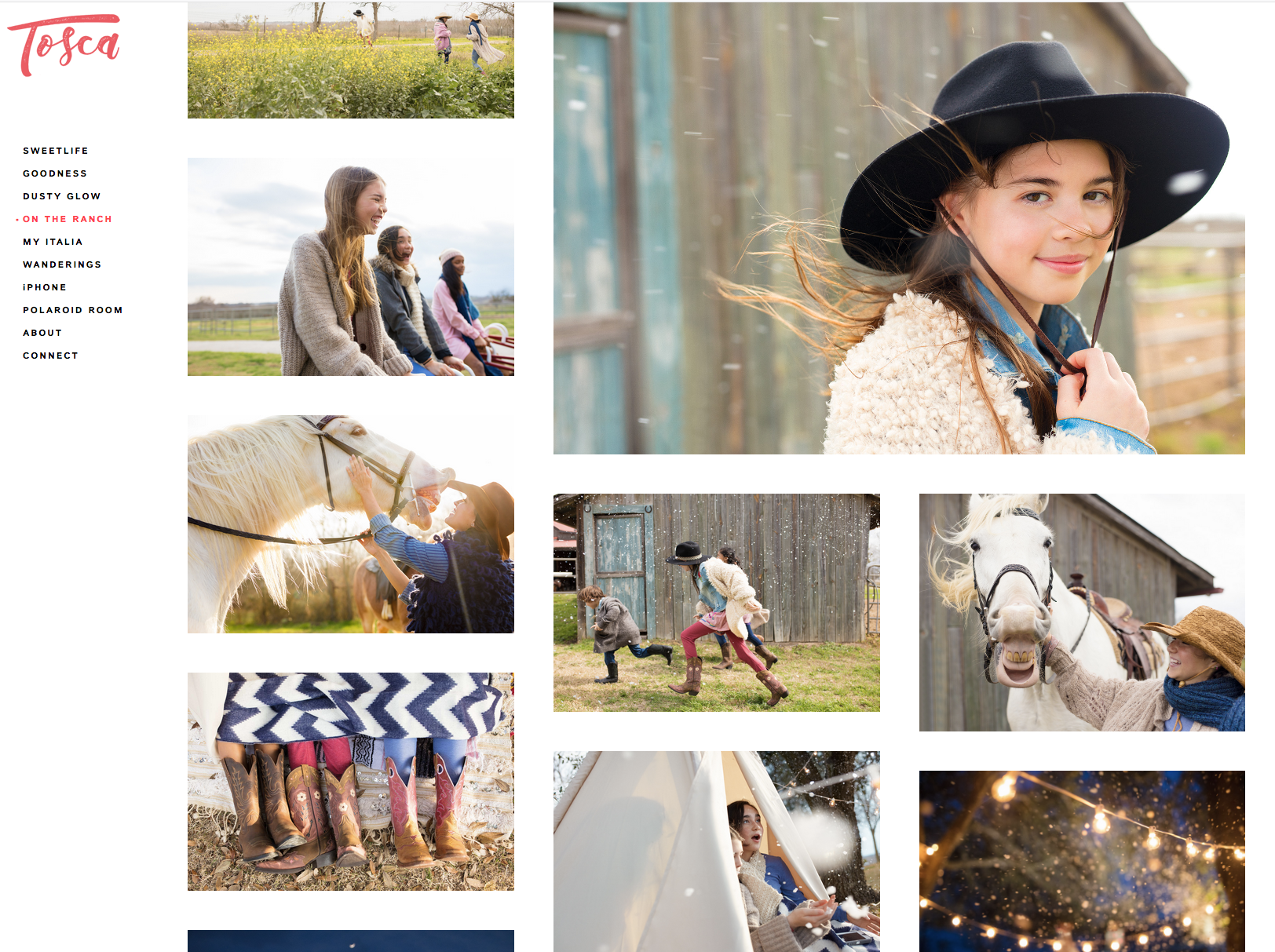
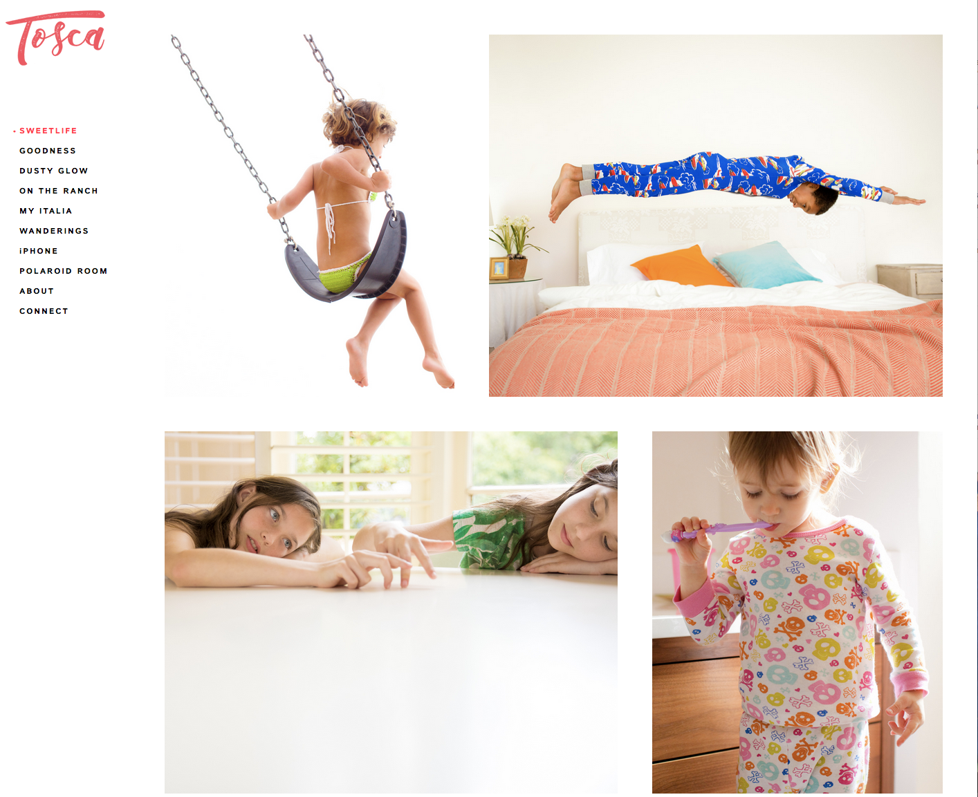
I recently had the pleasure of working with commercial lifestyle photographer Tosca Radigonda on her new website portfolio. The website, built on the PhotoFolio platform (photofolio.io) features a stunning collection of children's lifestyle work, as well as dreamy and ethereal travel imagery.
Tosca and I also worked together to create a gorgeous, 16-page print promotion which was sent to advertising and editorial creatives, along with a coordinated email promo.
You can see more of Tosca’s work at toscaradigonda.com
Jason Elias Promo
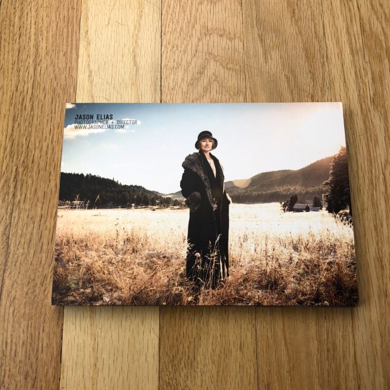
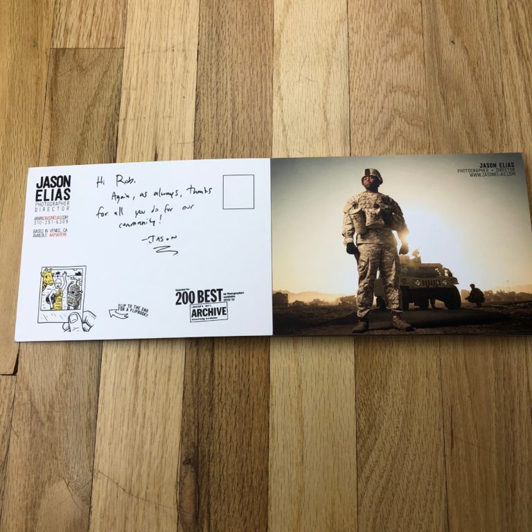
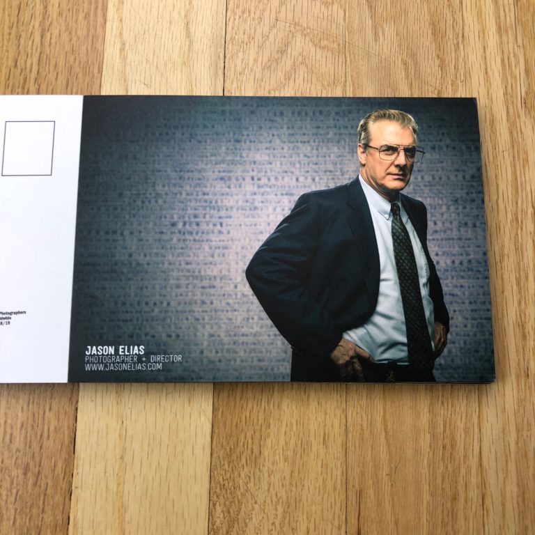
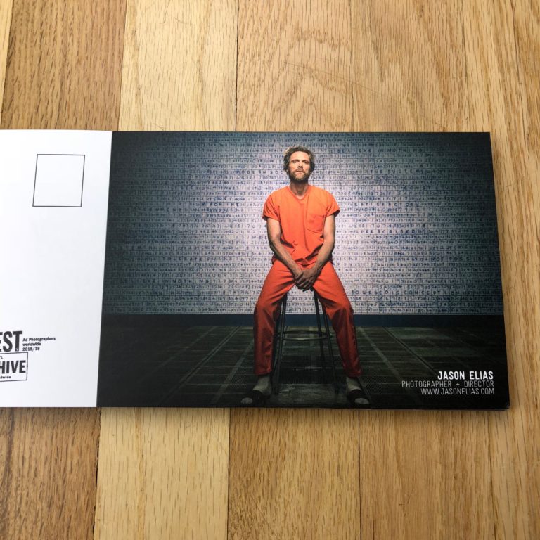
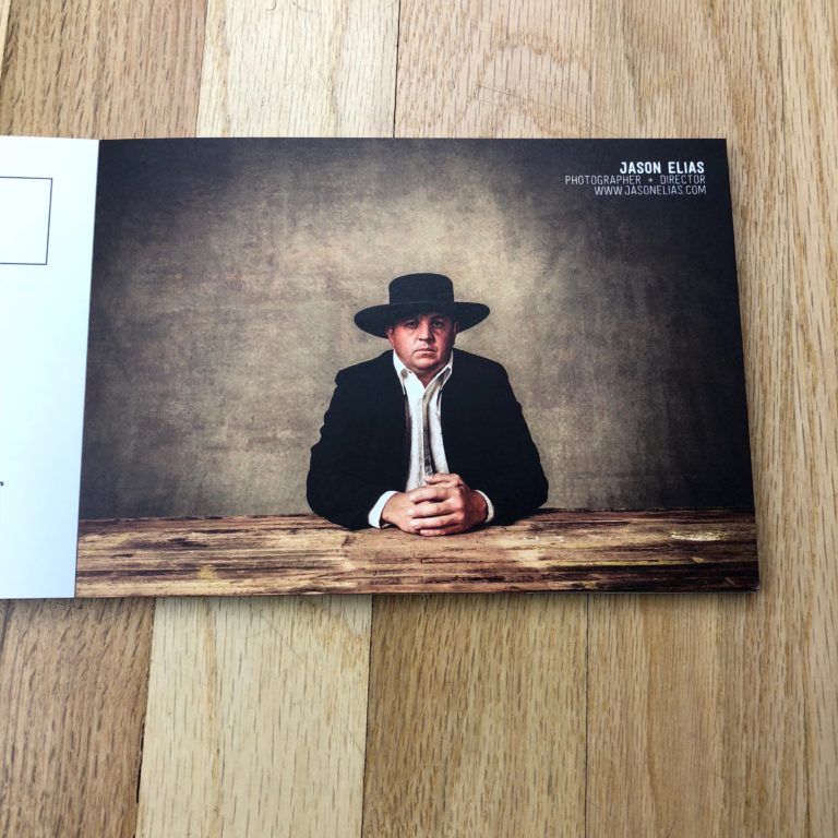
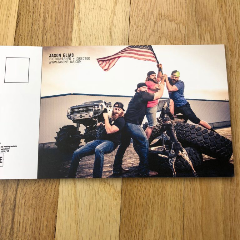
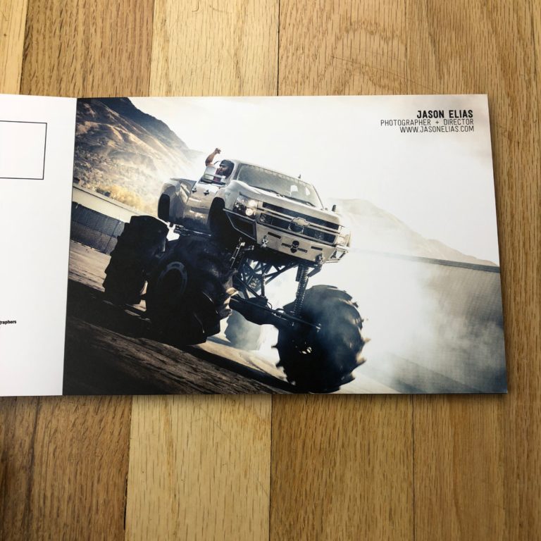
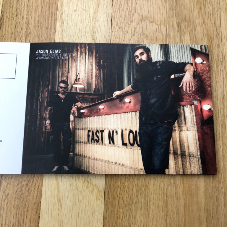
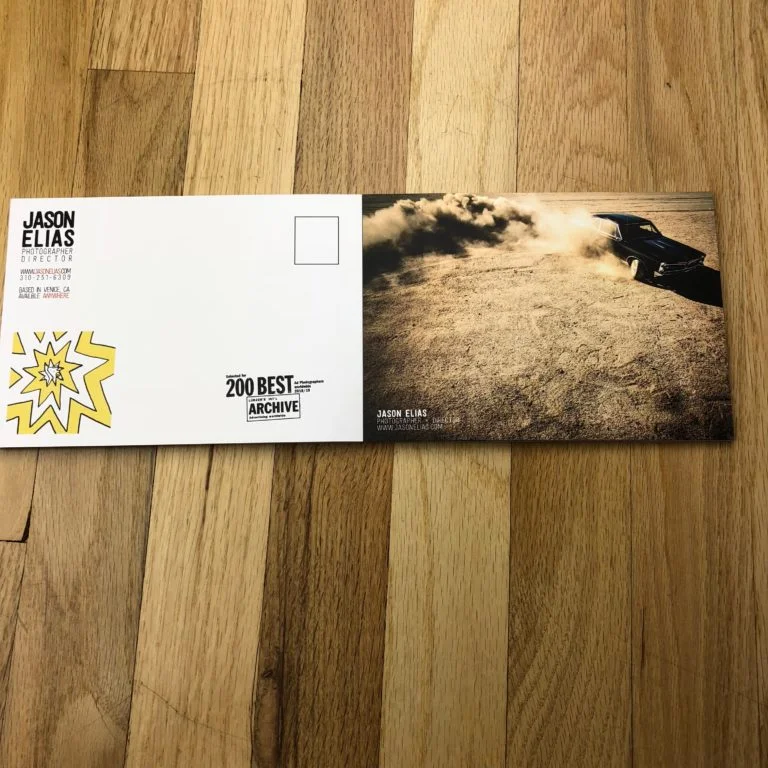
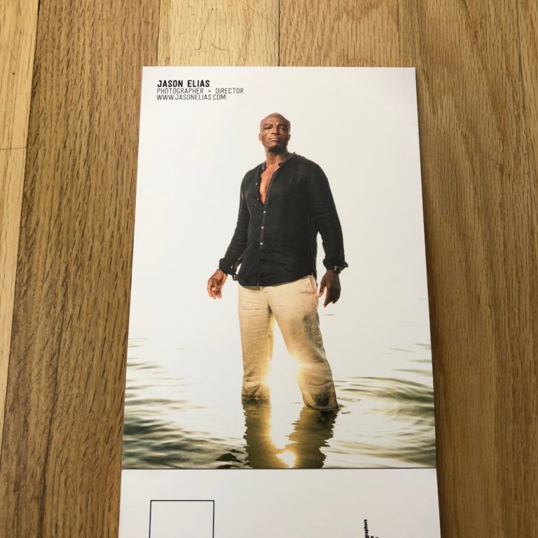
I worked with photographer Jason Elias to create a postcard promo book of his work to send out to potential clients. Jason is a California-based photographer and director who’s work focuses on portraits, travel and lifestyle. He regularly works with clients like Discovery Channel, Animal Planet, USA Network, Delta Airlines, and HBO.
More of Jason’s work can be seen here.
Promotional Magazine for Ian Curcio
This 16-page booklet features SC-based Ian Curcio's portrait work for corporate and commercial clients.
Jason Elias Postcard Flipbook Featured on aPhotoEditor.com
I recently wrapped up some marketing work with LA-based Jason Elias. He chose to do a postcard flipbook with Paperchase, and we wanted the edit to take the viewer on a journey through his work. From the "hero" images to the more quiet moments, the piece captures the dynamic, fun and sometimes intense work that Jason does for clients like Discovery Channel, Showtime, and others.
Read the interview with Jason at http://aphotoeditor.com/2017/12/11/the-daily-promo-jason-elias/
“...the edit was done by a great editor based in Texas, Jasmine DeFoore – https://www.jasminedefoore.com/. I really like Jasmine’s take on things and she always helps me see my work with fresh eyes. Once she knew I was going to do the postcard book, she also had the great idea of having an animated GIF in flipbook form on the back. So I found a great animator in DC named Travis Pietsch to build me one – https://www.travispietsch.com/. I kind of had an idea and he helped craft it and make it. Once I had it on there I realized that as much as you try to stand out in some way, there is also something to just having fun and enjoying being creative for the sake of being creative, and that’s why I loved the flip book so much.”
Buff Strickland Promo
Buff Strickland, an Austin-based lifestyle photographer, has published a beautiful magazine-inspired promo full of images of how people live, love, work and create. With modern and elegant typography throughout, the piece showcases Buff's aesthetic which is warm, inviting and authentic.
This was my third photo editing project with Buff, after having built a print portfolio for her and updated her website over the last two years. It's always really satisfying to work with someone repeatedly over time, as I get to see their work grow and change.
Specs:
Designed by Nicole Fikes of Merry Design Studio 36 pages, cover stock weight Printed by Ginny's in Austin, TX
Jonathan Hanson Print Portfolio & Print Promo
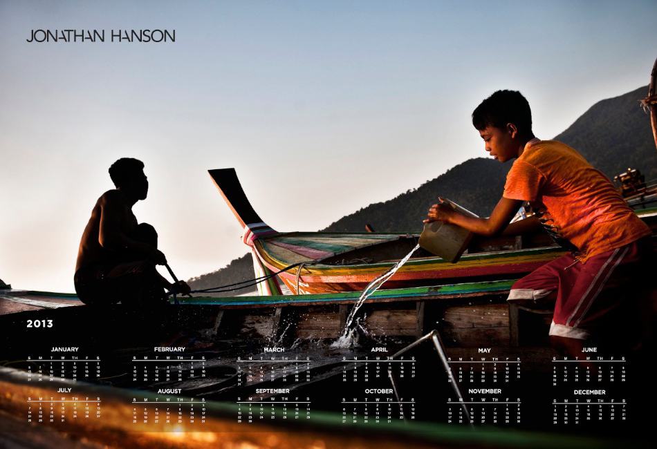
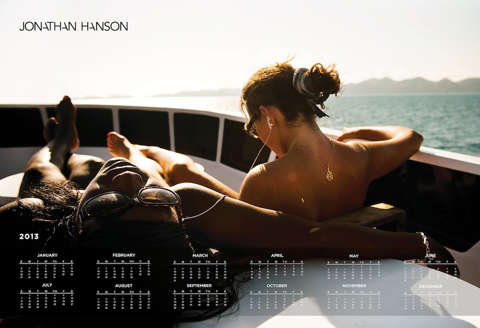
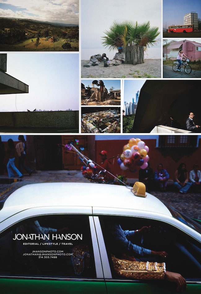
I've been working with Baltimore & NYC-based Jonathan Hanson since 2011 on a variety of projects. We started by re-editing all of his work, then creating a new website and logo, custom print portfolio and printed marketing pieces. In January, Jonathan sent out some beautiful calendars to a select group of clients he is interested in working with. He has consistently updated his blog, sent out email promos and personally updated appropriate clients about his latest work, travel updates and other relevant news.
His web analytics are telling a great story of the success of his marketing efforts. The average time spent on site has increased by more than a minute, the number of unique visitors is up 51% since a year ago and his page views are up 142%.
David Maurice Smith Website, Portfolio and Marketing
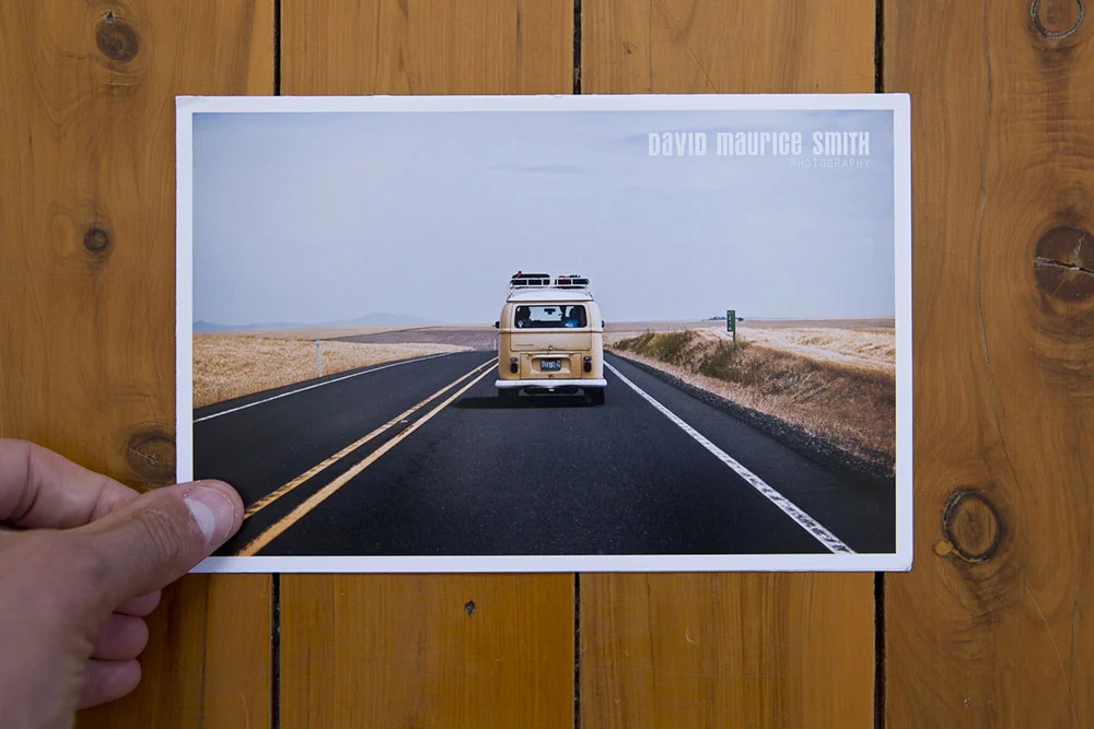
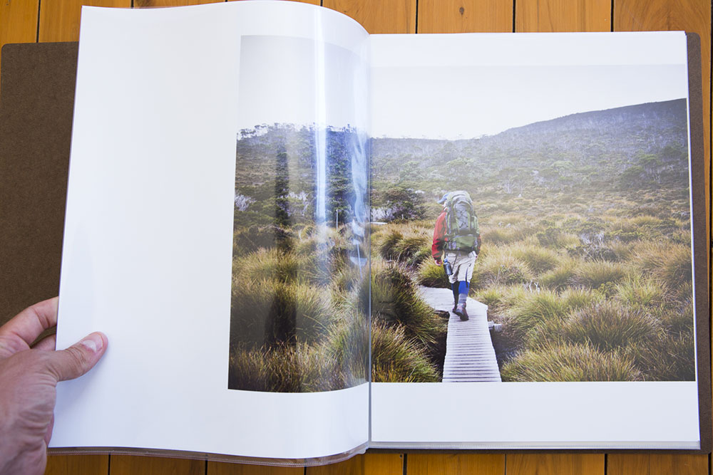
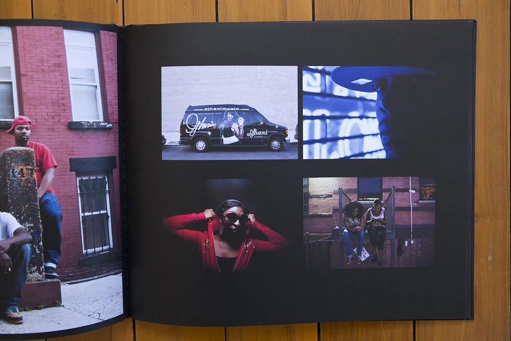
David Maurice Smith is a Canadian photographer living in Sydney, Australia. He came to me looking to revamp his website and get his work in front of top magazines around the world. Together we reworked his web site edit, created a print portfolio, built targeted mailing lists for the kinds of clients he wanted to reach and created a stunning print promo to send to them.
Feedback from David about the process and results:
2 days after I sent out our first promo which you helped design, structure and create the mailing list for, I got a 7 day travel assignment with Monocle Magazine. They absolutely loved the promo and loved my website which you had helped me restructure. I think there was just a level of consistency that came across in all the work I was presenting in print and digital form that inspired confidence in editors. Since then, I have had several magazines reach out from my newsletters to commission work, and word of mouth jobs through editors that originally heard about my work from my print promo and my email promos.
Overall I think I benefited so, so much from having your eyes help to organize, structure and present my work... The pictures were there, it was just a matter of putting them together in a way that spoke more clearly to the needs of picture editors... it inspired so much confidence going into meetings and sending off work.
Aside from that, the feeling of having a plan was unreal... you spend so much time floating solo as a photographer, doing everything yourself and plugging away. Having you in my corner helping me structure a process of what to do, how to do it and when to do it was invaluable.
Kimberly Davis
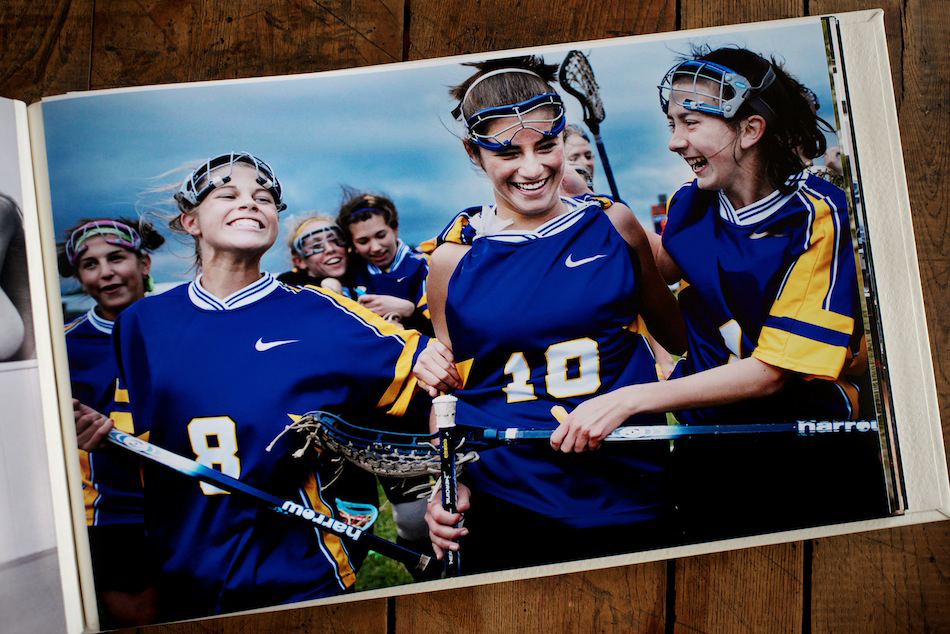
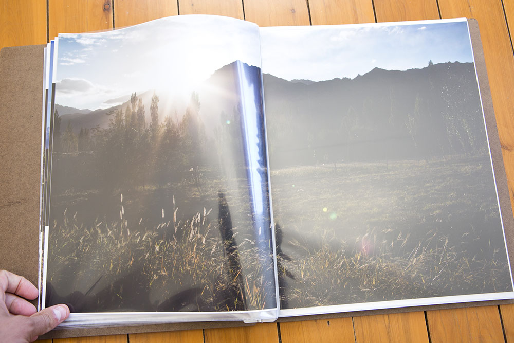
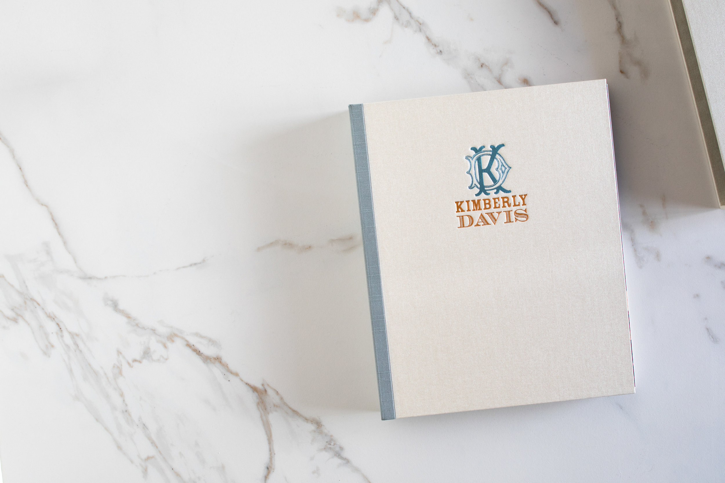
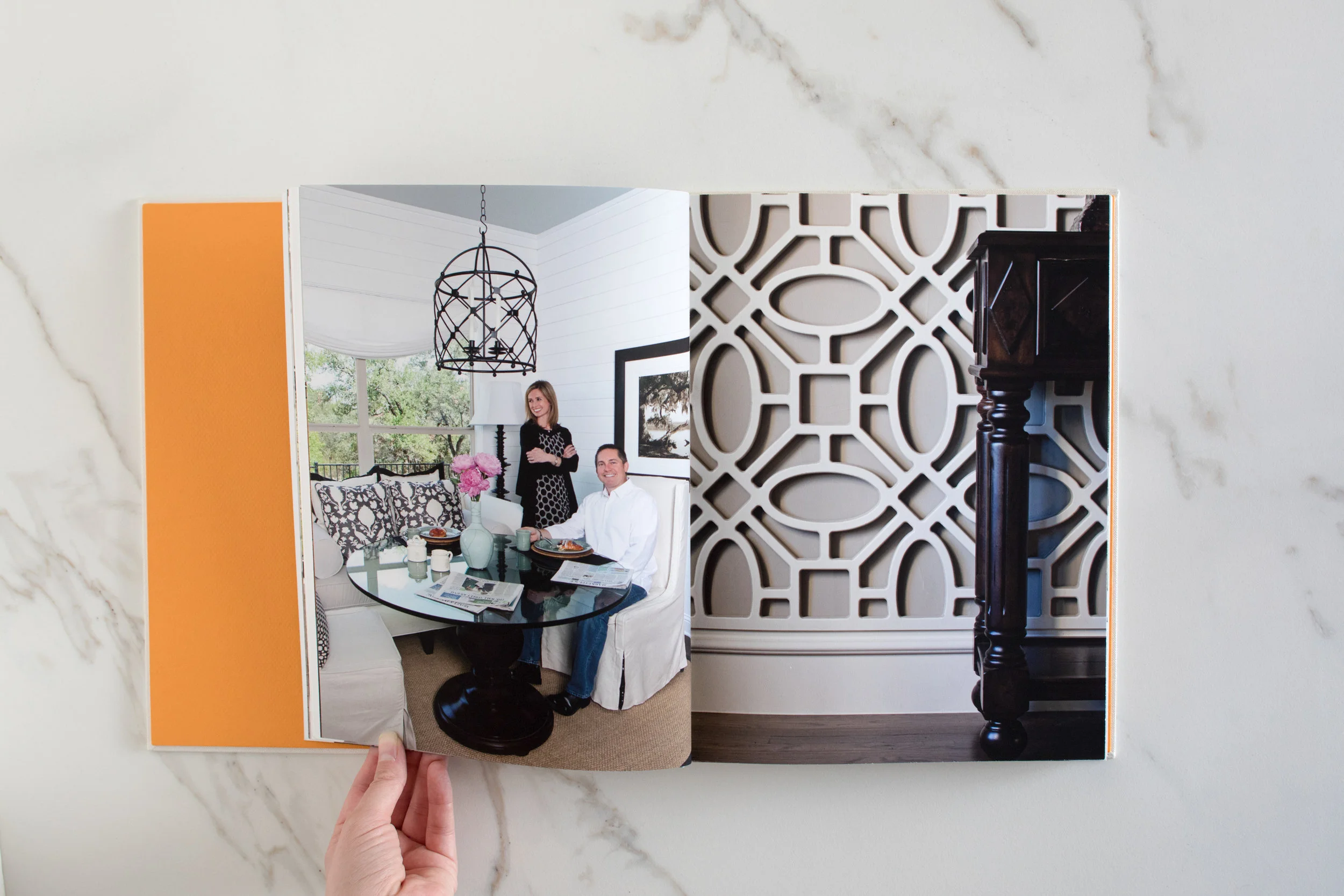
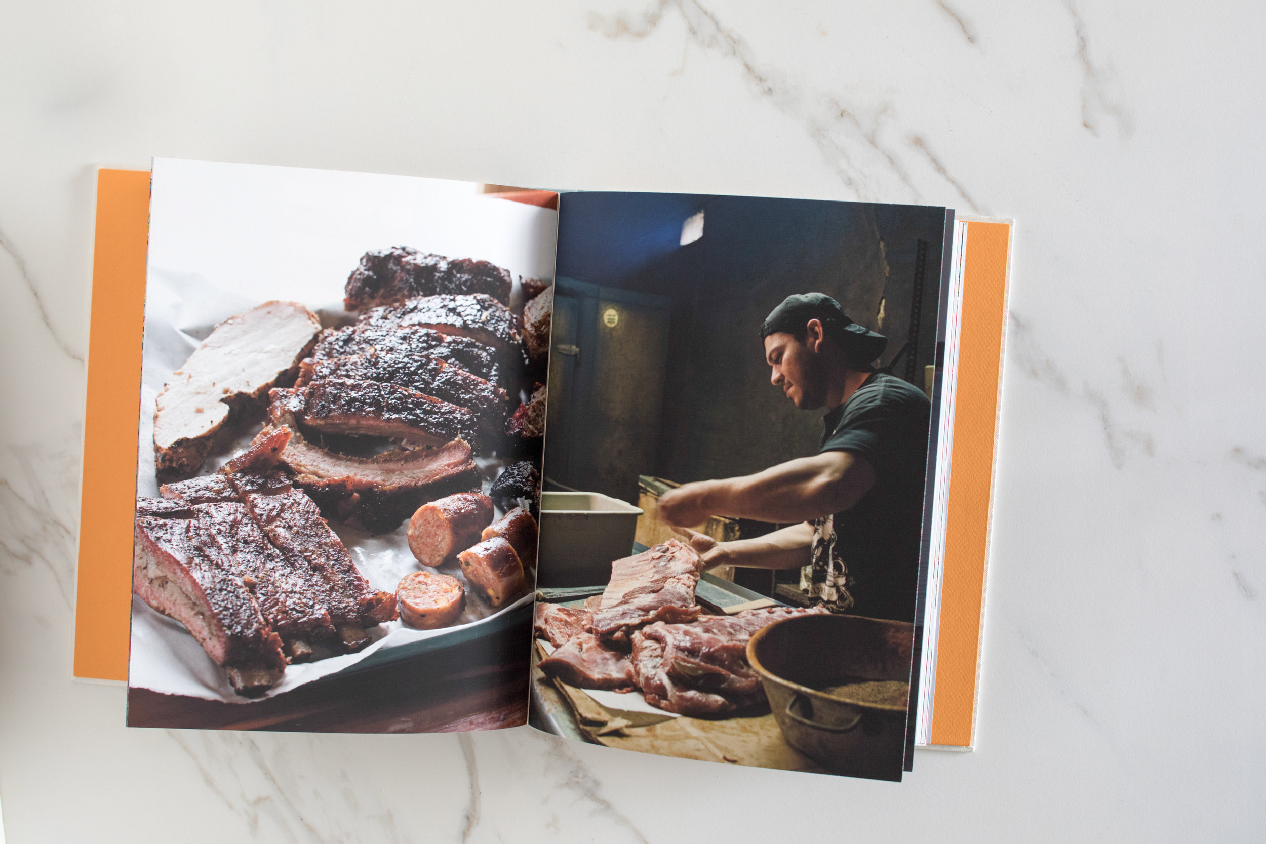
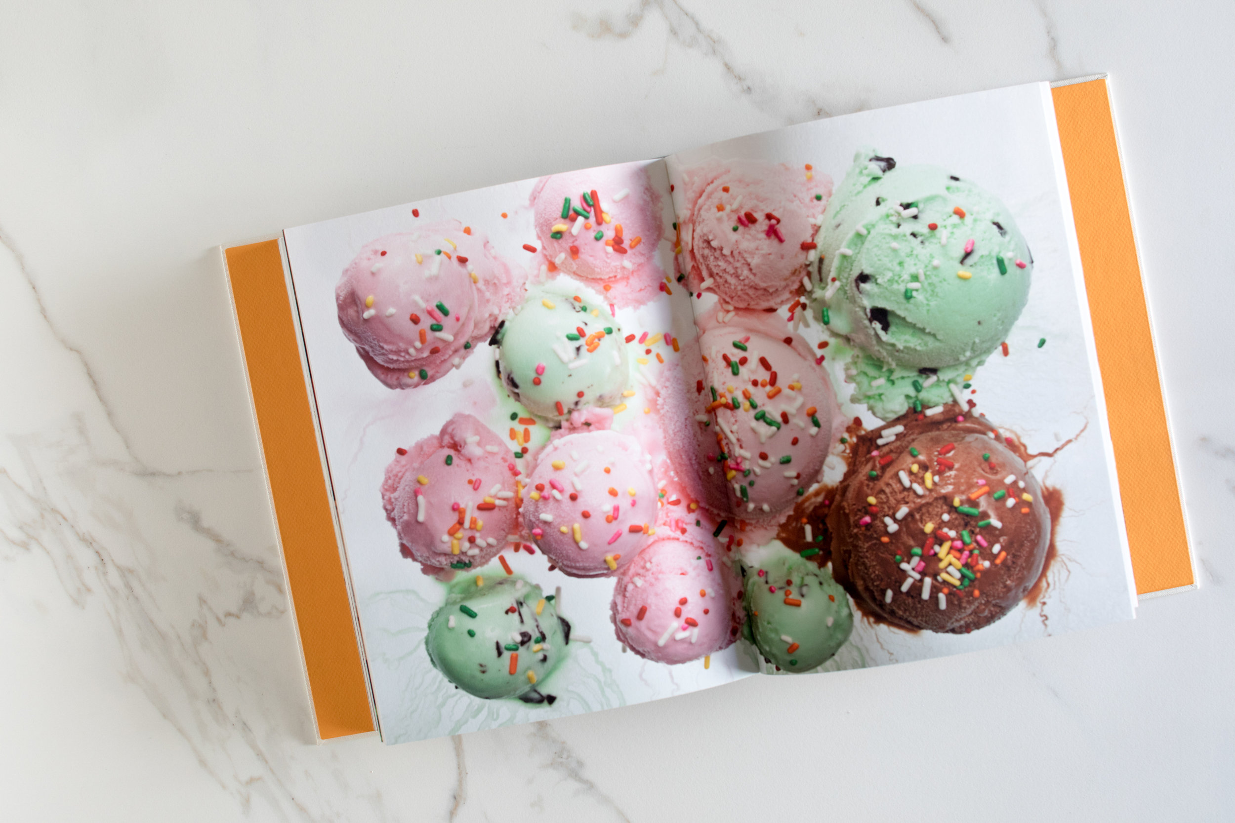
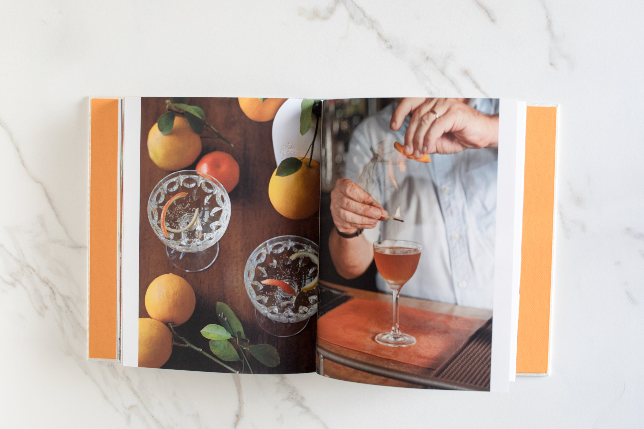
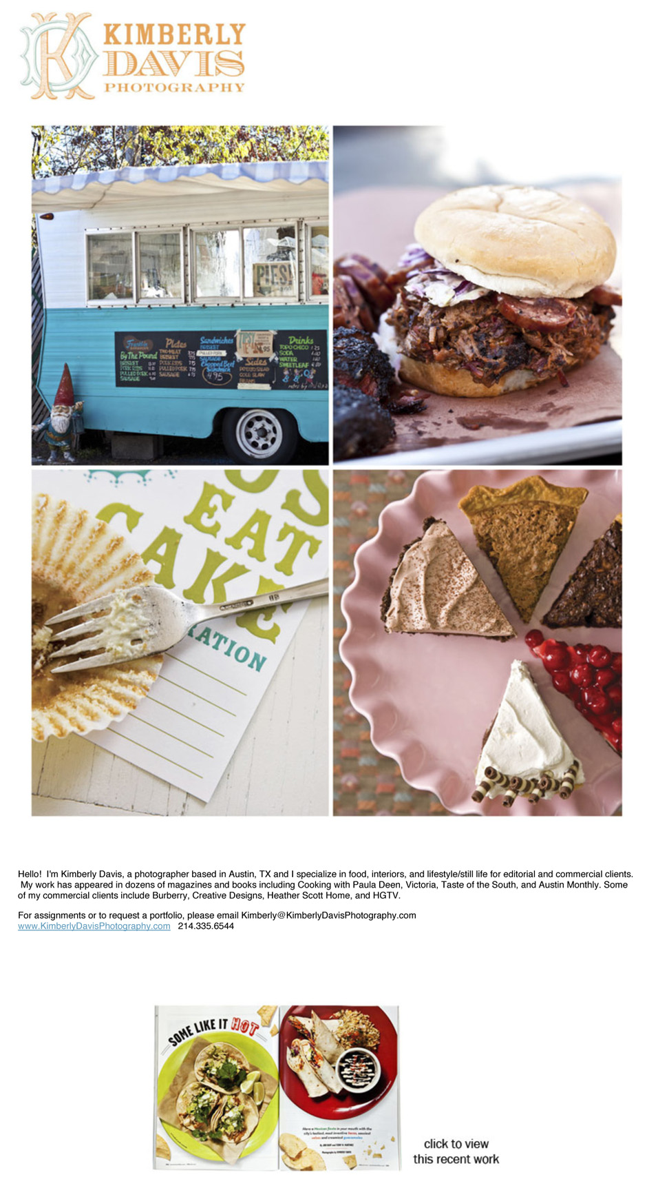
Kimberly Davis is an Austin-based interiors and food photographer with a real love for all things smoky (BBQ) and pretty (interiors). She and I started working together in 2011 to help her fine tune her web presentation, create a print portfolio (the book was custom made by Jace at Cloverleaf Studio), and create a marketing plan.
Print Portfolio:
Email Newsletter/Promos:
David McNeese Print Portfolio, Website, and Promos
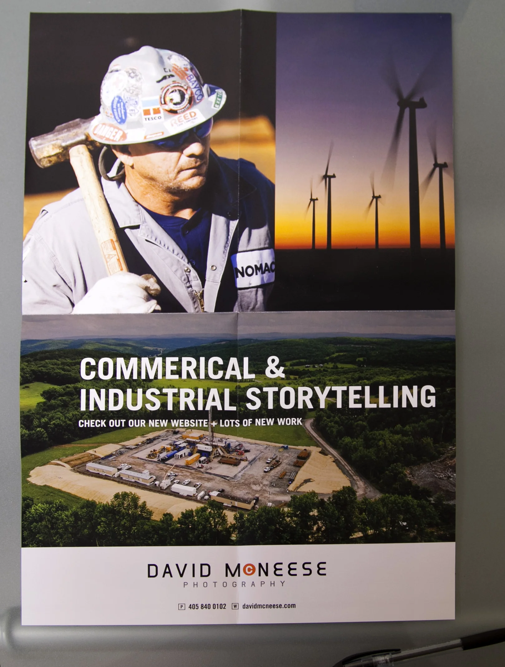
David McNeese is an Oklahoma-based industrial and corporate photographer with a passion for shooting large-scale projects full of logistical challenges. His studio is frequently tapped to create stunning imagery for energy, oil and gas companies, and large construction firms. David came to me needing to refresh his brand identity, overhaul his website and develop a plan for targeting clients with the kinds of large scale jobs that he excels at. We started by going through all of his images and choosing ones that best show off his corporate storytelling skills. We then worked with Livebooks to create a custom website. Once the website was launched, we announced the new look through email and print promotions designed by Nathan Ryan.
We also developed new print portfolios, built by Scott Mullenberg's Mullenberg Design Studio. David had the opportunity to show the new portfolios off at a portfolio review in Austin in February, where he received very positive feedback from art buyers and reps.
New website:
Print Portfolio:
11x17" foldout double sides print promo:
E-promo:
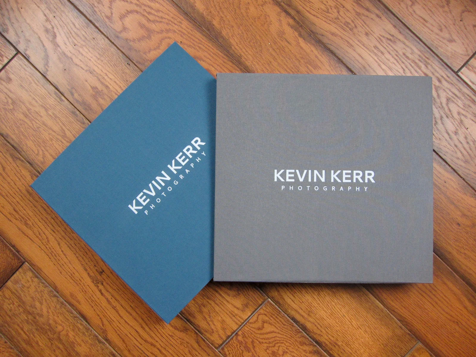
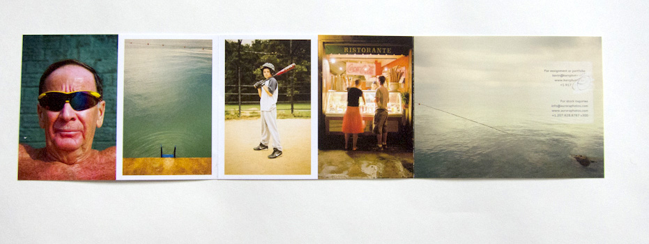
Kevin Kerr Website, Print Portfolio and Print Promo
NYC-based travel photographer Kevin Kerr and I worked together to re-edit his web and print portfolios, create a new print promotion, build targeted mailing lists and define who his top priority clients should be.
IMG_0377
Promotional Notepad for Redux Pictures
original_redux01
Conceived and produced a 300+ page note pad as a promo piece which was sent to over 1,500 photo editors, art directors and art buyers. The note pad featured full bleed photographs by over 30 photographers and was designed by the awesome Spunk Design Machine. The feedback was great from clients and the piece won a PDN Self Promo Award.


