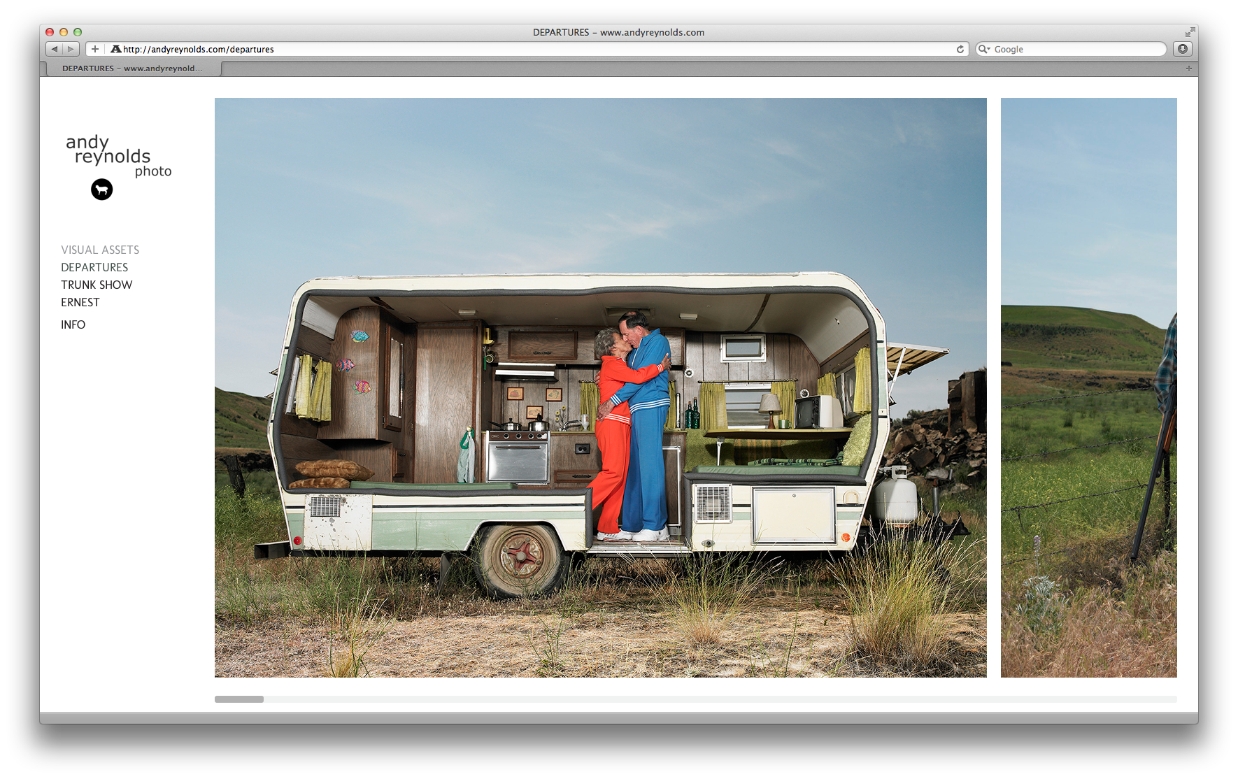
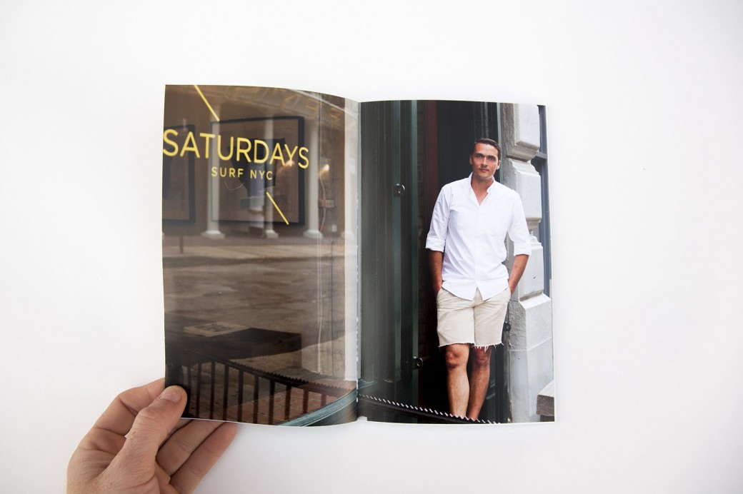
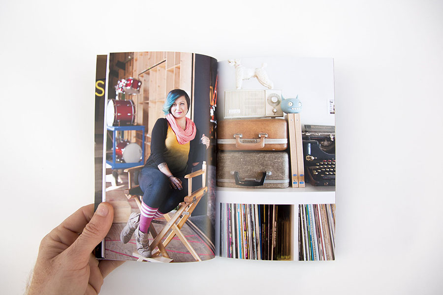
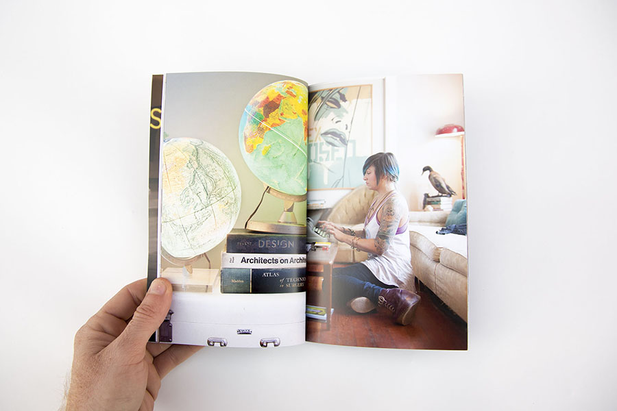
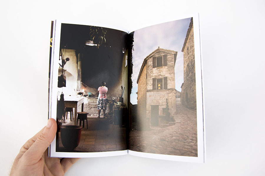
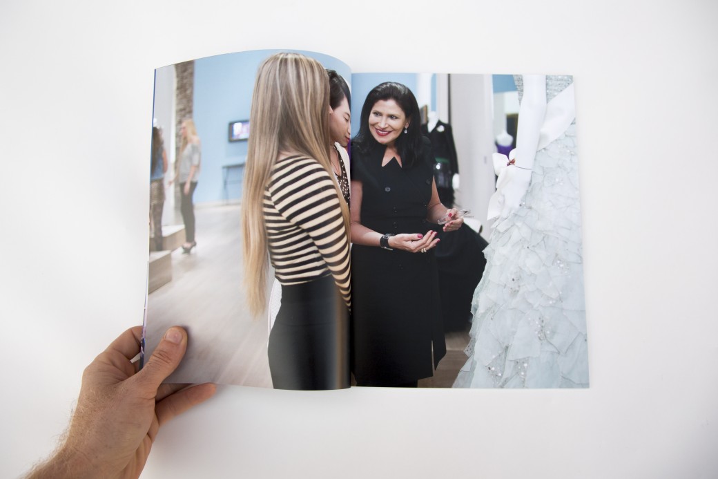
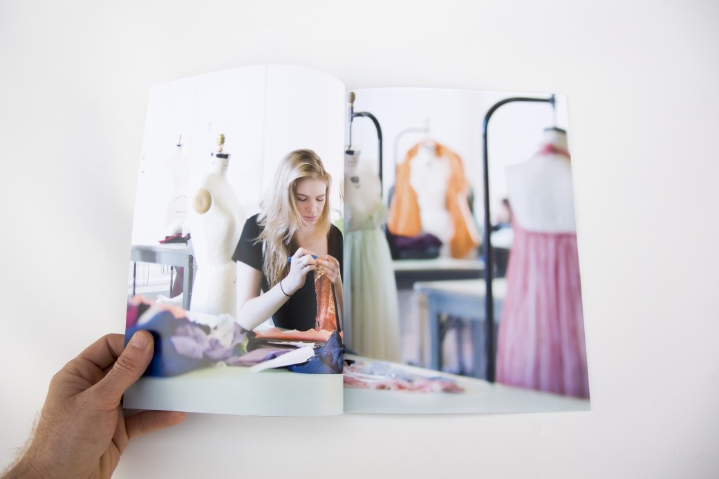
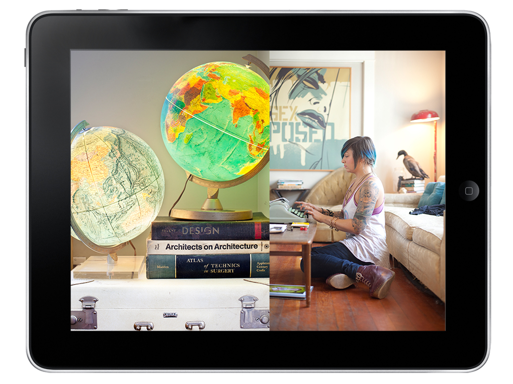
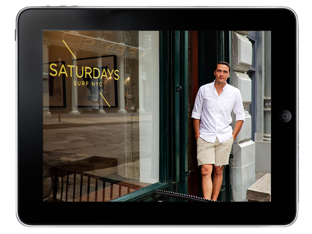
I've recently wrapped up editing Andy Reynolds' work for his website relaunch. We created 3 galleries with distinctly different moods. Andy is based in Seattle and works with a variety of commercial and editorial clients who appreciate his quirky concepts and ability to capture every day life with wink.
Sarah Lim Website, Print Portfolio and Marketing
Sarah Lim, an Austin-based editorial photographer, contacted me because she was having trouble making sense of her various types of images. She had travel and documentary and lit studio portraits and natural light environmental portraits. There were a lot of strong images among the folders on her hard drive, but they were having a hard time getting along. We started by first talking about the kind of work that she would like to be getting. Then we started editing her work so that it was a bit more focused and showed off her strengths. We announced the revised edits via email newsletters and print promos, and since then Sarah has shown work in her custom print portfolio (which she hand carved her logo into... yes, you read that correctly) to a variety of clients at in person meetings and portfolio reviews.
Since reworking her portfolios she has started working with a much wider range of clients including Texas Monthly, Austin Monthly, The New York Times, AAA, Inked and others. Texas Monthly has been using Sarah since September 2012 for their monthly travel column, The Wanderer.
Sarah was kind enough to share her thoughts on the process:
"Jasmine is fantastic! I was just getting started and didn't know my ass from my elbow, but she kicked me into shape. The very day my first mailer landed on photo editor's desks, I booked my first national magazine job, and I continue to turn to her for professional advice as my career progresses! With her re-organization of my website edits, it's like she saw which direction I wanted to head, better than I could and has been instrumental in not only getting me work, but helping me better understand and narrow my own focus as a young photographer.
Seeing it all put together has in turn helped me hone in on my own style. She's a super nice gal, who's personally invested in the success of her clients. Alone, I couldn't even make headway to get people to return an email, but Jasmine's expert advice has helped me get the gears moving in the direction I want to head."
TheDocumentaryProjectFund
TheDocumentaryProjectFund was founded to help make sure that photographers who want to tell the stories of their communities will be able to do so. TheDPF focuses on those photographers who work within their communities. They may work locally but the issues of community are the same as those faced globally. Looking through the lens of a photographer who is committed to his community will translate to communities everywhere.
Submissions for entry will begin May 15, 2013 and run through June 15, 2013. More information can be found here.
YPA Mentoring Program
Calling all students! YPA has finalized the locations for the 2013 mentoring program & has a total of seventeen teams set up around the world.
The program takes place over the summer beginning June 1st, ending August 15th pairing up students with leading industry professionals. Teams will meet for eight two hour sessions, (days and times to be determined by teams at first meeting).
The results of the program will be featured in an exhibition in NYC and will be prominently displayed to a worldwide audience. You will gain experience and insights from your mentors, create new work for your portfolio, develop professional business skills, and with your team will create a local campaign to promote yourselves and your work.
All teams will work on a common theme this year titled “Escape”. We invite you to explore what the word means to you.
If you are interested in participating, click here for more details – Deadline for applications is May 10th.
Jennifer Whitney's Spring Promo
Jennifer Whitney's spring promo is out, and it's a beautiful custom envelope with four different bodies of work each with its own trifold insert. The themes of each card are: Everyday moments that make up our daily lives, commercial work she shot for Cooking Channel during SXSW 2012, food, and her series on election season called “the vote”, including coverage of RNC 2012 in Tampa.
Video interview with KLRU Collective
KLRU Collective filmed photographer Kimberly Finkel Davis and me at the Texas Photo Roundup!
I talk about what it takes to be a working professional, and Kimberly visits AgavePrint and Cloverleaf Studio for help with her beautiful print portfolio.
Lissa Gotwals Website
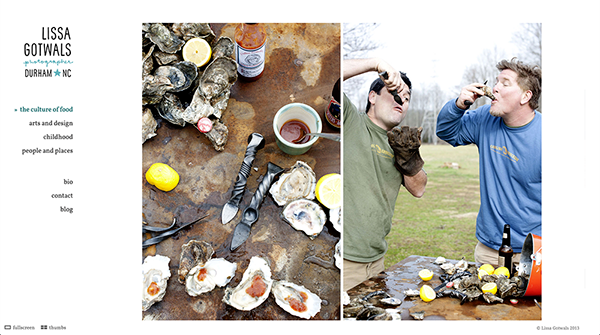
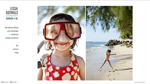
Lissa Gotwals is a Durham, North Carolina-based lifestyle, entertaining and portrait photographer. Her work is full of life and energy, showing the connections that people have between each other, the Earth and the food we grow and eat. Amidst the daily celebrations of life, there are quiet moments that are filled with nostalgia without being overly sentimental. The work feels real and genuine. Her new website puts that work front and center, showing off her great use of color and ease of capturing real moments. In the next few weeks, we'll be sending out a print promo announcing the new work. Stay tuned!
Case Study: Hilary Duffy
Hilary Duffy is a New York City-based photographer specializing in photography for NGOs, magazines and corporate social responsibility projects. We created a brand new website for her with a new edit that focused on her strengths in storytelling around the world.
Donna Alberico Website
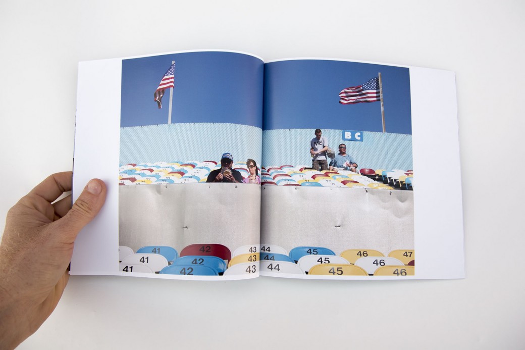
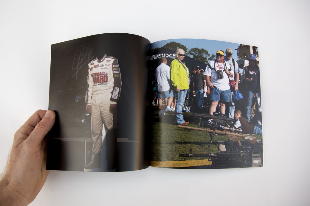
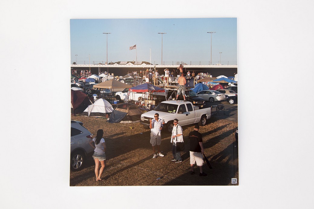
NYC-based commercial and editorial photographer Donna Alberico came to me looking for help with editing her work for a new website. She has a mix of documentary and portrait work, and needed a way to mix the genres that made sense, felt cohesive but kept the documentary spirit of her work front and center. We decided to center her new website around a variety of galleries, including:
4 documentary projects: Truckers, Autism, Slaughter and Day at the Races 2 galleries centered around themes: Pursuit of Beauty (a fascinating look at the lengths people go to attain beauty, from childhood to adulthood) and Hanging with Celebs (a tongue in cheek look at behind the scenes celebrity culture)
Gabriella Marks Website
New website edit for Gabriella Marks, a photographer based in New Mexico. We created a variety of galleries grouped around themes, including: Farm, Table, Portraits and Artisans.
Dennis Burnett
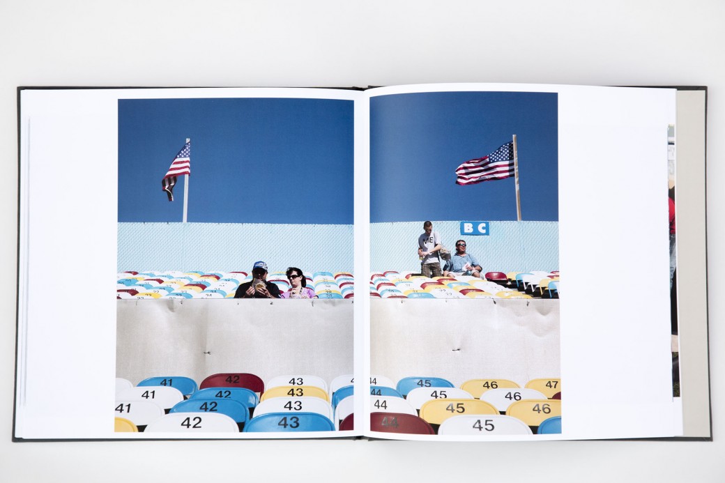
Dennis Burnett recently relocated to Austin from Savannah and was looking for help with editing and presenting his work. We put together three presentations:
- A personal projects book (printed by blurb on their new proline paper with cloth cover)
- An iPad presentation of his editorial work
- An editorial magazine leave behind (printed by magcloud)
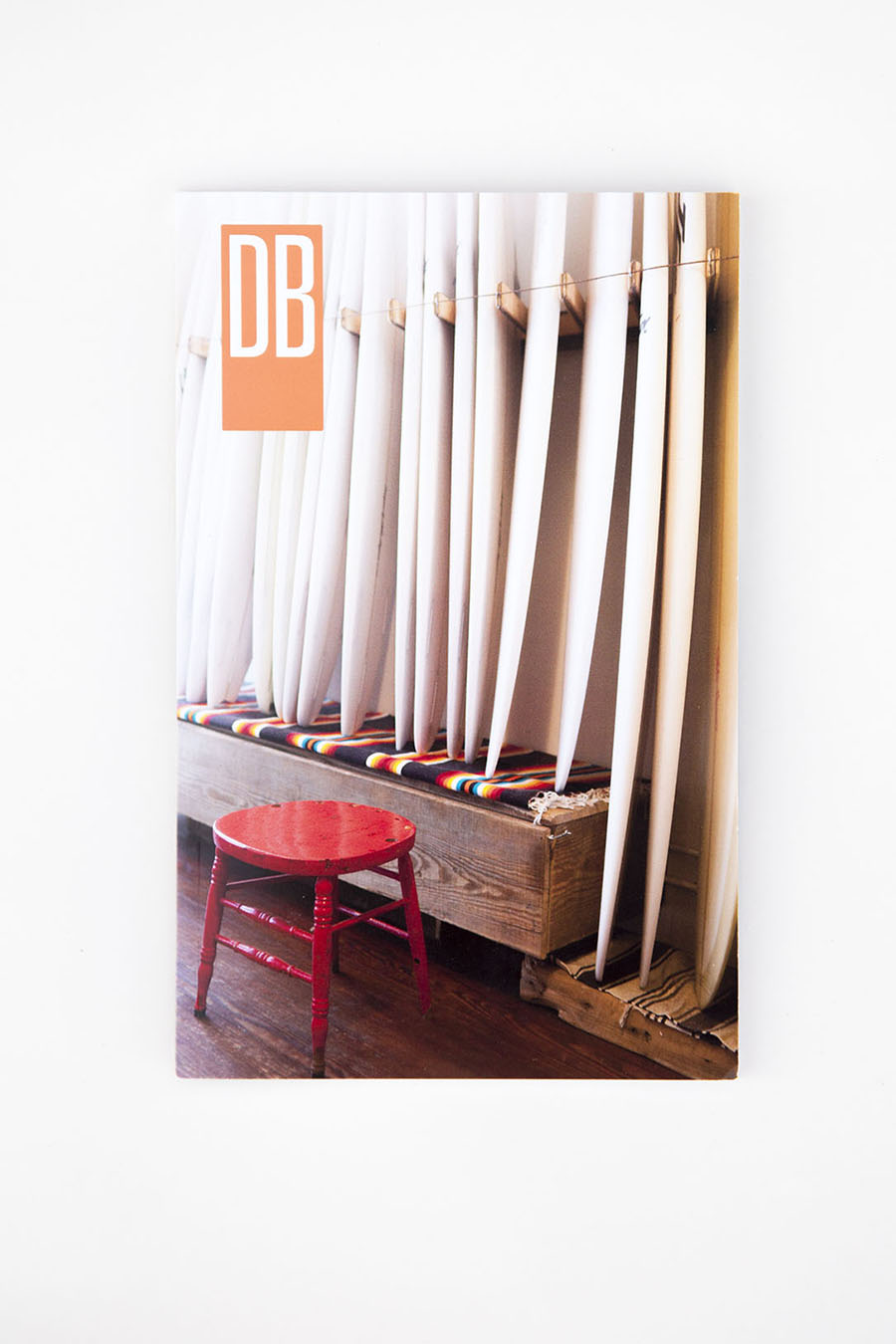
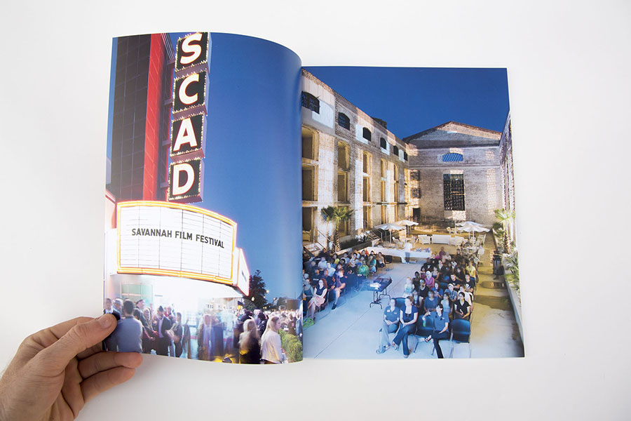
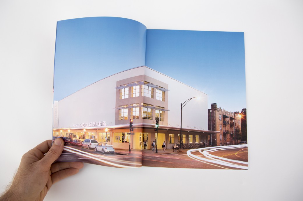
- A magazine highlighting the work lifestyle, architectural and interiors work he did for SCAD (also printed by magcloud)
Dennis showed this work at the Texas Photo Roundup portfolio reviews and received very encouraging feedback.
Case Study: Tim Calver
Print promo and coordinated e-promo for Tim Calver, a talented photographer based in the Caribbean who specializes in underwater and hospitality industry photography.
Case Study: Benjamin Spell
Benjamin Spell is a Brooklyn-based portrait and lifestyle photographer. Our work together started with a new edit of his existing body of work. Ben had a strong collection of work but it was muddled by imagery that was too different either stylistically or in subject matter. We tightened up his edit by focusing on a cohesive look that was more polished and focused on lifestyle imagery. Ben had a custom portfolio built by Scott Mullenberg, which has started showing to prospective clients in the NYC area.
Together we brainstormed about potential personal projects that would help beef up the portfolio or become the foundation for a new promotional piece. We decided on a series focused on the shopkeepers of Williamsburg, Brooklyn. Our goal was for Ben to create a cohesive body of work that highlights his great portraiture as well as evocative details and atmospheric shots. The images turned out great and were used in a trifold card that went out to 500 potential clients, as well as an emailer that went out to a larger list.
Kimberly Davis
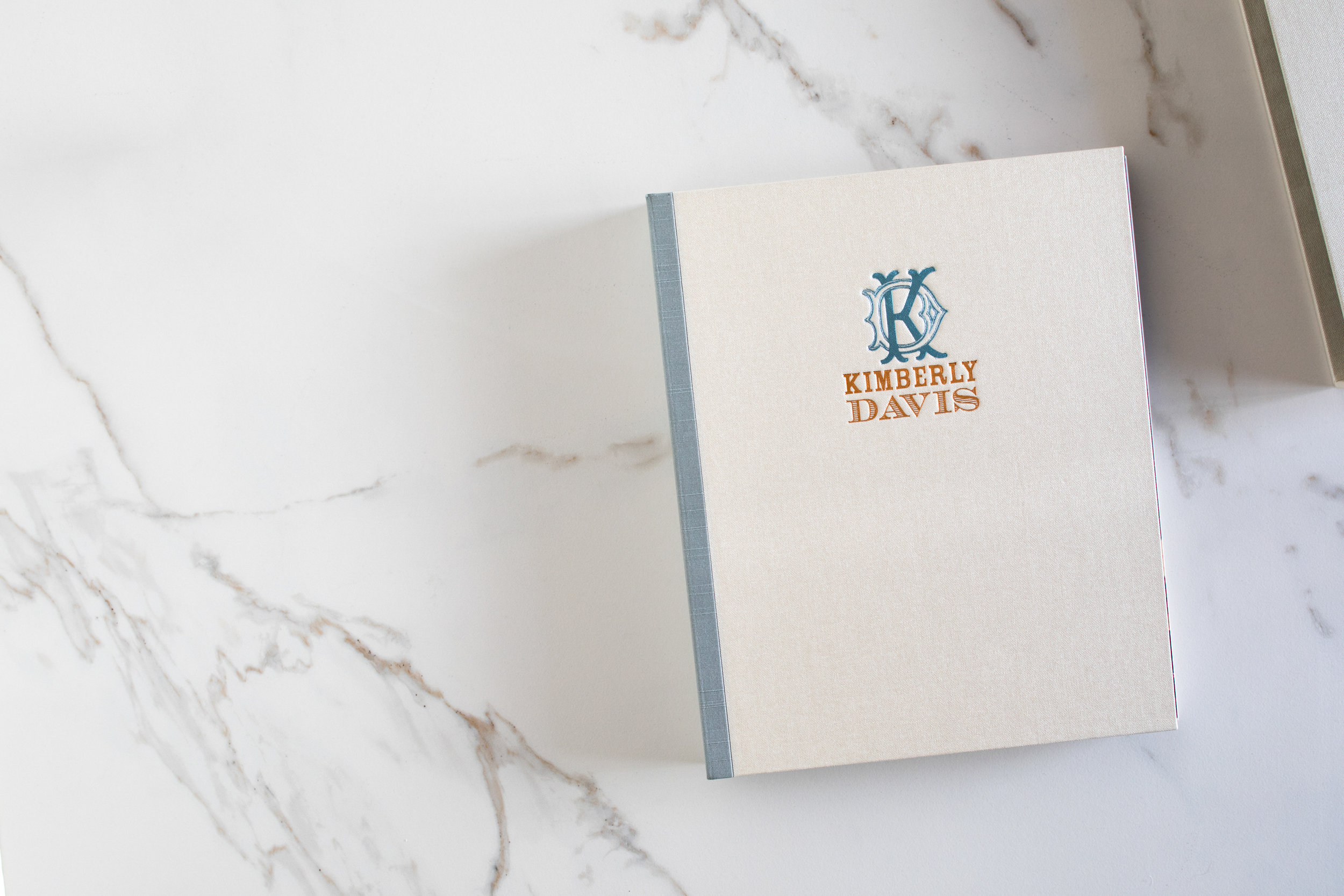
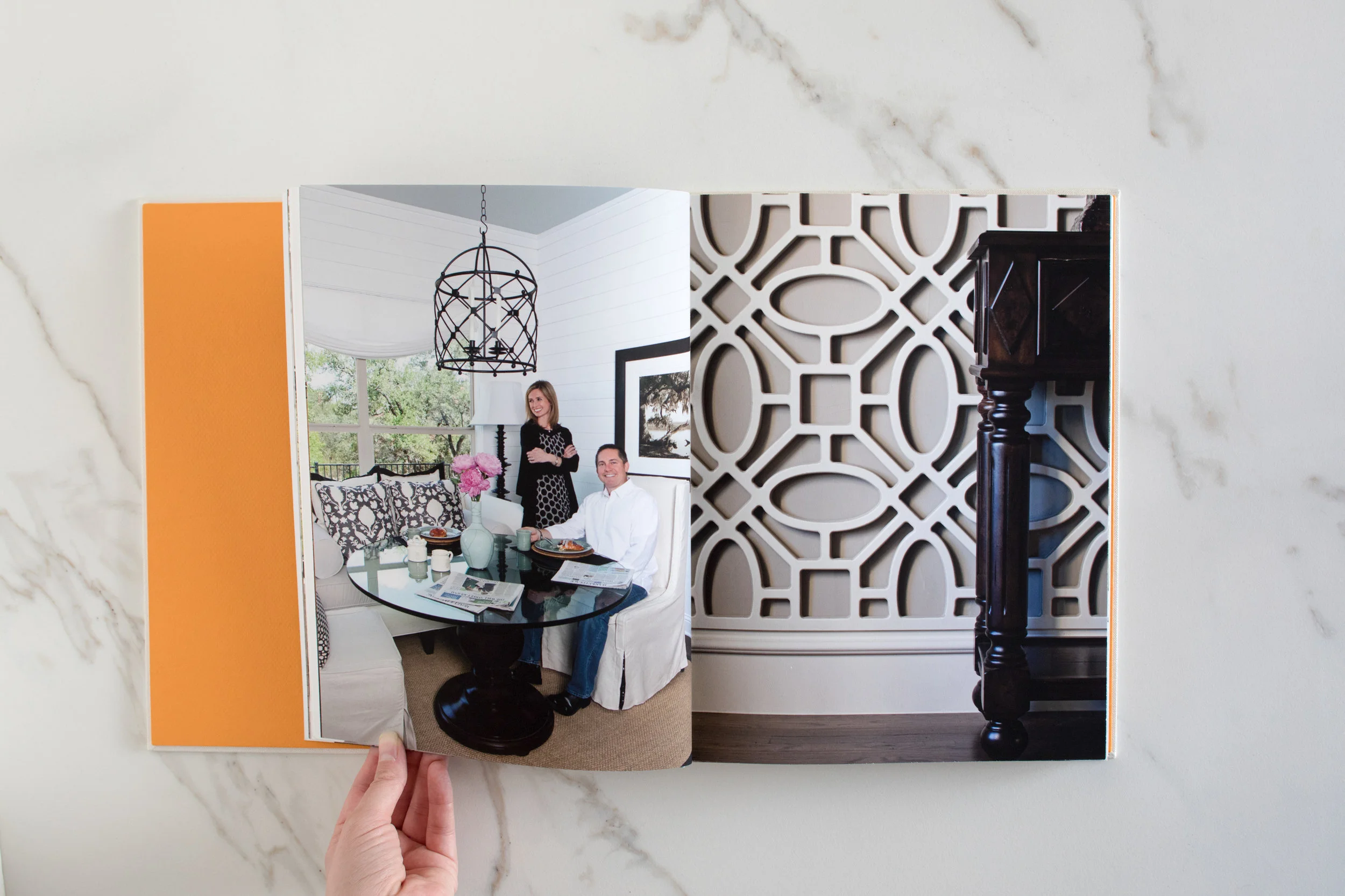
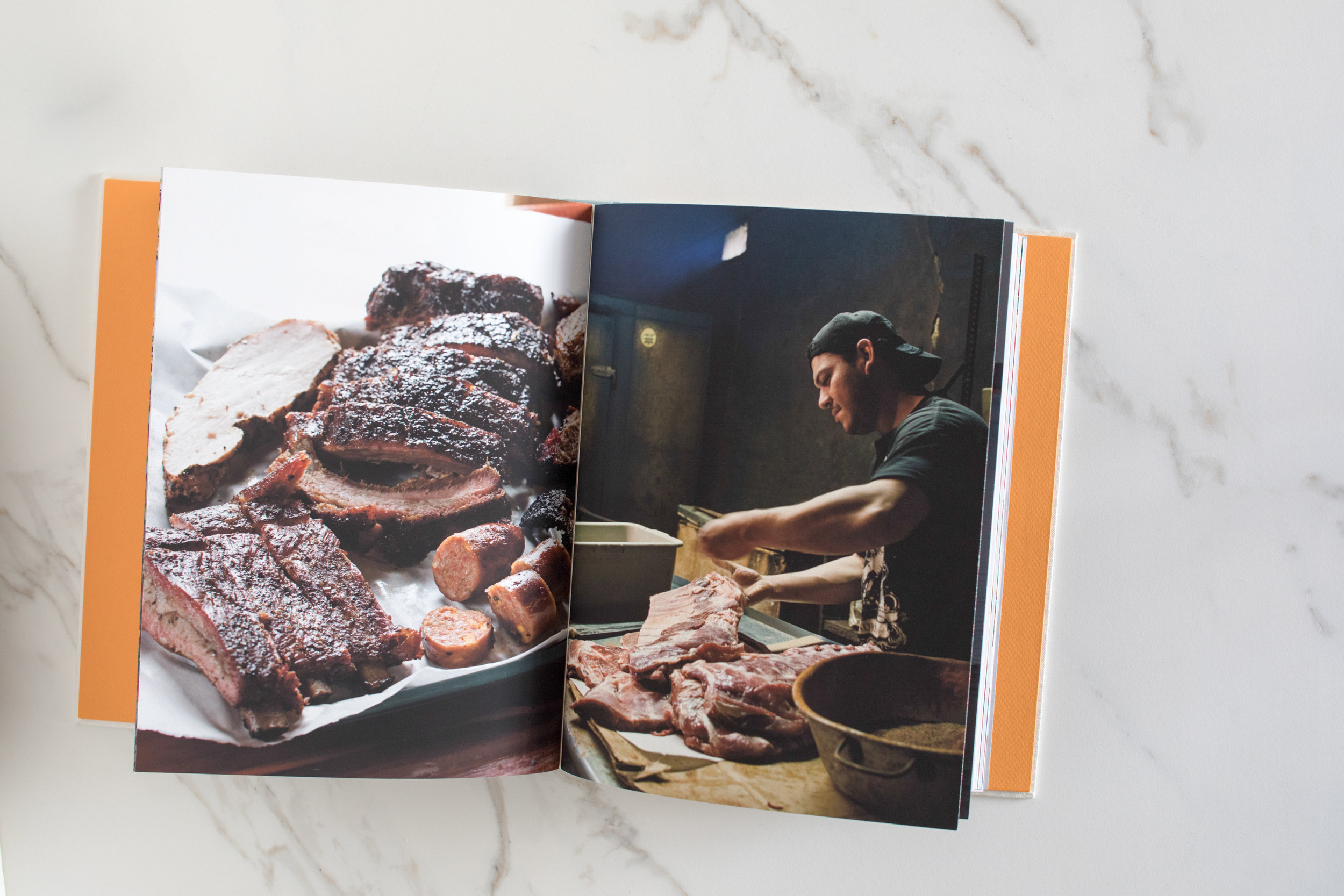
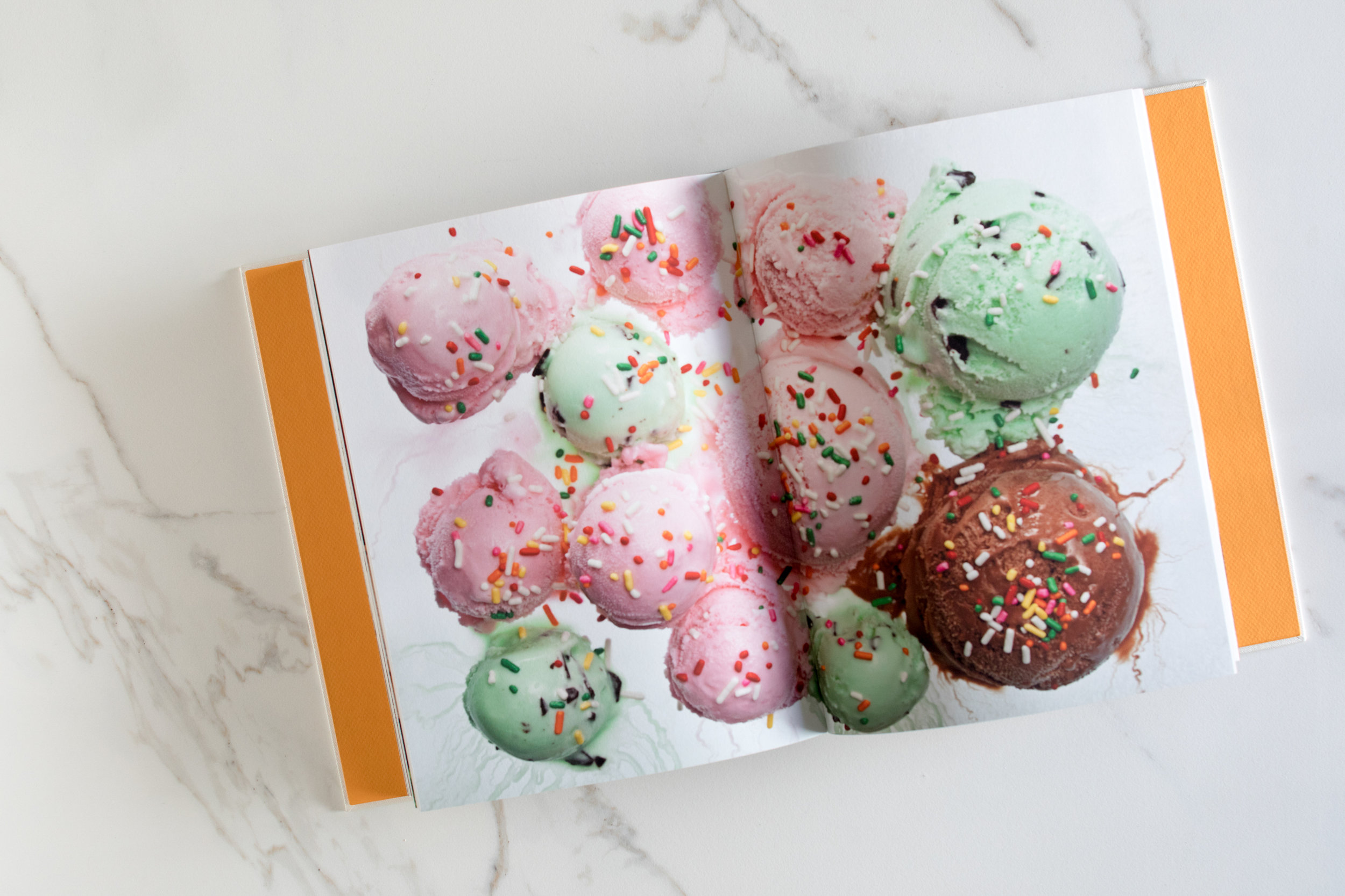
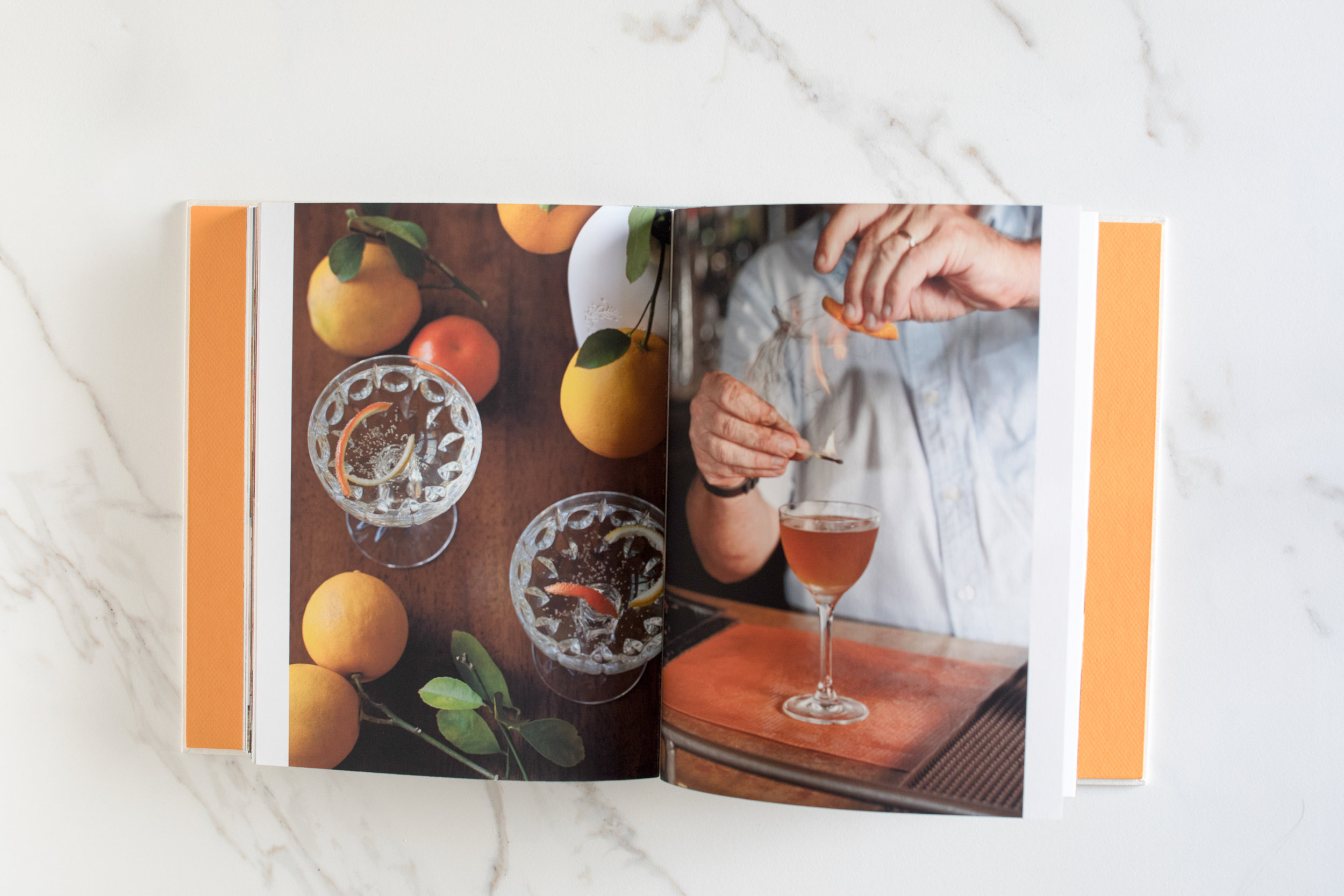
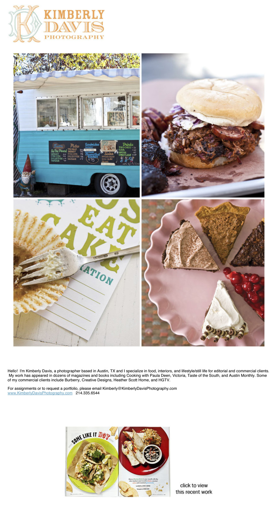
Kimberly Davis is an Austin-based interiors and food photographer with a real love for all things smoky (BBQ) and pretty (interiors). She and I started working together in 2011 to help her fine tune her web presentation, create a print portfolio (the book was custom made by Jace at Cloverleaf Studio), and create a marketing plan.
Print Portfolio:
Email Newsletter/Promos:
Is it Time to Embrace Watermarks?
For years people have said that watermarks are the domain of the hobbyist or paranoid semi-pro. But the rampant online spreading of photos with no way of knowing who took the original has opened my eyes to the value of a well-designed (and placed) watermark. The real world examples are numerous, I'll share one from last week: I've been trying to license a handful of images that I've found on facebook pages that had no credit or copyright information. I contacted the owner of the facebook page to ask him for credit info for the pictures in question (I knew he wouldn't have it, but wanted to make a point), and his response was that he usually doesn't know because he "gets them from other sites with no info".
So I began my hunt to try and find the original creator of the image. Google's similar image search is helpful, but if a photo has gone viral, Google will find countless similars but they're all just tumblr reblogs and pinterest repins.
As it is obvious that the cat is out of the proverbial bag when it comes to unauthorized sharing of images online, I think the best thing you can do is create a watermark or graphic that will travel with the photo as it hops around from twitter to tumblr to facebook to pinterest and back again.
Of course, there are people who are working hard to make it easier to remove the watermark. A quick Google search for "how to remove a watermark" yielded over 45,000 results.
What are some other ways that you can leave a digital fingerprint? Any great examples of watermarks that are well-designed?
David McNeese Print Portfolio, Website, and Promos
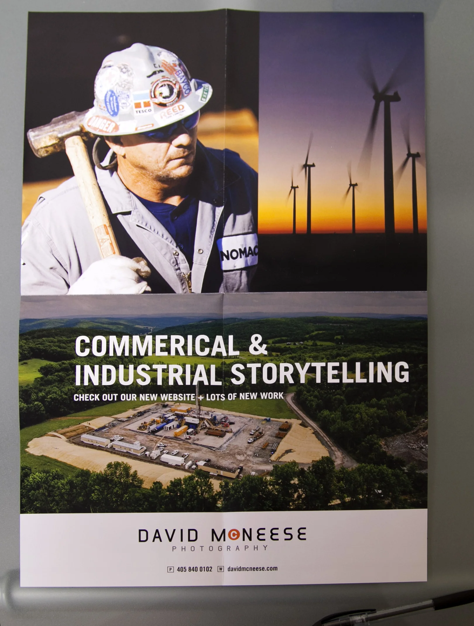
David McNeese is an Oklahoma-based industrial and corporate photographer with a passion for shooting large-scale projects full of logistical challenges. His studio is frequently tapped to create stunning imagery for energy, oil and gas companies, and large construction firms. David came to me needing to refresh his brand identity, overhaul his website and develop a plan for targeting clients with the kinds of large scale jobs that he excels at. We started by going through all of his images and choosing ones that best show off his corporate storytelling skills. We then worked with Livebooks to create a custom website. Once the website was launched, we announced the new look through email and print promotions designed by Nathan Ryan.
We also developed new print portfolios, built by Scott Mullenberg's Mullenberg Design Studio. David had the opportunity to show the new portfolios off at a portfolio review in Austin in February, where he received very positive feedback from art buyers and reps.
New website:
Print Portfolio:
11x17" foldout double sides print promo:
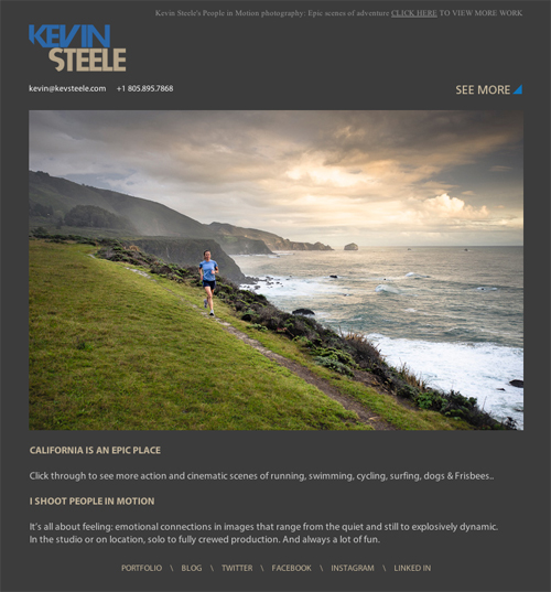
E-promo:
Kevin Steele
Last year I helped lifestyle photographer Kevin Steele redo his website and chose images for a targeted marketing campaign.
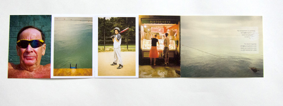
Kevin Kerr Website, Print Portfolio and Print Promo
NYC-based travel photographer Kevin Kerr and I worked together to re-edit his web and print portfolios, create a new print promotion, build targeted mailing lists and define who his top priority clients should be.
IMG_0377
Mike Kane Zine Interview
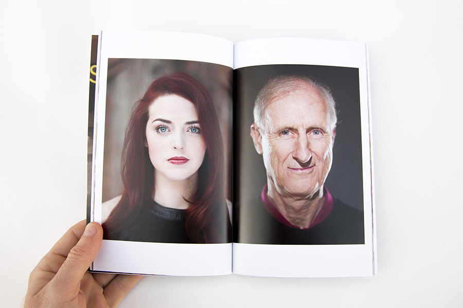
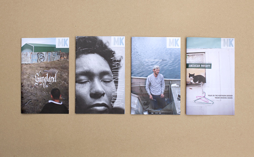
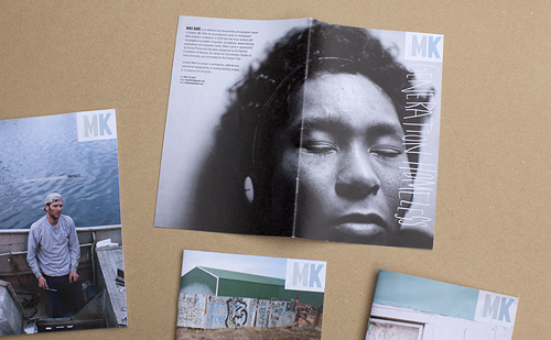
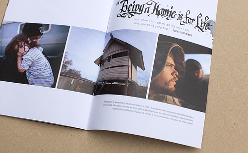
Mike Kane recently sent me four zines he self-published. They're really lovely. Small, well-designed and edited, with a clear point of view. I love that photographers are taking the time to craft something that can be handheld, and that leaves an impression among the chatter of our online lives. From the newspapers to the foldout posters to the zines, it shows that people care about making a lasting statement with their work.
I talked with Mike about the process of creating these zines:
What inspired you to make your series of zines?
I was gearing up for a trip to New York this spring, trying to figure out something interesting that I could leave with editors. Originally I thought I'd do a card or something. But then I started talking with Mary Virginia Smith, through my involvement with Blue Earth Alliance. She recently published a great book about self-publishing, and she told me about Allison V. Smith's zines. Allison hooked up with a designer and started doing these really cool iphone photo zines. Mary's book describes how they are collectables now. And that just totally appealed to me- try to make something that someone might actually want to keep around for a little while. Also the format suits the kind of shooting I do. I definitely like to present things as an essay or series- I've always had trouble selecting just one or two images for a card.
Were you involved in the pre-internet zine scene? I remember reading Maximum Rock n Roll when I was in high school and thinking that the there was this big world out there and all you had to do to connect with it was order some zines out of the back of MRR. Did the DIY ethos influenced your photography career?
Yeah I remember seeing some pretty intense zines come through Yellow Springs when I was in college. It was all a little above me but I totally understood the notion of just making the thing that you want to see. You can get so frustrated trying to communicate your vision, or express the potential you see in yourself - it feels so good to just say look, this is what I'm talking about! This is how it should look! I love that control. Blogging kind of has that same release, you can publish the stuff that gets passed over, show things the way you want to show them. Zines are kind of an extension, a print version of that maybe.
What was the biggest challenge in making these?
Time. You really can't sit down one afternoon and bang it out. At least I couldn't. I second guess everything. I come back a few days after doing something and just cringe. And once you involve a designer, and then a printer...it's a lot of back and forth. And everybody's busy. So I had to learn to give myself way more time than I would have expected.
Do you collect zines from other photographers or artists? Who?
Not really, but only because I don't personally know anyone else who's doing it. I wish there was some sort of zine swap I could go to. I'd love to trade and see what other folks are doing.
Who are you sending these zines to?
So far I've just left them with people that I've met personally. But this summer I'll probably send a small number around to people I missed in New York, or have had some kind of contact with. They are a little pricey and I don't want them to get tossed without opening.
How did you choose the four topics you did for the zines?
Well it was my newest, decent work basically. A few essays, and the portrait portfolio. Together they kind of represent everything I do for editorial and documentary work. One project is self-funded, one is all foundation commissions, and the other was done with grant money. Most of the portraits were editorial assignments. Who designed them? They look great!
Thanks. The design was definitely collaborative between myself and a great graphic designer I used to work with at the Seattle Post-Intelligencer, Andrew Saeger. He runs his own letter press and t-shirt company now, and I was able to barter some T-shirt fashion photography for help with the zines. I had the basic idea for lay out, and he worked the typography magic. He definitely took the project to a level that I could never have gotten it to on my own. Where'd you have them printed and how much did it cost?
I shopped around a little, tried MagCloud first, which was super inexpensive. But I didn't like the paper and they don't customize, so I ended up at AlphaGraphics in Seattle. The unit cost varies depending on how many I print, but at 30 it's $10 a pop, including proofs and set-up, etc. Not cheap but I really love the paper, and the images look right. Do you think this is something you will continue to do annually, or more often?
I'm definitely going to keep this up for awhile. Like I said it really suits the work that I'm producing right now, and until that changes, or until I find something that works better, I'll keep at it.
Any advice for someone thinking of self publishing something similar?
Give yourself plenty of time. It's amazing how long the process can be- photographers are perfectionists when it comes to their images. Getting the perfect proof can take some time. And you should find a printer you work well with, that's not going to give you a lot of guff when you keep asking for another proof because an image is too dark.
Even though a professional printer is used to tweaking files and matching colors, photographers working with their own images, on a project they're shelling out a fair amount of money on, are going to be insanely particular. If your printer doesn't understand that you might have problems.
Awesome Things about Look3, in No Particular Order
I just returned from three (was meant to be four... thanks a lot American Airlines) days in quaint, charming and lush Charlottesville, Virginia and the fabulous Look3 Festival of the Photograph. Look3's motto is "Peace. Love. Photography." and they do a great job at celebrating all three. Here's a list of some highlights, in no particular order:
- Lynsey Addario's heart-wrenching and inspiring presentation of the work she has done on women's issues over the last 15 years.
- Robin Schwartz's presentation of "Amelia's World": Portraits of her daughter with various animals. Her daughter has a magical gift for connecting with animals.
- Camille Seaman's wonderful telling of venturing into the world of Arctic and Antarctic photography, and how we are all connected in this world. So inspiring!
- Sitting under the stars, drinking a miniature boxed wine (think grown up juice box) with David Laidler, Alyssa Coppelman, Timothy Archibald, Andrew Hetherington, Jennifer Whitney and others.
- Piling into a bus with 19 other people to go from the Razon party to the Luceo Images party.
- Burgers and meeting the rest of the Prime Collective members
- Timothy Archibald's fantastic "Echolilia" project, in which he and his autistic son embark on a photographic journey together
- Simon Norfolk's Astra3B series
- Swimming in the river on our last day, while a bunch of baptisms were performed right behind us.
'Til next year everyone!


